Society of Visual Storytelling

    SVSLearn Forums

    • Register
    • Login
    • Search
    • Recent
    • Tags
    • Popular
    • Users
    • Groups
    • Search

    Hi SVS :)

    Introductions
    11
    15
    4209
    Loading More Posts
    • Oldest to Newest
    • Newest to Oldest
    • Most Votes
    Reply
    • Reply as topic
    Log in to reply
    This topic has been deleted. Only users with topic management privileges can see it.
    • Dulcie
      Dulcie SVS OG last edited by

      Welcome to SVS @Katie-W! It is a great place to be, hope you like it here
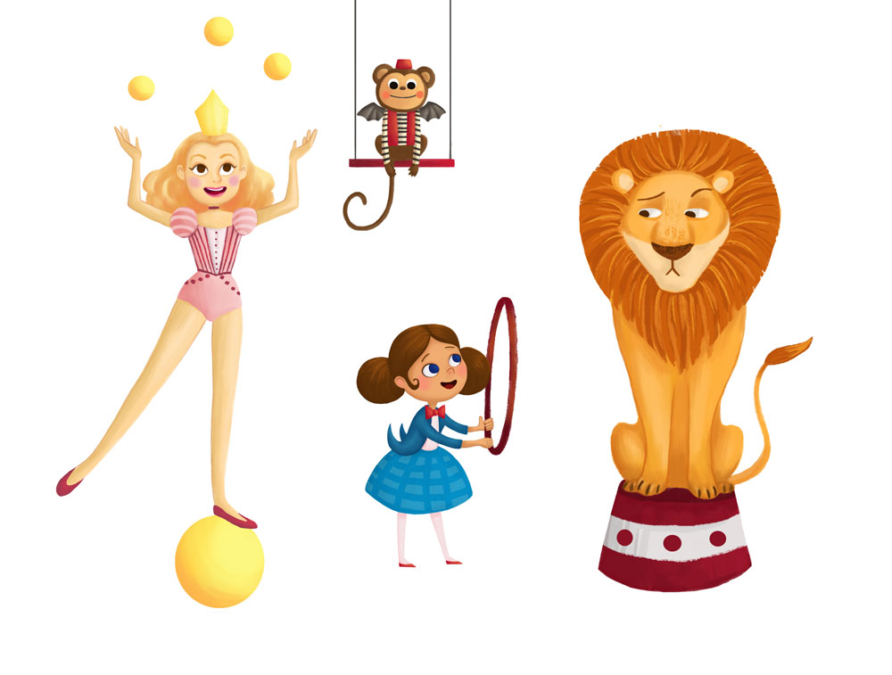
 🙂 Love your concept for 3rd Thurs, the circus idea is great and very nicely finished!

      www.dulciemascord.com
      https://www.instagram.com/dulciemascord
      https://twitter.com/dulciemascord
      https://www.facebook.com/dulciemascord

      1 Reply Last reply Reply Quote 0
      • DanetteDraws
        DanetteDraws last edited by

        Welcome @Katie-W!

        OMG your characters are adorbs! I love the monkey in particular, I just want to give him a hug. And never let go.

        One critique I'd say is that the lion looks more bored/skeptical than he does scared. I would work on his expression a bit more. He also doesn't look quite grounded on that base - more like he was cut out and pasted on it. Same with the shadows - they look more like they're floating above rather than being grounded.

        I LOVE Dorothy's little jacket with the back flap bits (totally mental blanking at the moment what those are called) curling up.

        https://danettebyatt.com
        Twitter @DanetteDraws
        Instagram @DanetteDraws

        mattramsey 1 Reply Last reply Reply Quote 1
        • mattramsey
          mattramsey @DanetteDraws last edited by

          @DanetteDraws said in Hi SVS 🙂:

          One critique I'd say is that the lion looks more bored/skeptical than he does scared.

          I figured that was the look she was going for. Like: "jump through that? Pu-leeze."

          https://www.inprnt.com/gallery/mattramsey/
          https://mattramsey.artstation.com/
          https://twitter.com/mramseyART

          1 Reply Last reply Reply Quote 1
          • Kekkerz86
            Kekkerz86 last edited by

            Welcome Katie! And your art is great, I really like the concept here and I think it works really well for the characters!

            "A broken pencil is pointless..."
            www.keishamorris.com

            natiwata 1 Reply Last reply Reply Quote 0
            • natiwata
              natiwata SVS OG @Kekkerz86 last edited by

              @Kekkerz86 Welcome to the forums! You have a lovely style, very appealing, good color choices with a nice level of polish to it!

              Nat Iwata
              www.iwataillustration.com

              1 Reply Last reply Reply Quote 0
              • Katie W
                Katie W last edited by

                Thanks for the warm welcome everyone!

                @DanetteDraws Thanks for the critiques, I agree with you about the shadows and lion needing more weight on his platform. I seem to have a hard time placing characters concretely in space. Something to work on I guess! As for his expression, since it was a redesign I intentionally tried to make him look more unwilling rather than scared to create a moment between him and Dorothy (I didn't think he would be afraid of her since they're friends!). I can see how making him look scared would make him more recognizable though, thanks again for your comments.

                DanetteDraws 1 Reply Last reply Reply Quote 1
                • DanetteDraws
                  DanetteDraws @Katie W last edited by

                  @Katie-W you're welcome! I like that you've changed up his expression to be more unwilling and you've definitely nailed it - the one thing then I'd say would be a small easy fix is just move his eyes to be looking downwards at Dorothy/the hoop. Right now he's looking across at Glenda. Then the apprehension about "doing tricks" would really be apparent.

                  https://danettebyatt.com
                  Twitter @DanetteDraws
                  Instagram @DanetteDraws

                  1 Reply Last reply Reply Quote 1
                  • Katie W
                    Katie W last edited by

                    @DanetteDraws Thanks again for the great suggestion. I changed up his eyes to make his gaze more obviously directed at Dorothy and I think it looks way better... I also removed the shadows completely as I was told in the critique 🙂

                    0_1471626601865_circus_wiz_of_oz_full.jpg

                    DanetteDraws 1 Reply Last reply Reply Quote 4
                    • bharris
                      bharris last edited by

                      Looks great!

                      www.brittanyharrisillustration.com/
                      www.instagram.com/britillustration/

                      Rian Trost 1 Reply Last reply Reply Quote 0
                      • Rian Trost
                        Rian Trost @bharris last edited by

                        Really charming characters. The little monkey is adorable, and the coat tails on Dorothy are an awesome way to create some depth. Great work!

                        www.riantrost.com

                        1 Reply Last reply Reply Quote 0
                        • DanetteDraws
                          DanetteDraws @Katie W last edited by

                          @Katie-W love love love! It's looking so great now 🙂

                          https://danettebyatt.com
                          Twitter @DanetteDraws
                          Instagram @DanetteDraws

                          1 Reply Last reply Reply Quote 0
                          • First post
                            Last post