Personal Project (with my son)
-
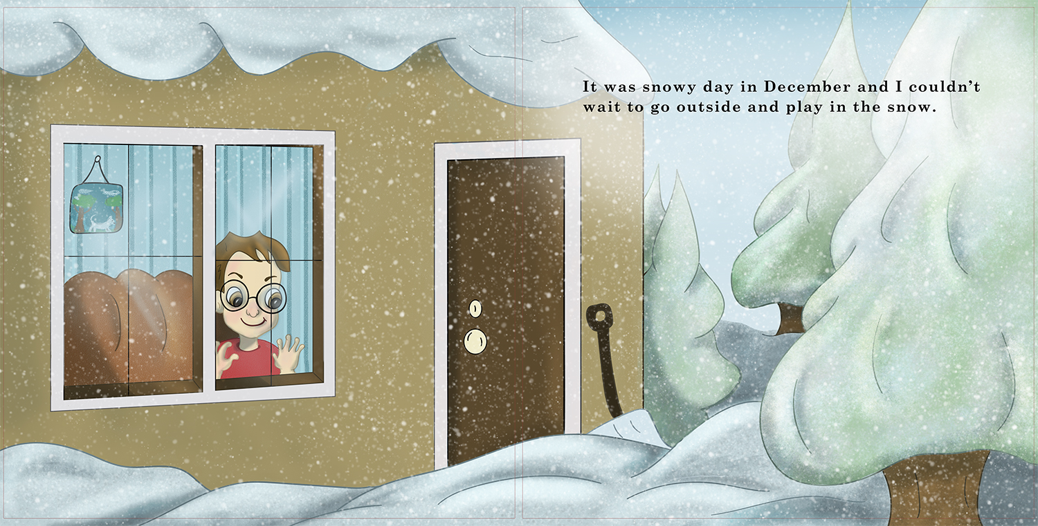
A few months back I shared some characters I was working on for a personal book project that I am working on with my son. Update on that is that the story has been proofed by a friend... the book dummy is done and approved by my son and I started to work on the sketches. I wanted to take the first spread to finish and share to get some feedback on it. I am trying hard not to over work it and spend time on the fine details but I also want it to be interesting for kids to look at. I would love the thoughts and feedback from my SVS peeps. Should I continue with this style or am I headed down a dark alley?
I would like to add that I want this completed and on createspace by December. A goal that I am aiming for.
-
It is a charming illustration (particularly like the sense of light), but there are a few things that may be worth considering. The perspective is off (door and window do not have the same horizon) and the house and tree lack a sense of volume (they look like cardboard silhouettes). Of course this may be a stylistic choice - then also perspective is not that important and you could actually skew it even more and get rid of the shadow rendering and even use collage to intensify that choice (like In Lauren Child´s work).
In terms of visual interest, you may think about being more specific. The house, for example, is not a specific house, rather a symbol for a house. You could think of a specific type of house, located in a specific country and built in a specific time. Like a mountain cottage if it is in the mountains (and a Swiss cottage, or a Swedish cottage, or a cottage in the Rockies, etc...), or a town house of a specific town. That helps to think about details, find reference and make images in general visually more interesting. And once you have made those choices all the others follow (like what type of trees would grow in those places, what kind of furniture and colors are prevalent, what would be visible on the horizon, etc...
Just some ideas, as, of course, every style is different - that is just how I approach a narrative image in general. -
@smceccarelli I was worried about the house and trees. I kept I thinking that the house looked like a box with no character in itself. I will work on that piece. One thing that I did different is I kept my line work. Usually after I get my shadows and highlights in I add a layer and paint out the line work. I was not sure if I should keep the line work and color it like I did or do my other style and paint it out?
-
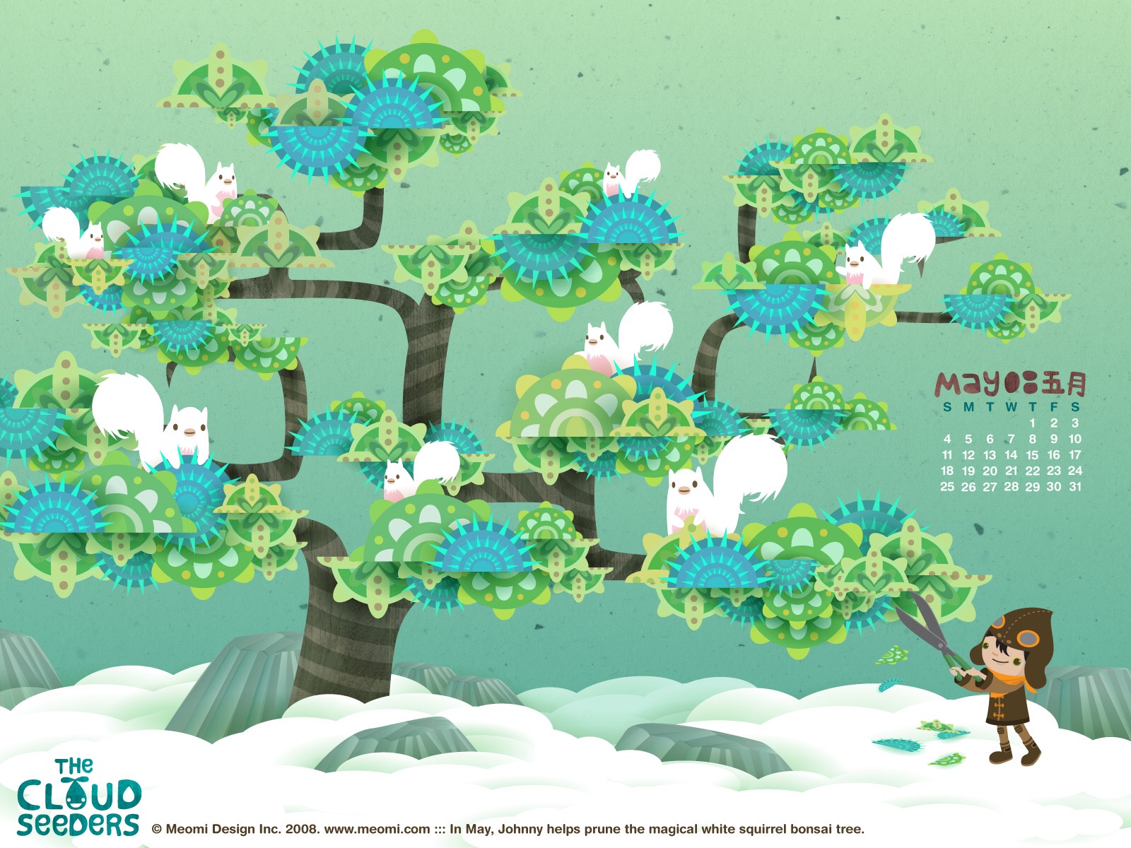
@Chip-Valecek There are successful ways to do either, so it is really a stylistic choice and there are no rules. You could go for a painted style and eliminate the line (and work more on the volumes maybe), or keep the line and push the flat/collage approach. Or go for flat without line (like the work of the illustrator pair Meomi, which I absolutely love - even though it is completely different from my work). Or combine line and volume rendering, like Justin Gerard. The most important thing is probably to make a conscious choice and stick with it, and make all decisions dependent on the choice. Will Terry often talks about "doing things with intention" - which is easier said than done, of course!
Here is an illustration from Meomi, which may give you some ideas on how to handle snow in a flat/collage style:
-
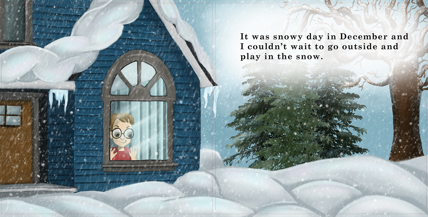
I slept on it and you are right, I am going to go with what I am comfortable with. I will post the updated piece soon.
-
Here is my updated piece. I went with the style I am most comfortable with. I will take another pass over to clean up some edges but I feel this piece has more character then the first one I did. Thoughts or Crits? About to move onto the next two pages.
-
@Chip-Valecek This looks way more interesting to me Chip - really nice - would love to see warmer light inside the house and hitting the snow outside the window - only critique though would be that the boy looks flatter than the rest of the piece - I think even minimal shading would help give some volume to the boy - really looking good!
-
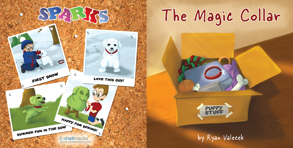
Its been awhile since I posted an update here on this project, but i am happy to say that I submitted my files for review. Once approved I will get a proof copy and then it will be FINISHED NOT PERFECT (as Jake Parker says). Any way here is the cover design:
-
@Chip-Valecek - that is excellent news Chip! Congrats on completing the project! Both you and your son have to be very excited about this!
-
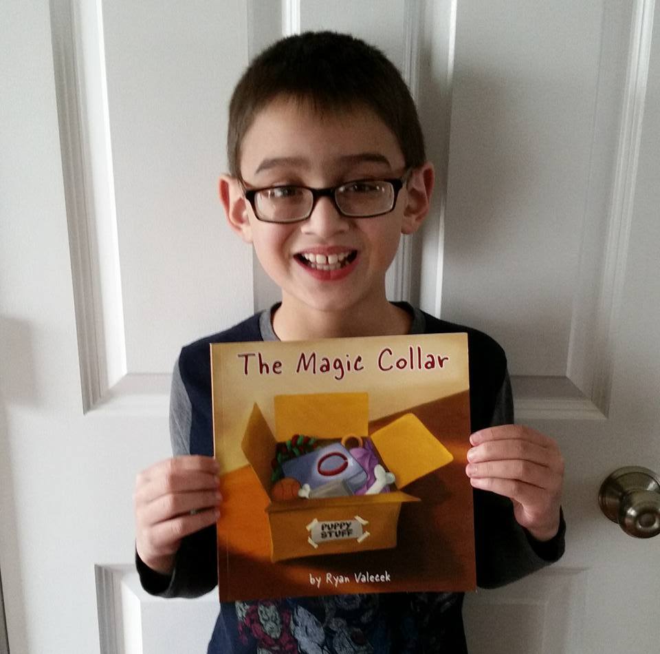
Proof came in the mail today. Pretty happy with it. Some of the pages are dark and I will need to lighten up a little. A few tweaks on the text and it should be ready to go. I will get one more proof after the changes to make sure. But we are both excited!
-
Awesome! Congrats!
-
@Chip-Valecek Awesome!!!! Chip I found with create space I had to up the saturation ( on most pages) about 30% Good luck!!!!! So happy for you both!
-
@Chip-Valecek What a great father you must be Chip! Your son looks very proud to have that book!
-
@lmrush Yeah the blues really came out dark, so i am fixing that. I will get one more proof and hopefully that will be the winner.
-
@Kevin-Longueil He was so happy. We were out at lunch and when we got home I saw the package by the front door, i told him what is was and he ran to get it. He sat there and read it. He was super excited.
-
@Chip-Valecek I can't wait to see it, post once it's ready!!!!
-
@Chip-Valecek
Your son looks so happy! I think it's wonderful that you two finished your children's book project. Awesome!