Architectural ink cityscape
-
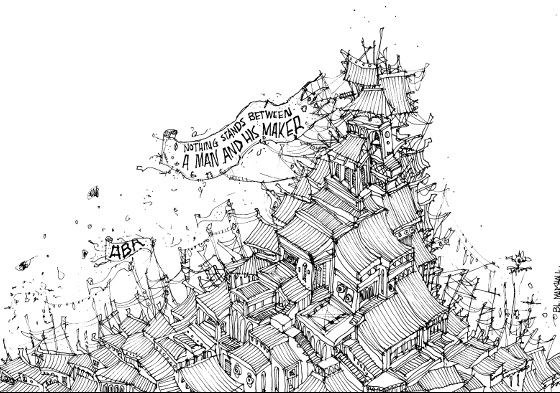
Hey there!
I wanted to share a recent artwork, any advice for adding colour or improving linework will be appreciated!
Thanks, Brad
Medium: Ink
Size: 210 x 297 mm (A4) -
This is beautiful! Not sure I would add color, this looks perfect and complete as it is. Very nice use of rhythm and pattern.
Are you familiar with the work of Shel Silverstein? -
I love this! It reminds me of Quentin Blake's work, so if you were going to add color you could check out how he does his. But I agree, I think it stands nicely as is. Of course, you could always add one color, say red on your focal point, and leave the rest b&w. Thinking as I type...
-
@smceccarelli Thank you so much! I have seen some of Shel Silverstein's work, I think just The Giving Tree, will have a look at more of his illustrations

-
@Rebecca-Hirsch Thank you so much! A wash is a good idea I'll try experiment
-
Wow this is awesome! Really love the style/linework and whimsical approach!
Nat Iwata
www.iwataillustration.com -
@natiwata Thank you so much!
-
@Brad ditto with what @natiwata said
I also agree with @smceccarelli that this (and the pieces I saw on your Facebook) are great in just black-and-white as it becomes quite textural with an exploratory nature to it. However, I don't think that color would necessarily diminish that, plus, there are likely times when it may require color.
@Rebecca-Hirsch has a great approach there. To go with that, you could approach colorization where all of the roofs (or whichever chosen element) are of the same hue or various shades of the same hue. Or somewhat similar, you could reduce your color palette strictly to just 3 colors or something like that.
Also, I like the idea of a wash. You could do that on the piece itself, but in my digital-minded ways, I might consider doing washes of color on separate papers and lay them in under the line work (with the layer set to multiply or with the black selected & turned into a layer) in Photoshop. You would have to mask the different washes so that they show up per each portion of the sketch as desired. You can also use different papers, other textures, or other mediums (watercolor, ink, marker, gouache, etc.). The idea with this would be to attempt a collage-like coloring process to maintain that whimsy. It might be that simply doing a wash on the piece itself achieves this quicker without all the complication, but then again, if you create several pages of full washes, you could use them over and over for different pieces and even modify their colors digitally as necessary.
I have seen some whimsical art be rendered with the coloring not adhering to the line boundaries. Colors bled over the lines. In fact, I've seen it where it was just a "blob" of color thrown behind the entire image without any attempt to fit to anything.
I've also seen something where—like in the case of this particular image—the entire mass is colorized and the background is separately colored as either a very flat solid color or some wash with/without texture. (I'm probably thinking of some of the character paintings by Simon Bisley)
Scott Monaco | QuietYell.com
IG/FB/LI: @QuietYell
IG-2: @QuietYellSketches
TW/PIN/BEH/DEVART: @ScottMonaco
SCBWI: http://bit.ly/1r8Dmqr -
@QuietYell Thank you so much for the excellent feedback, will definitely try some of those ideas, love the idea of setting up the different wash backgrounds!