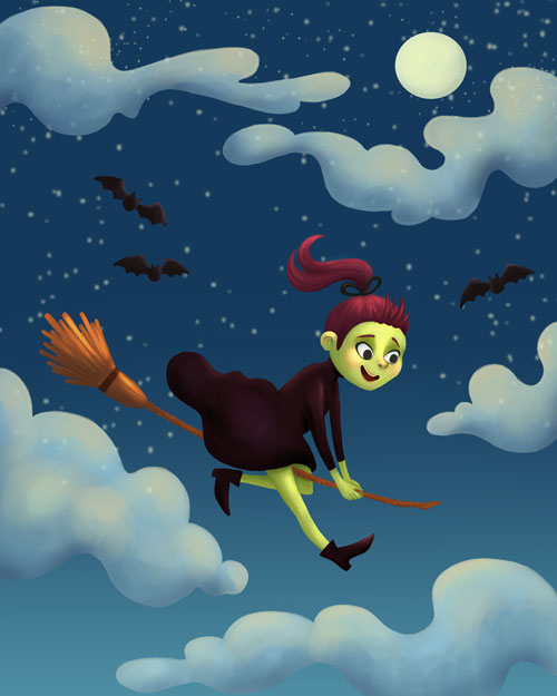
Little flying witch illustration
-
Hi All,
I’m pretty nervous to be posting this (I’m internet shy!) but I’ve been working on this little flying witch illustration for the past day or so and wanted to get a bit of feedback to see if I’m missing any glaring errors. I also don’t quite know how to handle the bats. I’m not sure if I should let them sit back as they are now, or make them more of a point of interest?
Thanks in advance for looking and for any comments or critique
")
-
I would make one bat large and one small to give it some depth. For the witches face it looks like there is another light source since the bottom of her face is so bright. If the moon is the source of light then it would have more shadow.
-
@Katie-W I think this is looking great - it may be worth trying to put a small measure of cooler light on the tops of the witch and broom - you could add a bit of shadow to the undersides too like Chip was mentioning - the shadows could go toward being warm - i am reading by the gradation of the sky that the sun is setting or has just set... is that right? So that could be why her face is lit they way it is - if this is true maybe a tiny bit of warmth in the very bottom of the sky would help to show this - i'm sure i'm off the mark here but that is what i am getting from it
you have a very nice style - i really enjoyed your 3rd Thursday entry last month. -
Really nice! It has such a fun Halloweeny feel! Gives me nostalgic feeling of Halloween as a kid :))
-
@Chip-Valecek Thanks for the feedback! I like your idea of making the bats different sizes to seem like they are different distances from the witch, I’ll give it a try. I see what you’re saying about the brightness of the bottom of her face, I guess I was afraid of it looking like she had a beard haha. I’ll see if I can tone it down
@Kevin-Longueil Thank you so much for your feedback and suggestions! I’m kind of terrible at colour and light (something I’m working on) so I really appreciate your suggestion of the cool/warm lights at the top and bottom. Time for me to get back to work and make this piece clearer
I really enjoyed your 3rd Thursday entry last month too, you have such a distinct style of working!@Shams-Nelson Thanks Shams, that’s what I was going for!