October 3rd Thursday
-
@Leontine Thank you very much! Glad you think they have short story potential, will see how it goes
")
Here's an update, #3 sketch and values:
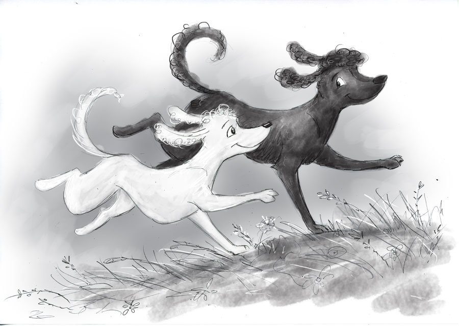
...and #7 sketch and values... @smceccarelli I tried a lying down dog pose, I liked it better that way - thank you for the suggestion!
Suggestions for improvement welcome as always..
-
@Dulcie Cute! I love that the dog bone is being carried by a string, and not by a slobbery mouth. Very thoughtful! Watch the bottom left corner. The line of the hill is uncomfortably close. I would also make the whole front hill bigger so the black dog has all 4 paws on it. It looks a little like a sharp edge rather than a gentle slope. Can't wait to see more!
-
@Joy-Heyer Thank you for your thoughts! I will pay attention to those areas you mentioned...I've been doing a v rough colour key tonight and I've added some bushes in that bottom left corner to avoid the hill hitting that corner, and all four paws are on the hill now
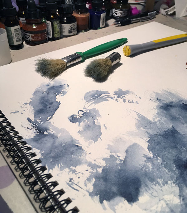
I don't know how many of you have watched Lee's latest class yet, but in it he describes how he uses the cheapest brushes and destroys them to make them really beaten up, so they make more quirky and interesting shapes with the watercolour. He does things like rub them over concrete and runs over them with his car (!) ...So to prepare for the next step in my piece, I got a couple of cheap brushes to try the same thing...went outside and rubbed them over the concrete....then tried bashing them with a concrete block and broke one of them in two! (oops..) So I gave up that idea and attacked them with scissors instead
...and after all that, they did still make some interesting textures. So I might get some more brushes and go even further with the destruction...
-
love your stuff, Dulcie.
-
@Marsha-Kay-Ottum-Owen Thank you!
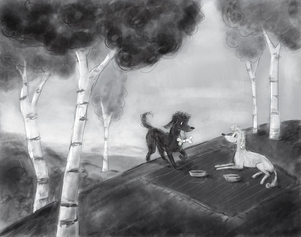
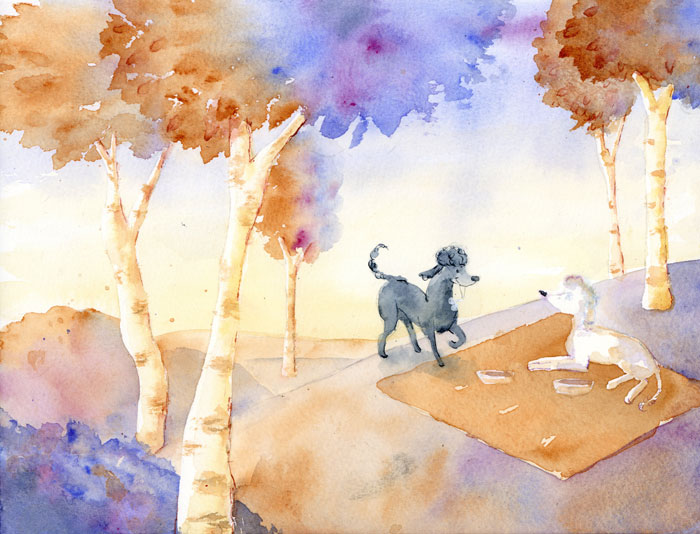
Well, so far I did a smaller scale A4-sized practice piece...in the video Lee has a practice version to work from, which he says he uses to work out any issues beforehand, to practise washes, etc...so I thought I should do that. Because it was only A4 in size I had trouble getting any detail on the dogs (I didn't finish this properly), so hopefully that should be easier in the final piece. I also lost my nerve a bit with the darker tree details...the further I go with a (traditional) piece, the more scared I am that I'll mess it up with the final details. Never mind, will try and do better with the final!
I'll also try to hit the values a little better, and tweak the colours because it came out very orangey and saturated overall.
-
I love the warm/cool washes on the trees! I think this will turn out beautiful. Lee White´s says something along the lines of not being afraid of messing things up - he says "it´s just paper and paint"
")
-
@smceccarelli Thank you
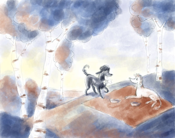
I started the final tonight, now part-way through...a moment ago I considered it and thought 'hey this is going well so far!' and at the same time a voice in my head went 'okay, so don't mess it up now!' and I felt all that fun arty messing-about feeling start to go away....so I thought, best not think too much - keep painting!You and Lee are quite right that it's just paper, it doesn't really matter...I keep telling myself the 'Fail. Fail again. Fail better' mantra and I read another one recently along the lines of 'winners are people who learnt from their past failures' (I paraphrase, can't remember the exact phrasing)...but it applies very well to art, I think
-
I love the texture your brushes create! I know it is just a practice, but it has so much character! I can't wait to see your final illustration! Beautiful!
-
BTW my daughter saw it (she is 9) and said: "How nice! Dogs in love!", which I think is a great testimony to your storytelling and ability to create mood, because she did not know anything at all about the image and there is nothing obvious about them being in love - it´s all color, atmosphere and expressions!
-
This is looking fantastic:)
-
@Joy-Heyer Thank you!
@smceccarelli Aww, thanks for passing that on! It's great that your daughter could tell what it was about
@evilrobot Thank you!
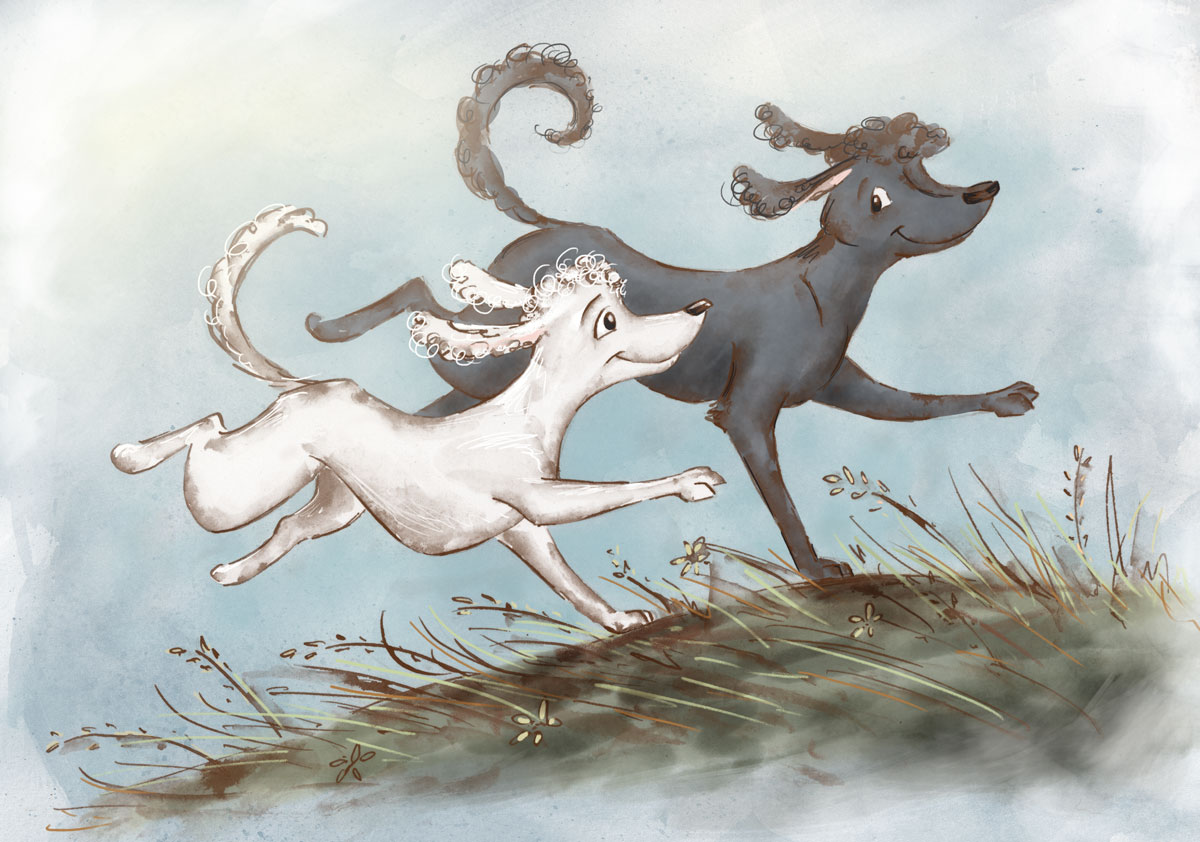
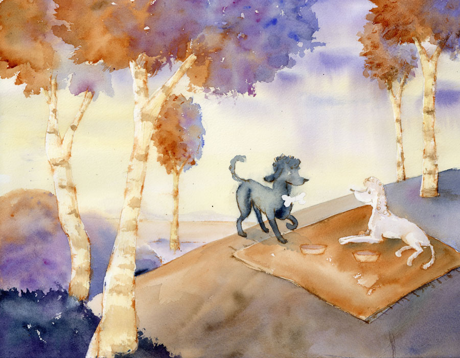
Well, after a few days missed out because of family visits etc, here's an update. I did the "final"...though as you can see it is not finished yet. ..I made some errors and decided that the final doggy details would be easier to add digitally. I think I hit the values a bit better...And the bowls, with the scrubbed out watercolour - that technique really works and that was a great discovery...loved doing that.....But still, the whole piece doesn't quite look as I would like...and even though I wanted this to be as traditional as possible, I still want this for my portfolio so I'll do what any sensible artist with Photoshop would do and fix it digitally
-
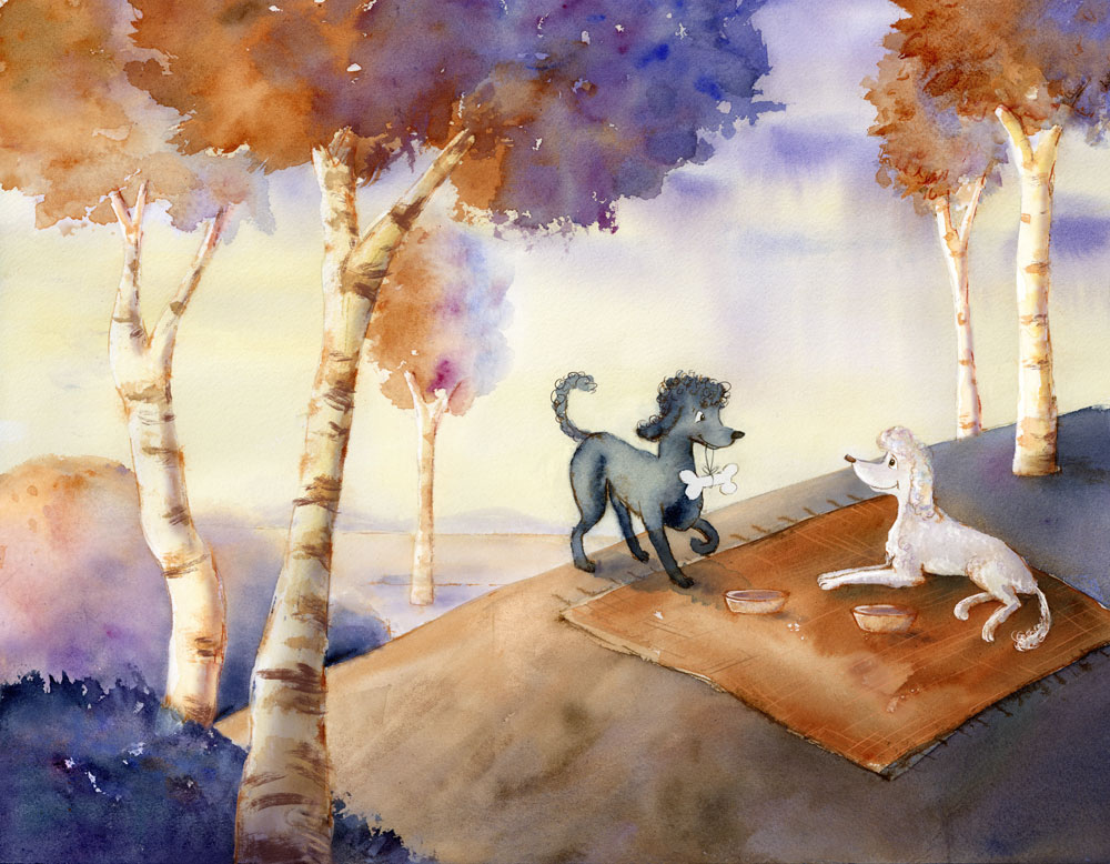
Here's another update, with digital layers...is there anything I should consider doing to make it better? Thoughts welcome
-
It´s awesome! It turned out absolutely lovely! I love the color scheme, the trees are spot-on, there is nothing really I would change.
If you want some comments that offer a bit more food for thought (but are not reason to change anything), I am wondering a little about the "roundness" of the hill (it looks a little like a cutout still) and the position of the horizon. I am not sure there is anything wrong with either, it just makes me think.
A free comment from my daughter (who really loves this illustration) is "it looks like it´s raining". I think the atmosphere is perfect as is, but the comment makes me think wether adding the giveaways of sunlight (sharp cast shadows) would add anything or make it worse. Probably it would make it worse, because it would destroy the dreamy, golden-hour quality, but I thought I share her comment just the same.
Great work, I think it really shows your mastery of watercolor! -
@Dulcie This looks really great Dulcie! A very nice piece for your portfolio too for sure - i think for critique i would say the only thing that is coming up for me is the sharp lines of the eyes and also the mouth on the white poodle - if there was a way to let these lines bleed a tiny bit or add a few sharp lines elsewhere in the piece - that is all i can come up with and it really is not much of an issue - great work!
-
@Dulcie Love the color palette! Such a charming image and story line.
-
@Dulcie Looks fantastic. The only thing I see is the darker dogs shadows make a tangent with the edge of the hill. Look at the back leg and the very front most leg the dark shadow of both end right inline with the hard edge of the hill. I don't see anything else I would change it's a very beautiful image.
-
@smceccarelli Thank you! Really glad you like how it turned out - I appreciate your kind words, and that your daughter likes it too!
Yeah the roundness of the hill had been bothering me as well...I've added in part of the more bumpy outline from my test piece, to try and fix that. I agree with your daughter that it looks like there is a cloudburst somewhere.. I didn't intend that, but that would be more tricky to change...will have a think about that.@Kevin-Longueil Thank you! I appreciate all of your kind thoughts and critique. I've tried adding a few more fine lines on the trees, though the way I did it so far, I'm not sure anyone will notice. If I can think of more places to add them I'll do that ...I think next time I do a piece, I'll try to build in more linework/detail so it can feel more balanced across the whole piece.
@Rich-Green Thank you!
@evilrobot Thanks for both the nice feedback and the suggestion to improve it ....I've tried to fix the shadow tangent, hopefully I understood what you meant properly.
Here's the (final?) update:

-
I started the final for my other sketch...but this time I did a different technique, inspired by the way Cory Godbey treats his linework. In my Fall Critique, Will Terry suggested that I study how several artists treat linework, including Lee White and Cory Codbey - and it has been such a great suggestion. So, I got Cory's video demo, which is really good...and this my first effort at trying to do things similarly - though, I have barely scratched the surface of all the things he does in his process.
But, it's a start, anyway. At the moment I'm not sure whether this is finished, or if I should polish more (any critique welcome as always)