question about lighting
-
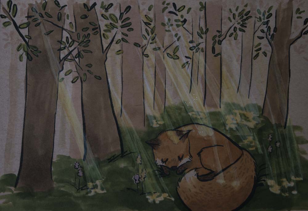
So i was really happy with this image until I wasn't. Im not quite sure about the dappled light, and the beams coming through the trees. Does anyone have any tips?
-
@ShereeNorthrup I'm sure we can help out!
First though: can we see your reference image(s)?
-
I like the concept - it´s a very delicate image. The dappled light does not read unfortunately. I think there are two main reasons: first, light rays are always perfectly straight - yours seem to curve a little and are a bit wobbly overall - it looks like some liquid falling rather than light. The second and more important aspect is that your value structure does not allow light to read properly in general. If you squint at your image, everything is overall very dark. You need a very broad value distribution (from very light to very dark) to be able to paint light. If you crunch the value distribution (like in this case, everything is concentrated in the dark part of the spectrum), you may get very appealing images but you will not be able to render a sense of light (dappled or otherwise). I hope this makes some sense!
-
This is such a lovely image.... I agree with what everyone else is saying about the light though - unfortunately right now it's detracting from your image, rather than adding to it. Also, it's important to remember that there would be shadows on the fox and trees - adding those in will help a lot.
One note that hasn't been mentioned about the dappled sunlight is that you've got the edges of the sunlight where it hits a surface very hard, whereas it should be a gradient. That's partially why they look like splotches of liquid, rather than light. I highly recommend taking the "Painting with Light & Color" class here - it's great and will help with this a lot. You've got such a lovely style!
-
@mattramsey I think my first mistake was that I didn't really plan out my image well. I looked at some references but didn't have a set one to refer to.
-
@smceccarelli I do understand what you are saying. I think that is something that I will work on when I redo the image.
-
@amberwingart I totally I agree that the light is detracting from the image. I have been meaning to take "Painting with Light & Color" I think that will be next on my list of classes to take.
-
Lovely concept. The Fox is beautifully designed. Perhaps you can simplify by placing groups of trees and than create less light beams? It makes the lightening much easier and the composition more 'readable'. Make some studies on lightening on 2x2,5 size images The smaller the thumbnail is, the better you mind can decide what is working. Good Luck!
-
@ShereeNorthrup said in question about lighting:
@mattramsey I think my first mistake was that I didn't really plan out my image well. I looked at some references but didn't have a set one to refer to.
I think focusing on this would offer the most bang for your buck. Looking forward to seeing the updates!
-
Thank you for the ideas and the encouragement @Leontine. I've been thinking about omitting the light beams all together. The little color studies helped a lot.
@mattramsey thank you very much.
-
It is a lovely concept- I would add to the above comments, if you decide to tackle sunrays again try thinking of them similar to architecture- That is, they should be not quite parallel, because they get wider at the base, but they should all flow the same direction. What I mean is, instead of a vanishing point, try designating on origination point somewhere off- paper, and use that to line up the sunbeams. I hope that makes sense- I'll look forward to seeing the next version
")
-
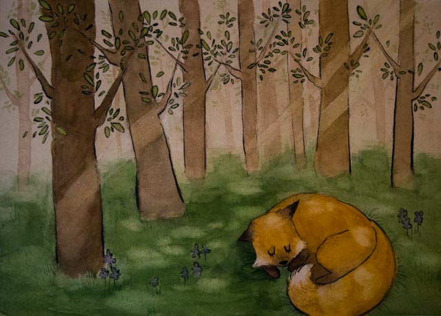
I have been meaning to post this for awhile. I switched to watercolor, as it was easier to achieve the lighting affects that I wanted. Thanks @mattramsey @smceccarelli @amberwingart @Leontine @Tyler-Blake for your suggestions and encouragement.
-
Beautiful work @ShereeNorthrup! I really like your trees and the fox is so very sweet.
-
@DanetteDraws thank you so much. I really appreciate your comment.
-
@ShereeNorthrup what a lovely fox!
-
I love your fox