Inktober 2016 Recap
-
Thought I’d share a recap of all my Inktober 2016 posts into one image. (Feel free to share your own recap in this thread too)
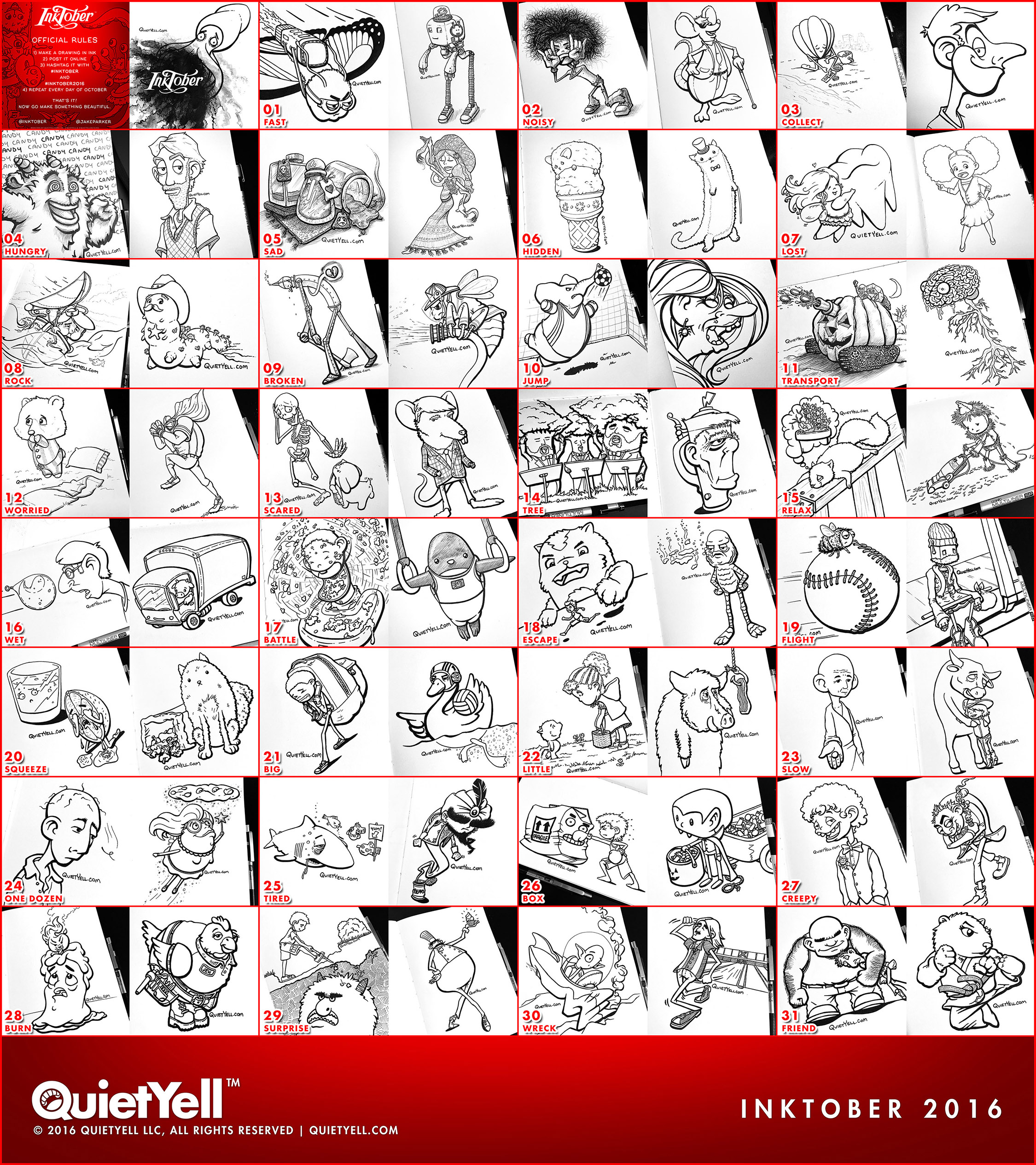
My approach was to do two inked sketches per day with each morning post done according to the daily prompts given by @Jake-Parker (listed on each sketch in the image) and the afternoon posts being free choice.
Since I tend to lean on painting/rendering with much of my work, I decided to do most of my Inktober pieces without the use of shading (whether using grayscale or hatching; though, there are about 6 pieces that I did use some hatching on). So, this became an exercise in playing with shape & character styling, line-flow & line-weight, and/or concept (particularly with a push towards the humorous side). Note: I held off of using my ink brushes and decided to stick with a Zebra F-301 for initial lines and with line styling done by a Copic Multiliner SP (0.3 & 0.5 tips) (a little bit of a Sakura White Gelly Roll was used on a few as was a Copic Multiliner SP 0.1 tip).
These did not go through rounds of refinement & such; however, I would love to have feedback on which ones stand out to you (and why, if possible). Any other thoughts are welcome too. Thanks!
For me, considering the ongoing development my drawing style & character style direction, I am currently preferring: 09-A, 09-B, 12-B, 16-A, 16-B, 24-B, 25-A, 29-B (with some others coming in “2nd place”)
See the individual Inktober posts (with "commentary") at my "sketches" Instagram, Twitter, or Facebook Page.
Inktober was fun and I’m glad I did it!
-
Well done! You've done it!
Leontine
"A picture is worth a thousand words."https://leontineillustrator.com
https://www.instagram.com/leontine.illustrator/
http://www.facebook.com/leontineillustration -
Love your logo & tagline--very nice presentation of your inkings too!
-
Very nice!
-
@Leontine @BichonBistro @Doha Thank you all so very much!!!
 ^ - ^ )=
 -
These are wonderful! My favorite is 9a--the tin man. He really looks broken hearted. Nicely done.
Twitter: @Joy_Illustrated
Instagram: joy_illustrated
Website: joyheyer.com -
@Joy-Heyer Thanks!!!
Interestingly, 9A-Tinman is my favorite too; or at least right at the top. I think the direction I took with his proportions (also the expressiveness of his emotions) is what is drawing me to him. I use to do a lot work in the past where the figures have quite long legs; kind of reminiscent to many fashion design illustrations. It seems that I am being drawn back to that again.
You'll also notice that I did a lot of figures with what basically amount to "stick" legs/arms. This is particularly seen in 24B-Cookie-Fairy and 29B-Chef-Cupcake, which also both are more geometric in construction too.
I've been using my sketching & Inktober as a way of feeling out where I am generally wanting to go stylistically with my drawing & character structure. I haven't wanted to commit to or "force" a direction yet, but I think 9A, 24B, & 29B are where I am headed, especially because they are similar in character construction to what is still one of my favorite paintings of mine: http://quietyell.com/project/dancing-with-the-bull/
Anyway, thank you so much for your kind & encouraging words! They are so incredibly appreciated!
-
Very nice!