Parrot
-
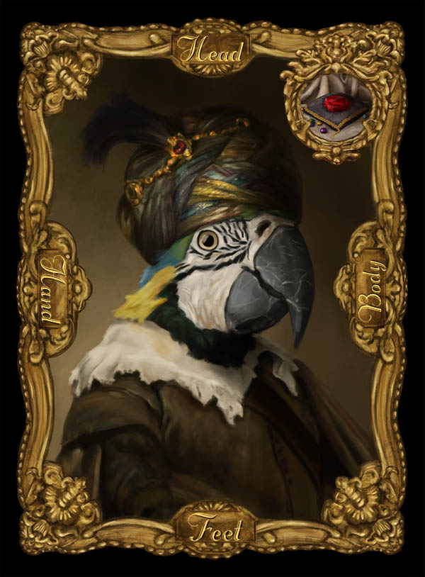
So I'm still working on the final logo but in the meantime, here is the fancy parrot. I just have the fancy pig left and then all of the clothing cards...and the logo....and the rule book layout...ugh.
-
This is looking really good!
I wanted to add a few suggestions. I listed them here in the image, but I'll go over them here in the text.
- Brighten you light source. I think you can increase interest by upping the contrast a big in the light source.
- Hard Edges: Your image looks blurry at the edges. Watch out for soft brushes in photoshop (or hard brushes set to a low opacity). Create hard deliberate edges. Especially at the edge of materials, etc.
- Warm tone: The old masters always added a glaze over the image that added a warm glow. You can add that here too which might brighten the image and add that richness.
Hope that helps. Let me know if you have any questions. : )
Cheers
Lee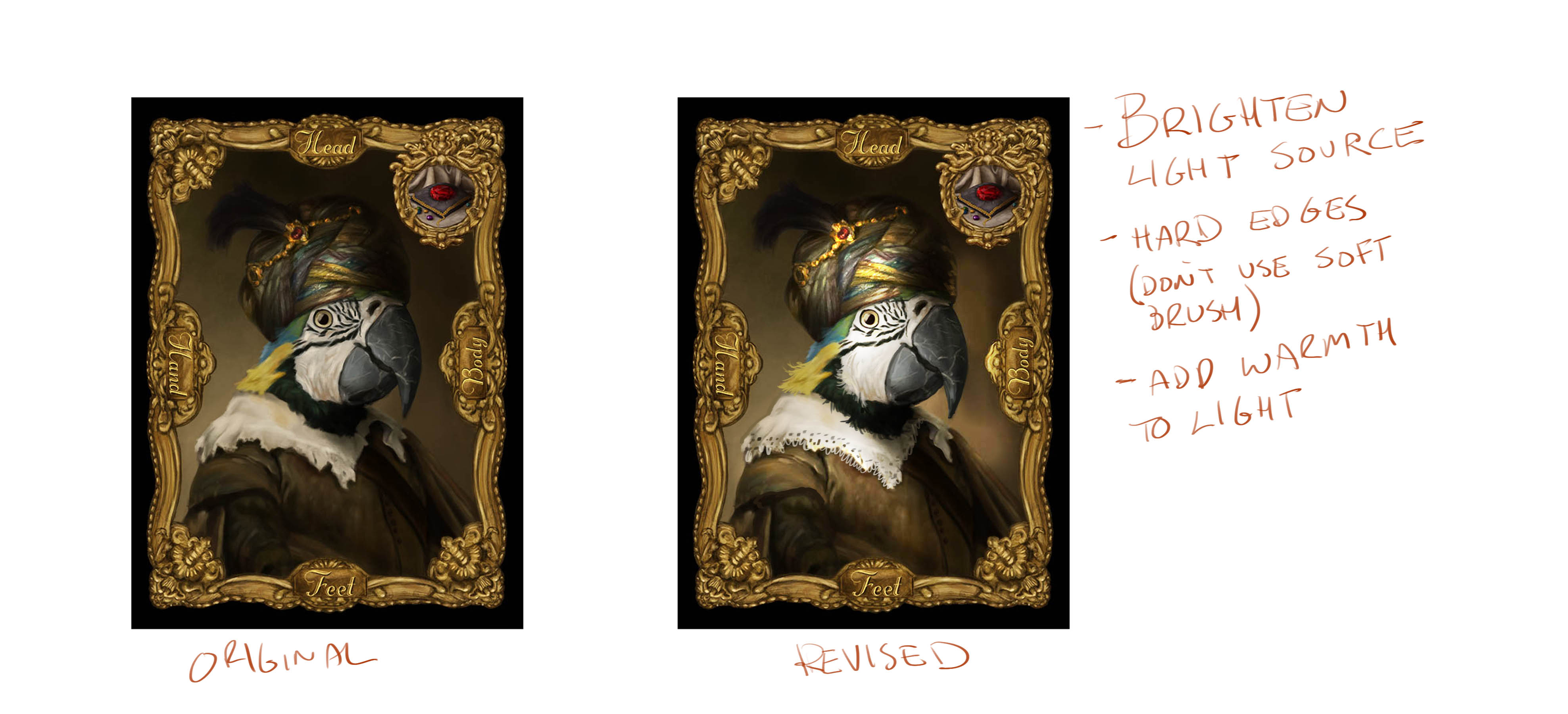
SVS Faculty Instructor
www.leewhiteillustration.com -
@mattramsey Really nice work Matt!
-
Beautiful beautiful work! I can feel Rembrandt´s spirit channeled
")
Let us know when the game comes out, I would like to get a copy! -
@Lee-White I do struggle with hard/soft edges--I'll go over all of those suggestions, thank you!
I see you pushed the "doilie" aspect of that white collar. I was going back and forth on that. For your warm glaze is there a certain layer style you prefer? I go back and forth on the merits of overlay, soft light, vivid light (obviously with vivid you have to pull the opacity way down).Thank you @Kevin-Longueil and @smceccarelli !
-
You and @Lee-White are rock stars!
-
@mattramsey Matt - I am really enjoying these fancy animal pieces you are creating. Your work has been good for a long time but I continuously see ongoing growth and improvements in your work which is so exciting. You should be very pleased! Great job!
-
@Rich-Green wow--i really appreciate that comment!
Yours too @lmrush, thanks!
-
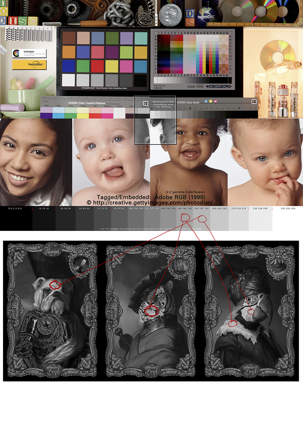
Here are 3 side-by-side. I didn't go quite as hot with the lights as @Lee-White had but that might be due to my monitor calibration.
I added an orange overlay layer on all three images to try and tie them all together.
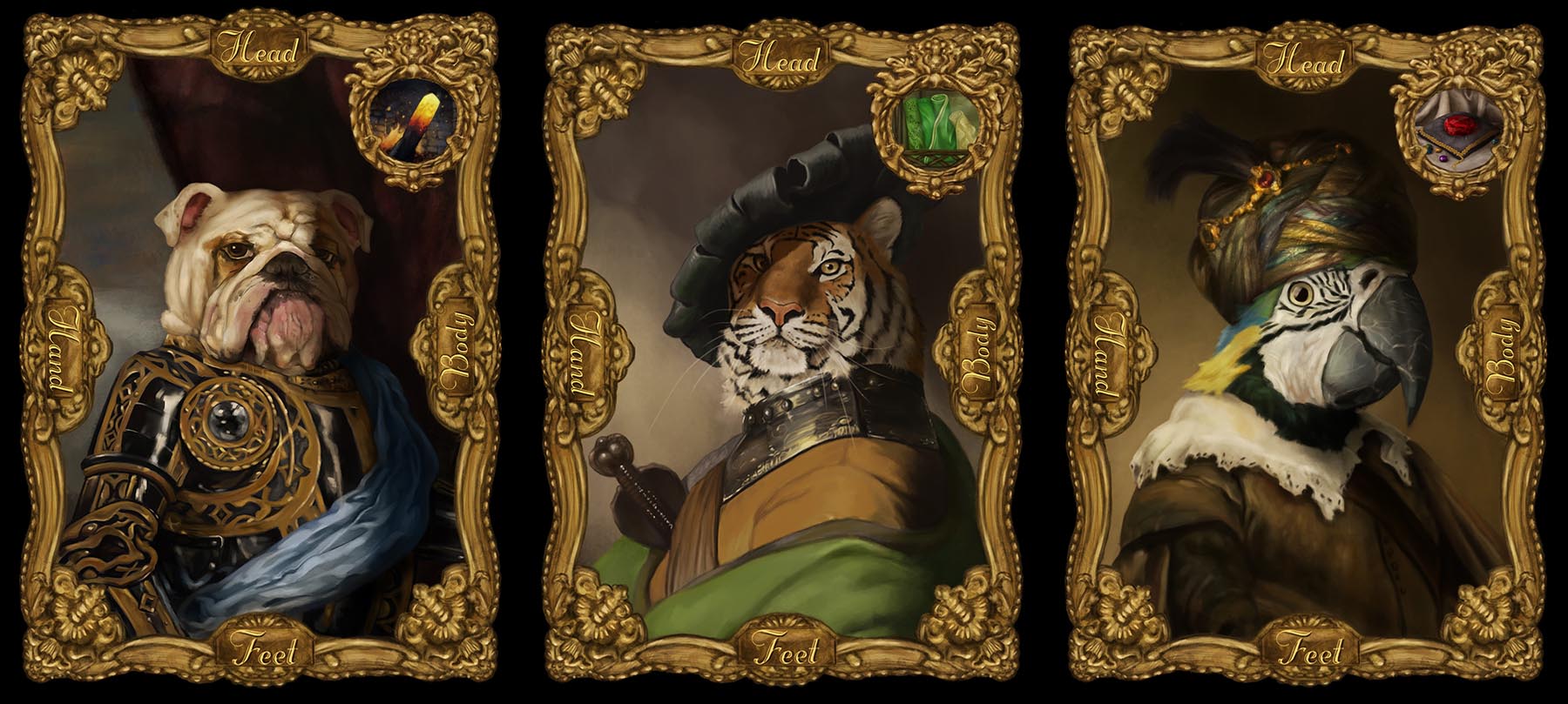
Not sure if I need to push the dark values on the tiger and dog (maybe more so the tiger). I am a little worried about them printing more dark & contrasty than my monitor shows.
-
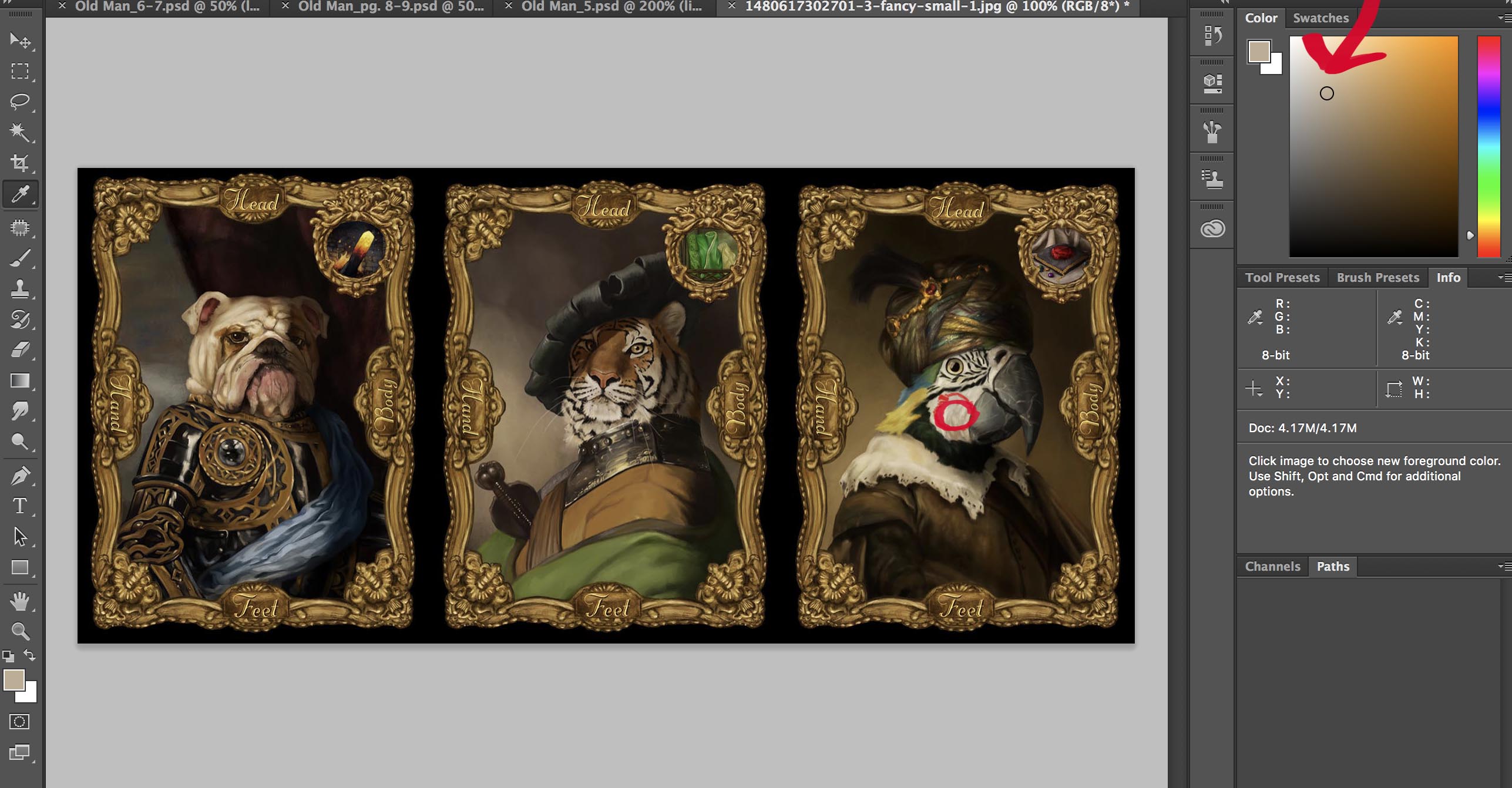
These look good, but they are really dull in terms of value. Your monitor may need some pretty good tweaking. If you look at this image, you can see where I sampled on the parrots cheek. Look in the color palette box and see how dark this value actually is. Your brightest bright is sitting at about a 25% tone. Even if you don't go to full white, you have about two values you can lighten to in order to get a full value range.
SVS Faculty Instructor
www.leewhiteillustration.com -
@Lee-White that's one of the things that really frustrates me--it seems like there is always fight between how it looks on my monitor and everywhere else. Also: the image can change so much from monitor (correctly calibrated or otherwise) and actual print.
I am kinda hoping that, if I can get this game sold to a company, they have processes in place to deal with this. I feel pretty lost.
Maybe I need a spyder calibrator or something similar?
-
A spyder calibrator is a good place to start. The other thing is just looking at your photoshop file next to a color/value test image. You will see here if I change your image to greyscale how dark your images are in the value scale (note: you should see ALL 15 gradient changes in that lower greyscale bar). If you don't see all 15 greyscale steps, your monitor needs to be adjusted. Your lightest values are in the 5th and 6th greyscale box. They need to be in the first or second box to have a full value range.
Also, make sure your color profile is AdobeRGB 1998. That is a very stable profile and works for most monitors.
Many times just having a document like this open next to your image while you work can really clean up value problems.
SVS Faculty Instructor
www.leewhiteillustration.com -
@Lee-White Sweet--I'm guessing I can make it greyscale and adjust my levels then turn off greyscale. At least, that would be a really easy fix if that works.
Not sure what color profile I have--I'll see if I can change it to AdobeRGB 1998. There are a whole lot of PS things I have little to no idea about other than a vague sense that there are "file" things I should be aware of. For example: I've only fairly recently started making sure I have high enough DPI and on these animals I've gone to a 16-bit file thingy to prevent banding (especially in the darker areas of the image). Also: I used to paint in CMYK under the assumption that this was the more "true color" way to create.
-
So until I train my eye I'll definitely be using that grayscale.
Here is what I came up with:
First version / New lighter version
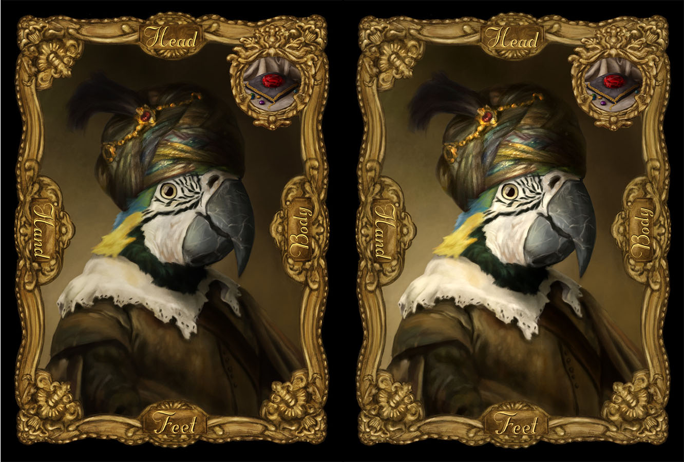
Everything in my brain is saying: too blown out.
But @Lee-White is right, the grayscale don't lie. -
@mattramsey looks great. Reminds me of the project I had in Chris Oatley's Magic Box Class. Really great work. Cheers
~Cheers, Kelly Lane~
https://klaneillustration.com
https://www.facebook.com/laneillustrator
@klaneillustration/instagram
https://www.behance.net/klaneafe2 -
@Kelly-Lane that's exactly what it is. I did the Tiger in that course.
-
Much better!!! great work. : )
-
@mattramsey Matt I am so glad you took Lee's advice to heart and went in and kept pushing the values. This latest update has so much more visual impact and is so much more dynamic now. Excellent work!