Hansel & Gretel
-
Hello everyone!
I have been trying for a while to create a consistent Children's Portfolio. Unfortunately, I have a very short attention spam and I keep jumping from one topic to another.
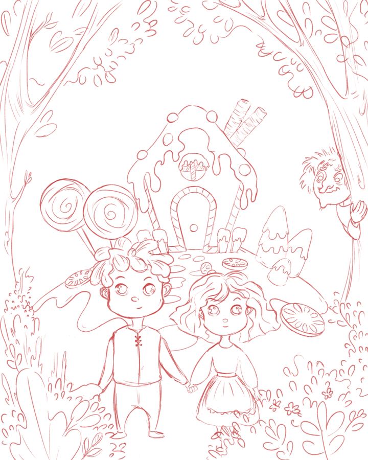
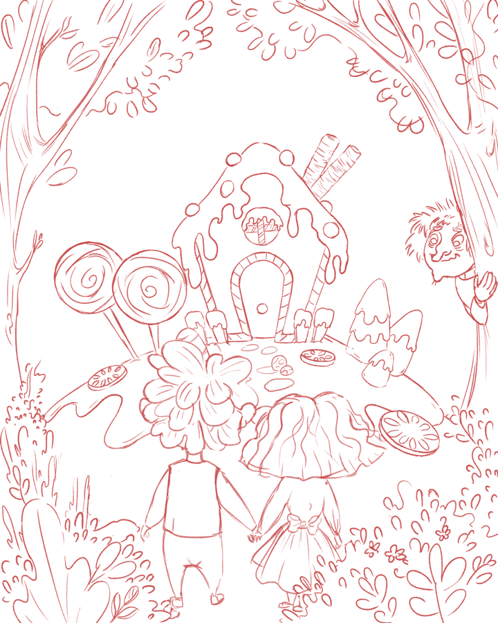
Now, I am forcing myself to make one important scene from several tales. Hopefully, by the end of this month, I'll have something to send to agencies.About the Two Illustrations bellow, I draw a cover book oh Hanzel& Gretel.
I would appreciate your feedback on the composition,and which one looks better.Thanks in advance for all of your help!
1- Facing toward
2- Facing away
-
@Doha I really like it. I guess the thing my brain notices right away is that the focal point shifts dramatically depending on the version. When they are facing the front, my eyes go first to them and then the house. And maybe it competes a bit? In the one where they are facing away, my eyes go straight to the house.
Probably coloring will have an impact on focal point too, but I would say to just decide where you want the focus to be and go with that. -
@Pamela-Fraley I see what you are saying. you are right the first one does compete.
I think I'll go with the second one.
Thank you Pamela!")
-
Hi @Doho - these are really fun!
While I agree with @Pamela-Fraley in terms of focal point, we're not talking an interior page here and therefore there's no question. You should definitely go with #1 where they're facing forwards. Publishers never, ever want covers with the character(s) facing away (unless there's a rule-breaking good reason for it that has to do with the story line). Always front-face your characters on a cover. Besides - wouldn't you want your characters to be the focal point anyhow? I mean, it IS their story, not the house's.
I do find it disconcerting that they're staring straight at the viewer though. What if they had 3/4 views and they're smiling/looking at one another?https://danettebyatt.com
Twitter @DanetteDraws
Instagram @DanetteDraws -
@Doha perhaps they could be enjoying a big lolly or munching on some sweets. Have them looking enticed by what lies behind them. After all the story is about temptation and leading astray. Hope it helps.
")
-
@DanetteDraws
Hi, Danette! thank you!
hmmm, that makes sense, I never saw a cover with characters facing away.
I will have to rethink the composition, maybe add something for them to munch on like @RobinSlee said.
That's a great Idea Robin.
Thanks a lot, guys this really helped! -
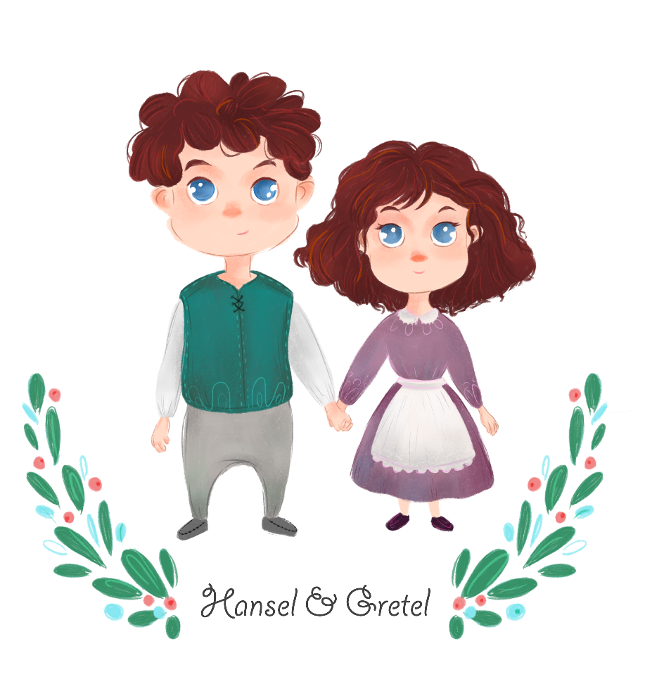
These are my characters.