Having trouble figuring out colors to use
-
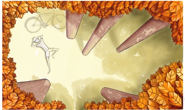
I have been working on this piece for a few weeks, and for some reason the colors I use for the character who is the focus of the piece has been harder than I thought. Any suggestions on how to know what colors to use in a piece like this?
-
Hi Eric,
To draw attention on him, I would take a blue pallet for him as complementary color to the orange leaves. To blend him into the landscape and to built some positive relation between him and the environment, I would give him an orange skin tone and a warm hair color.
I love the perspective.") It will be a really nice piece!
It will be a really nice piece!
Cheers, Jana -
@Eric-Castleman Hey Eric - i agree with Jana for sure - one thing that is pretty cool to do not the iPad is to put a layer over this image and paint in a midtone on the whatever you are trying to decide the color on - then bring up your hue, saturation, brightness sliders and play with them until you like what you are seeing - ...i think this makes sense
-
This post is deleted! -
@Kevin-Longueil tried upvoting it, and hit quote and submit instead

-
Not much to add to the color choice (I love the colors so far, and I think both warm and cool choices on the boy would work!) but just noting that you may have inconsistent shadows. It´s a bright midday, for sure, but the sun is slightly shifted to the bottom left corner, judging from the top trunks´ shadows. I think you can get away with the shadow of the other trees being less long, but the boy´s shadow should be approximately in the same direction as the top trunk´s shadow. Love the feeling of this piece!
-
@Jana awesome suggestion! I have been messing with the color you suggested, and am shocked I didn't consider the blue/orange relationship already. Great idea!
@Kevin-Longueil excellent idea! I have been doing as you suggested, and it has been a hige breakthrough for me. So much easier to sift through color ideas until it looks just right. Glad you have procreate
@smceccarelli this has been something I have been wondering about, but until you mentioned the shadow on the boy I didn't even consider how incosistent that would be. Thanks flr the clrrection!
Glad you are all here to help me our!
-
Sorry for the crazy mispelling. When typing on my ipad, the little box vanishes when I type, and I cannot correct my spelling.