Dealing with multiple focal points
-
Hi,
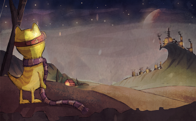
I'm working on some proof of concept artwork for a children's picture book. The first spread calls for multiple focal points to help set the scene and tell the story and I'm battling with balancing this out. The main character needs to be visible, as does a small hut-like house which is where he lives. The third object that needs to be visible is the large planet in the distance, as this is a key part of the story. Does my current composition work? I'm fairly happy it reads well, even when zoomed right out, but I'm not sure it is the strongest solution to the issue. Does anyone have any thoughts?
Follow me on:
Twitter @chrisrichdraws
Facebook www.facebook.com/chrisrichdraws
www.chrisrichdraws.co.uk -
@ChrisRichDraws This looks really nice - the thing that pops out for me is there seems to be equal visual weight with each focal point - maybe playing with scale might be good - treating the left half of the composition as it's own composition and using the rule of thirds might be good for positioning focal points - you could then use a steelyard for the overall image - where there is a large mass of visual weight on one side of the composition and another focal point on the opposite side - so i think increasing the size of the catlike fellow quite a bit and bringing him closer to the viewer so his head is at the top left of the rule of thirds and the house is at the bottom right of the rule of thirds - then bringing the little settlement on the hill in a tiny bit from the edge and possibly down - i did a super quick muddied version of this but forgot about the importance of the planet when i did it ....anyways it does get a couple of my ideas across better than my description i'm sure..... feel free to disregard though
")
-
Looks great, I would play with the values of the fore mid and backgrounds to add to Kevin's suggestions. All the best.
-
Perhaps backlight the cat character to almost a silhouette. This might shift focus
-
Maybe even blur the foreground slightly
-
@Kelly-Lane Thanks ever so much for those suggestions, I need to be braver with my value choices I think. @Kevin-Longueil I love the idea of increasing the size of the foreground character, they really helps add extra depth and variation to the image. I'll edit and repost once it's done. Thanks again! CR
-
hey Chris,
This is a cool image. I also struggle with this stuff all the time (as we all do I'm betting). The first question I would ask is do you REALLY need to show each of those things in the scene. Sometimes in a picture book you can leave some things out becuase you can show them on other spreads.
If the answer is yes, then you still have a few options. You can show something exists without giving it detail. This means simplifiying anything that isn't the focal point and adding detail and contrast to what IS the focal point. So what gets the focus here? the planets? the city in the disstance? The hut? or the character? You should do some value/color studies based on whatever your answer is.
Here's a quick take I did on the image. I simplified and silhouetted the city in the distance and added some different things on the foreground level to add interest and keep things separated. Feel free to keep what you want and disregard the rest. : )
I look forward to seeing more from you!
Cheers,
Lee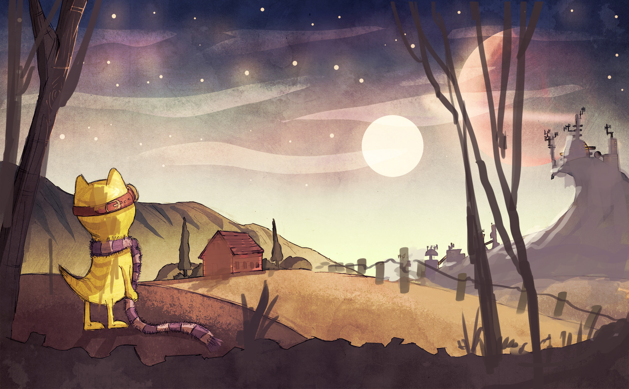
-
@Lee-White Hi Lee, thanks so much for your insight, it's hugely inspiring. I think, on reflection, I have tried too hard to show too much too soon; this is intended to be the opening spread and I wanted to have high impact and give the reader as many clues as possible about the character and his environment, which led me down the path of adding too much detail to elements which were not the main focal point. It's obvious to me now that less will be more. I love your redraw and I'll definitely be taking those ideas through to the final spreads I produce. I'll be sure to drop them here as and when I finish them. Thanks again!
-
I think also, if the hut is supposed to be small, it reads rather large. It seems like it is pretty far away, but still big, compared to the other elements in the landscape. I'd make the house smaller, or then bring it closer so you get the feeling its a hut and not a giant house. I hope its making sense.
-
it still read like a bigger house because it has two stories. I would also make the doors and windows bigger in relation to the house to make it shrink down.