Society of Visual Storytelling

    SVSLearn Forums

    • Register
    • Login
    • Search
    • Recent
    • Tags
    • Popular
    • Users
    • Groups
    • Search

    removed

    General Discussion
    6
    19
    4157
    Loading More Posts
    • Oldest to Newest
    • Newest to Oldest
    • Most Votes
    Reply
    • Reply as topic
    Log in to reply
    This topic has been deleted. Only users with topic management privileges can see it.
    • Chip Valecek
      Chip Valecek SVS Team SVS OG @Guest last edited by

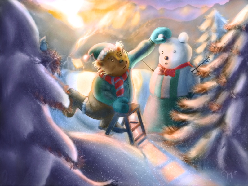
      @Renduin I really like your texture. I would say that the tree in front of the snowman(bear) should be removed. And then the tree in the foreground should be moved over to the left some more so it is not touching the the character. I think that would help bring the characters into focus. Also with the sun setting in the back Not sure if there would be so much bounce light on the left side of the main character.


      https://www.instagram.com/chipvalecek/
      https://www.facebook.com/cvalecek
      http://www.cshellmedia.com/

      ? 1 Reply Last reply Reply Quote 0
      • ?
        A Former User @Chip Valecek last edited by

        @Chip-Valecek Thanks for giving me some ideas to consider! One thing to clarify is that the sun is meant to be rising rather than setting. I don't know if some of my color cues indicated otherwise...

        Chip Valecek 1 Reply Last reply Reply Quote 0
        • Chip Valecek
          Chip Valecek SVS Team SVS OG @Guest last edited by

          @Renduin yeah sun setting and rising is always a tricky thing to pull off.


          https://www.instagram.com/chipvalecek/
          https://www.facebook.com/cvalecek
          http://www.cshellmedia.com/

          1 Reply Last reply Reply Quote 0
          • Jana
            Jana last edited by

            Hi @Renduin ! Very cute idea. πŸ™‚
            I have a problem with the posing of Mr Bearis though. I don’t really see why he took this little ladder with him. He is barely standing on it and obviously he would reach the snowbears ear even without it. I would either let it out or give it a more important function.
            I hope this helps. πŸ™‚

            ? 1 Reply Last reply Reply Quote 0
            • ?
              A Former User @Jana last edited by

              This post is deleted!
              1 Reply Last reply Reply Quote 0
              • Leontine
                Leontine last edited by Leontine

                hi Renduin, Lovely concept, I really like the look and feel.
                Just a view quick tips.
                Make sure you have a solid focal point. There's a lot going on in your pic that seem to just show your render skills but don't add anything to the picture. For example the tree's they have a awful lot of detail, but you don't need it to show that these are tree's. They distract from the bear, the nice snowman and the wonderful snow you've painted. So I should get rid of the green branches, and see how it feels. The rim light on the left side of the bear is a bit strong. Go for the best!

                Leontine
                "A picture is worth a thousand words."

                https://leontineillustrator.com
                https://www.instagram.com/leontine.illustrator/
                http://www.facebook.com/leontineillustration

                ? 1 Reply Last reply Reply Quote 1
                • ?
                  A Former User @Leontine last edited by

                  This post is deleted!
                  1 Reply Last reply Reply Quote 1
                  • lmrush
                    lmrush Pro SVS OG last edited by

                    I love your snow and pine needles-it is a lovely image, the idea of a snow bear is so endearing, the only place I got stuck was the eyes, the whites seem a bit large but that is only my opinion- great job!

                    Lisa Rush
                    www.lisarushgallery.com
                    www.facebook.com/ArtbyLisaRush/
                    www.instagram.com/lisarush11/

                    ? 2 Replies Last reply Reply Quote 0
                    • ?
                      A Former User @lmrush last edited by

                      This post is deleted!
                      1 Reply Last reply Reply Quote 0
                      • ?
                        A Former User @lmrush last edited by

                        This post is deleted!
                        1 Reply Last reply Reply Quote 1
                        • natiwata
                          natiwata SVS OG last edited by

                          This has a nice feel and what you're trying to do with the light will make it have a nice feel!

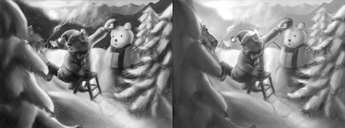
                          I would suggest taking this down to values and figuring out how to focus the image and add depth before moving to color. Right now there are a lot of competing darks and lights. I did a really quick adjustment and you can see where I'm going with it I hope. One thing to consider would be making the hills snowy in the background, which would make sense.

                          When considering color there is a great opportunity here to use nice blue hues in the snow shading and use warmer colors to focus in on the character.

                          0_1484429972597_Untitled-1.jpg

                          Nat Iwata
                          www.iwataillustration.com

                          ? 1 Reply Last reply Reply Quote 1
                          • ?
                            A Former User @natiwata last edited by A Former User

                            @natiwata A lot of good thoughts, and I'd definitely say that value structure is an improvement. I think I very well may do like you suggest and take it back down and build it back up. It was a challenge bringing things together, but I can say that I've not been satisfied with the final results. My eyes got stale on this one and my process was not as good as it might have been. I am learning though.

                            1 Reply Last reply Reply Quote 1
                            • lmrush
                              lmrush Pro SVS OG last edited by

                              great points @natiwata made, I feel it sometimes helps me to put a piece away for a bit even a week and come back with fresh eyes and motivation, please share your updates!

                              Lisa Rush
                              www.lisarushgallery.com
                              www.facebook.com/ArtbyLisaRush/
                              www.instagram.com/lisarush11/

                              1 Reply Last reply Reply Quote 0
                              • ?
                                A Former User last edited by

                                Okay, I went back to black and white, corrected my values and built it back up. I decided to go for something different for the colors. Funny thing is this took me 1/20th of the time to color that the first one did. I've learned a lot in the last week. At any rate, thoughts? Advice?
                                0_1484622349546_Image 27.jpg

                                1 Reply Last reply Reply Quote 0
                                • lmrush
                                  lmrush Pro SVS OG last edited by

                                  You really captured the morning light, I especially love how it hits the snowbears face, and the chimney smoke,.....this is only my opinion but I just loved loved your first trees-thank you for sharing your process

                                  Lisa Rush
                                  www.lisarushgallery.com
                                  www.facebook.com/ArtbyLisaRush/
                                  www.instagram.com/lisarush11/

                                  ? 1 Reply Last reply Reply Quote 0
                                  • ?
                                    A Former User @lmrush last edited by

                                    @lmrush yeah, I've debated what to do with the trees. On the one hand, I like to render details like that, but on the other hand they're not narratively important, so I thought doing a bit more value grouping would be beneficial.

                                    lmrush 1 Reply Last reply Reply Quote 1
                                    • lmrush
                                      lmrush Pro SVS OG @Guest last edited by

                                      @Renduin I completely understand, I need to follow your lead and do the same with my own as well πŸ™‚

                                      Lisa Rush
                                      www.lisarushgallery.com
                                      www.facebook.com/ArtbyLisaRush/
                                      www.instagram.com/lisarush11/

                                      1 Reply Last reply Reply Quote 0
                                      • Jana
                                        Jana last edited by

                                        Hi! It is really nice how all the objects in the piece capture the light conditions in both versions.
                                        However, to me the first version was much more morning light than on the second. The second looks to me more like a late afternoon. But maybe I made different experiences here in Germany. πŸ™‚
                                        I agree to Lisa: The smoke is awesome!

                                        1 Reply Last reply Reply Quote 0
                                        • First post
                                          Last post