Color...I am trash at color
-
Sorry just tried to upvote and it copied. I am no help. Right now I am in the same boat. I just follow an accomplished artists choices for now and hopefully it will become second nature. I believe it was Will or Lee.that said you can't copyright color schemes. Thanks for posting hopefully other posters will direct us!!!
-
@Eric-Castleman I think that the SVSLearn course, Painting Color and Light, covered some points that may be of help for you.
Aside from color theory resources and overall physics of light & color, perhaps a way to help you immediately is to lean upon the color handling of artists whose work you admire. Additionally, there are resources that help determine an overall color palette:
In fact, a couple days ago, @smceccarelli tweeted about a resource that might help you some:
http://colorsupplyyy.com/
"The best color combinations from designers & illustrators around the world." If you scroll down on the landing page, you'll see some of their thoughts regarding color.If you go to Pinterest and search "Color Palette" (or "Color Themes", "Color Schemes", etc.), you'll get a lot of results showing photos/illustrations with color swatches pulled out.
You can do this yourself with Adobe Capture (for instance, you could grab a google-image of a Maxfield Parrish painting or grab one of Lee's and run it through Capture to experience their raw, top-level color palette):
http://www.adobe.com/products/capture.html
"Turn any image into a color theme, pattern, unique brush, Look, or vector graphic that you can use in your creative projects on desktop and mobile devices."There is also a webpage to do this too (and probably other resources):
Scott Monaco | QuietYell.com
IG/FB/LI: @QuietYell
IG-2: @QuietYellSketches
TW/PIN/BEH/DEVART: @ScottMonaco
SCBWI: http://bit.ly/1r8Dmqr -
@QuietYell Awesome. Thanks!!!
-
Hi Eric!
When I need some inspiration about color, I use this page:
http://paletton.com/#uid=1000u0kllllaFw0g0qFqFg0w0aF
This helps me a lot when I just want to play around and find colors which match nicely. Maybe this helps you with color choices as well. -
@Jana oooh! that looks fun! Thanks for another resource to bookmark!!!
( ^ - ^ )
-
Hi Eric!
I found this video interesting on the subject of colour, it talks about the technicalities but in a very accessible way:
http://www.cgsociety.org/news/article/417/understanding-color
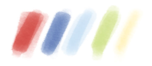
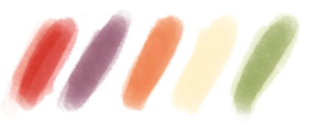
Though one reason I found it interesting/unusual was because I never really approach colour with a super methodical thought process, I’m definitely not thinking ‘oh what triadic colour scheme shall I do this time?’ Probably similar ideas are covered in the links mentioned already…but anyway, I do usually have a palette in my head before I start, and quite often when designing papers I’ll paint it for reference, thinking about what mood I want the colours to create. For example, last year I did some papers on a harvest theme, quite bold, rich, warm, saturated:
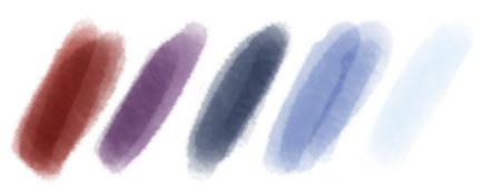
I think observing things every day and looking at what colour palette you’d do for that scene is really helpful, for example when coming downstairs very early this morning the sky was like this:
Then later that morning when I was driving out shopping, the colours were like this:
As an exercise, if you were to make a point of observing something every day, and later make a colour palette as reference for it, just think - after 30 days you’d have 30 colour schemes, and it would probably help develop a sense of colour for the mood and time of day you want to create in your work.
When I was doing art at school, one of the best things they did was to make us paint the same scene at three different times of day…it made you notice the difference in the light and how it affected the colour. Then you can apply it to the stuff you make up in your head.
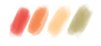
I remember recently you did a red dinosaur I think, red and green colour scheme. If you were to paint your dinosaur on a sunny mid-morning the palette might be like this:
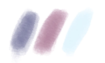
And late afternoon the palette might be like this;
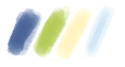
And nighttime like this:
So….I don’t know if this is all really very simple and obvious, apologies if it is, but I do also think that colour should be fairly simple to think about, and fun to experiment with, something that brings happiness when painting..that’s what its all about, surely, splashing colour around! …in (hopefully) a semi-controlled way… Anyway, hope this is helpful in some way
")
PS Just realised that I didn't talk about value and saturation very much... but I think the video covers the basics of that really well.
-
If you google "movie color swatch" and go to images, it will give you all sorts of images with their colors.
-
As everybody has pointed out in the great answers, there are so many resources for color schemes that there is no need or reason to wing it. Your own photos, other people photos, world observation, other art, color schemes generators of all types and ways - Adobe also has a mobile app called "Capture" which (among other things) generates custom color schemes from photos you take with the mobile camera.
I would still suggest reading a couple of books about color (there is a million of those too - "Color and Light", by James Gurney, is one of my favorites), because they help to learn to "see" - especially for light schemes. After you have read through Gurney's catalogues of light situations, you cannot help noticing them all around you and your world gets enormously more interesting (as has already been nicely written here!). -
Thank you all for your advice, as usual your answers are incredible! I guess I should be tackling color the same way I am learning design.. I am looking at other pieces of art to get ideas in that area, but for some reason think color should be dreamt up out of my own mind. Makes sense. I love all the websites you suggested, and will be getting the book that was tecommended!
-
@Eric-Castleman I just saw this morning that Marco Bucci, MarcoBucci.com, posted about a class he has coming up that deals with color. It's not an SVSLearn course, but Marco has done classes here on SVSLearn:
MARCO ON SVSLEARN:
Digital Painting 1
Digital Painting 2
Sketchbook Painting
Marco Bucci Live CritiqueMARCO'S INSTAGRAM POST: ( Here >> )
"There is still some sign-up space for my CGMA class, "The Art Of Color And Light" - which starts up in February! The class is an intensive 8-weeks, designed for the novice artist to budding professional. We will study and learn the concepts and principles of good composition and pictorial design, strong value use, and will gain a thorough understanding of how light and color work together. I've produced roughly 10 hours of lecture and demonstration material for the class, and will also be providing personal critiques to students each week. The class is ideal for those looking to work in the animation & illustration industries, as well as those who are simply looking to improve their art.
Check out the class at: http://2d.cgmasteracademy.com (or follow link in bio.)
Hope to see you there!"COURSE LINK:
http://2d.cgmasteracademy.com/art-of-color-and-light.htmlFYI, it's $700