Looking for Feedback
-
I'm not sure if anyone's pointed this out yet, but there is something about that lightening on the right that's reallyyyy bugging me. Maybe because it's going against the round curve of smoke in the background? Or maybe it's my animation background rearing it's ugly head, but the energy is flowing in a completely different way than the lightening on the left side of the piece. I think, even if you just "flipped" the taller flash it would feel better. Or maybe I have no idea what I'm talking about.
-
I'm not sure I see what's looking weird to you, @Perrij, I tried curving the end of the lightning up a bit and also tried flipping the other bolt over. To be honest, I don't know that it makes enough of a difference to me to change it (or repaint the background anyway.)
 .
.
(original, curved, flipped) -
oh wow, my mistake, I was referring to the purple flowing stuff. I don't know why I called that lightening. But yeah, I don't think it's worth it to repaint. Only if you had everything on different layers would it be worth trying out. Sorry for the useless feedback :'DD
-
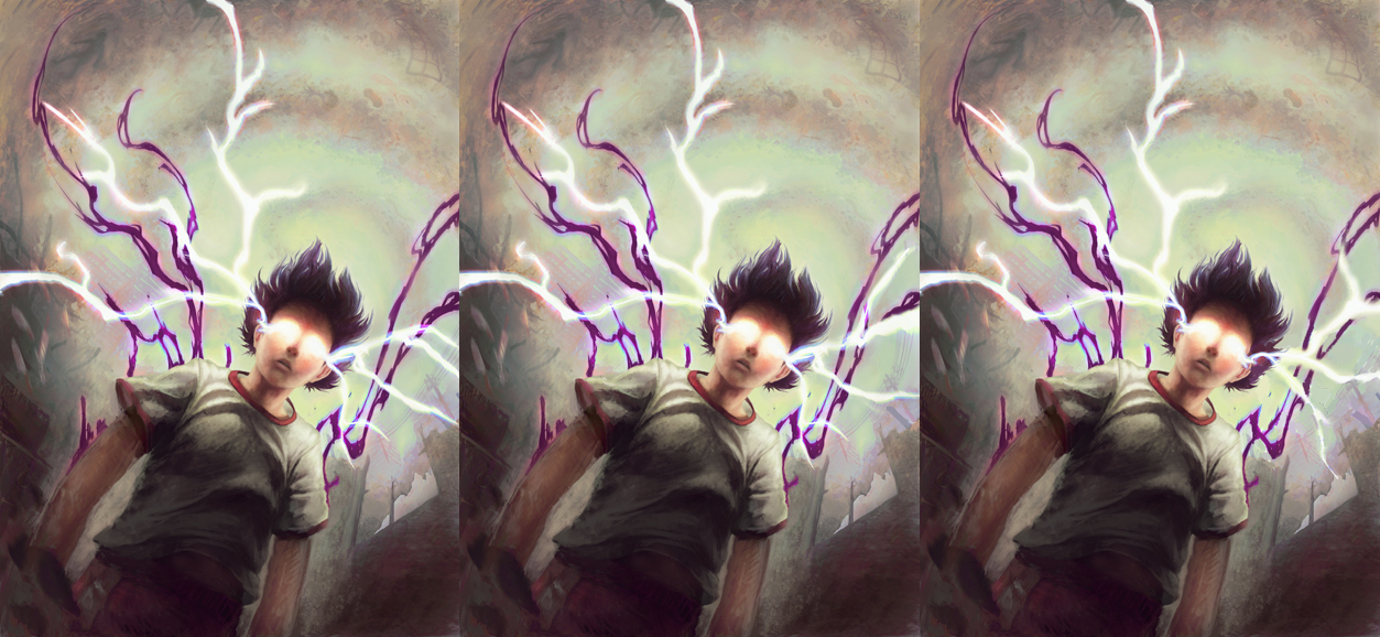
It's looking great. The only thing I'd comment on is that I'm not sure you need the purple energy flowing around him. It's the warmest colour on the piece and it takes my attention away from the focal point. It's an awesome composition. Very dynamic and full of energy which is obviously what you're going for. Really great work!
-
@Perrij It was called purple lightning in the few comments before so it's understandable. I guess that's the problem with calling both of them lightning XD. I kind of wish I could have kept things on different layers, but for me it's easier to get the colors right when I can use (abuse?) the color balance and replace color adjustments, which only work one layer at a time. Though the purple energy on that side would be a be a little easier to repaint, since it doesn't cross over the power lines as much.
@IanS Is it the color/temperature that's not working, or do you think it wasn't working in the monochrome sketches to begin with? Other than their color, I haven't actually done much with them since I started adding color and painting over the image so I'm wondering if softening the edges and bringing it closer to the same style as the painted areas will help.
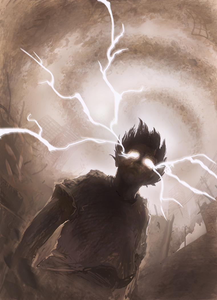
Edit: For reference, this is the latest version of the picture that I can just turn the layer off. I feel like it's definitely missing something when it's not there, but then again, I've probably been looking at this picture for too long.
-
I'm a little bit at loss right now in regards to that purple energy. I agree it's not working yet, but I'm not sure what I should do about it. I've tried out some things and wanted some opinions.
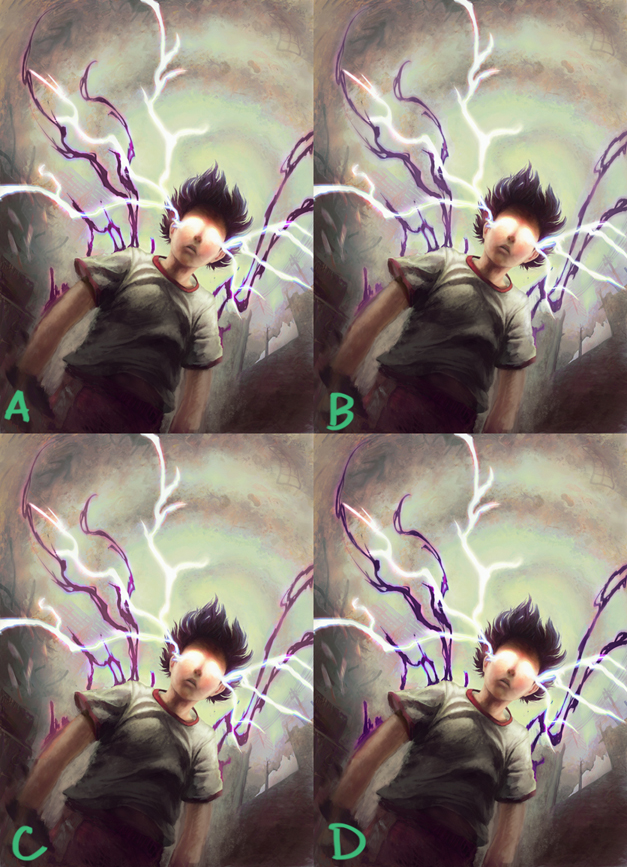
This first set here is just hue/saturation/value adjustments.
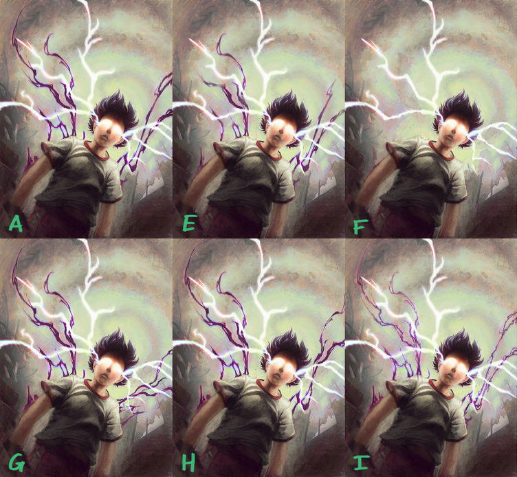
The second set has more shape differences. A is the original in both sets. G has the right side changed to be a flipped version of the left like @Perrij was talking about earlier. H just has a portion of it flipped. On variant I, I made the energy thinner
-
What if the purple lines were super fine. I really like it with the white and it seems like the purple is too strong but would look good as an accent. Just my opinion, could be totally off. I like the last one-letter I the best.
Marsha Ottum Owen
-
@Marsha-Kay-Ottum-Owen Do you think I should go even finer than they are in I?
-
I agree about keeping them super fine, or even not there at all (as in F). If you do decide to keep them, I feel that B or C is working best as regards color/value; they aren't competing for your attention as much as A or D.
-
@Xovq Yes. Really thin, but apparent like a bit of energy showing through. If that makes sense. I do like the white alone also but would be interesting to see whispers of purple veins branchign out...just for comparison.