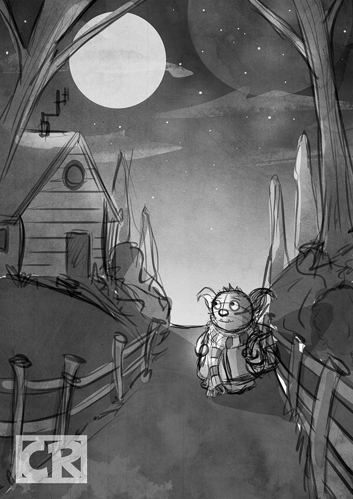
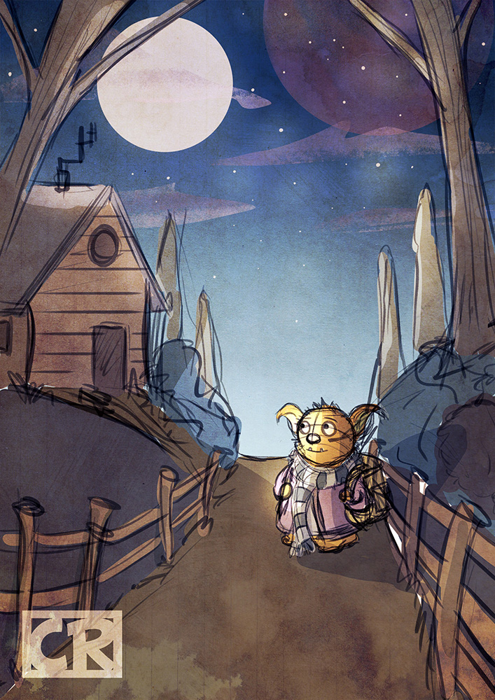
Value and contrast question
-
I'm still tinkering with approaches for a project I'm working on, and I thought I'd post another rough so I can see if I'm heading in a good direction before I get stuck into the finished project. My main concern with the image is with value. I wanted the character to be the focus but I find it difficult to push his value and contrast to get him to stand out, without bleaching him out completely. I've attached a colour version alongside the black and white version. I think it reads ok in B&W but I know it could be stronger. Anyone have any ideas how I could improve it?
-
You could try making the sky behind him darker or try lightening the areas around him and making him darker since the moon is technically behind him.
-
the area of mot visual weight and contrast is the moon. It is by far the lightest part of the image, and the sky is darkest around it. Perhaps invert the gradient the sky? This would make the sky the darkest at the bottom near your character, and lighter by the moon (also I believe this would look more like the sky at night, since it should be lighter near they main source of light).
By having your lighter character near the darkest part of the sky, I think it will pop more.