Character design little robin Bernadett
-
Hi, guys!
May I introduce... this is Bernadett. She is supposed to be a character in a fairy tale I am thinking about. She is the best friend of the donkey, who is the main character.
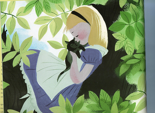
I am wondering if this needs more detail. If I compare my piece with an image by Mary Blair, which is also more or less flat, than I see that she used some lines and light reflections. I will copy her image here for comparison. What do you think?
Here the Mary Blair piece:
-
I noticed that I should use another texture next time. When I compare with Charlie Eve's (@Charlie-Eve-Ryan) work, she is so much more encouraged to use really strong textures. It is so beautiful, what she is doing.
")
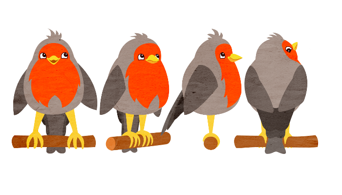
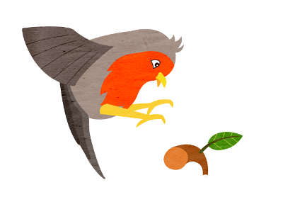
Here is Bernadett in action...
-
Ooops... forget the little feathers on her head. Here it is...
-
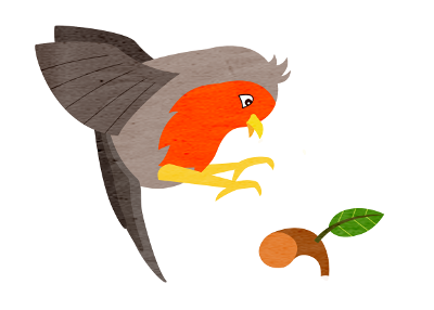
Maybe I should give her the second wing?
-
@Jana I like the second wing
-
@Jana That second wing helps, yes.
-
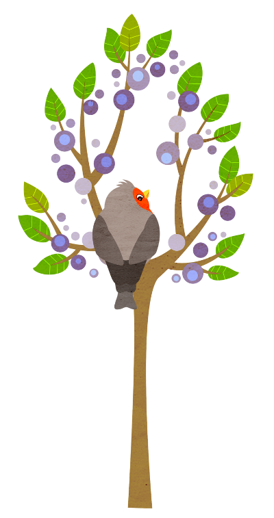
@Jana The Mary Blair piece has simplified shapes and lines--but it does have a feeling of depth, as well. What if you put your bird in a tree in a setting with a night sky like Mary Blair's, and gave your leaves different tones to create depth?.
-
@anthemsweet Thank you! That is a good idea. I will definitely try that soon.
-
Hi, I think it is a cute bird, but feels very static. Mary Blairs work is simplified forms, but since they are hand drawn more irregular. And the brush strokes you are using, I'd make them go with the shapes as if painted in, instead of across all areas.
-
@mirkaH Thank you for your feedback, Mirka.
I was already experimenting with some different textures and strokes, but wasn't really happy with it. I will go on trying to bring some more life to it. Hope I can share something soon. -
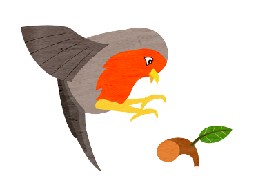
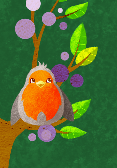
What do you think? Does that bring some more life into Bernadette?
It is far away from being decent. Still experimenting...
-
It seems poor Bernadette always looses some parts, first the wing, now the tail. Next time she will get it back...
")
-
@Jana Thanks for the compliments! I do love texture and I love the subtle texture and character design in your earlier posts. I think this last guy is a super cutie, but the background is falling a bit flat even with the added texture/color. I really love the simplicity of the earlier pieces.
If you want to play more with backdrops notice how Mary Blair is still letting part of the character pop off the page against a partially white background with strong darks to lights. She is also using brushes with lots of texture in the strokes, which I see you are starting to do. Maybe try to push the darks and try not to lose the white space.
I think you are on to a very fun, beautiful style here!! Keep going!
Happy Creating
www.charlieeveryan.com -
@Charlie-Eve-Ryan Thank you so much for your feedback!
That really motivates me to push further in this direction.
I was wondering if I overdid the robin with the light and shadow. In fact I wanted to keep it as simple as possible without being too flat. I guess I will go back one step with the robin to fit it more to the tree style.
Actually, I love white backgrounds. I am relieved that you encouraged me to bring some white areas back. -
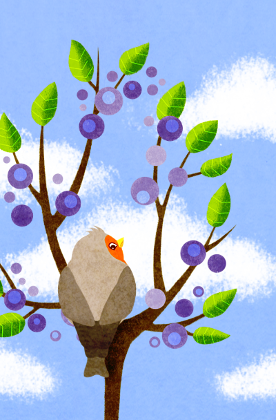
More experiments. I tried to bring back white and also some tiny black contrasts. What do you think? Is the style of the different objects consistent enough?
-
@Jana I think it's still too stiff, the shapes are even rounds, and the wings are the same. I'd still work on making it a little more of an organic shape. The bush strokes look a lot nicer on this one.