Tell me what you think is wrong with this new piece.
-
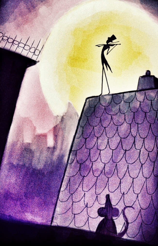
This is a piece I put together the other day, and my main goal was to get better with foreground in my compositions. Tbh, I am happy with how it turned out, and it is the feel I want in my art. However, I wanted the advice from all of you, whom I reapect very much, to tell me where I could get better in this piece. I know that as I move forward and progress, I will eventually see all the issues. So I ask all you better artists to tell me what you might change.
P.S This is merely to help me see my flaws, and not for me to take other people creativity and put it in my work and then put my name on it.
")
-
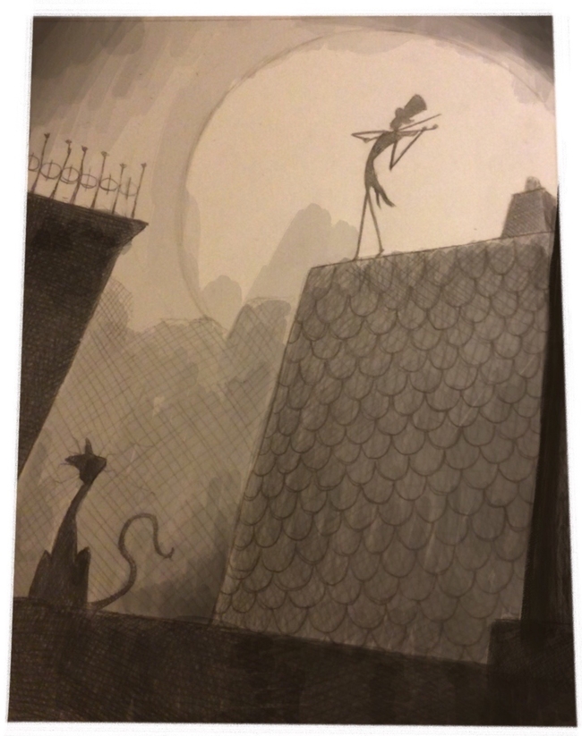
I certainly don't think that I am a better artist than you, but still I want to say what jumped on me.
")
I like the concept, color, texture very much. The only thing which I would change is to put the two focal points, the fiddler and the mouse shadow on a diagonal line from the left bottom to the upper right corner. That means I would simply shift the mouse to the left. Because the mouse shadow needs an area to fall on I don't have a quick solution for that.
Very nice piece overall. -
@Eric-Castleman I would say this is very Lee White-ish (which is a good thing!). In that sense, I find myself comparing it to his work and off the top of my head I'm going to say this might be a little too "simple".
Not sure if that is the best term for it. But if you look at Lee's work he's got so much texture and line work, etc. etc. going on. Not in a chaotic way--in fact, even with all the "stuff" he's got going on, he manages to keep everything simple and harmonious.
So maybe this is confusing but: you want simple...but not too simple.
The 2 things I would do is to do some more work on the roof (texture/line work) and then tighten up the image (i.e., crop it differently---probably bring the mouse up a bit so that we aren't seeing SO MUCH of the roof).
-
I think @jana nailed it with the compositional feedback. Diagonal lines always make for stronger and more dynamic compositions. Also, the mouse is dark, and the color behind him is also dark. Perhaps a small white or yellow highlight on his edge would pop him off the BG and make him stand out?
-
I really love all of these replies. It verifies that my own thoughts are on track. That is exactly what I wanted to get out of this. Much of what was said here are things I right away thought about, so I now have verification that my mind is somewhat right
@Jana this is something I was pondering, as well as changing the rat into a cat, just because a lot of people that see this image mentions the Pied Piper. Thanks for the advice, I will totally make that change
@mattramsey Awesome insight! Yes, Lee White is definitely the artist I am modeling myself a bit after. This piece is probably the most Lee White I have done. Prior to coming to SVS, my art was very much Quentin Blake like. I went from more of a comic book style to a very loose inking style, which Quentin Blake calls freewilling style. I would say that Quentin Blake is much more loose than Lee White is, but Lee's work is much more beautiful imho. Sp I am trying to find the middle ground. I love what you had to say here. It is something that helps me tune in on my goal a big more.
@kimchizerbe yes, great point! One of the reasons I somewhat worry about highlights, is that I suck at keeping bright colors in dark places in wagercolor, so my design tends to not include much of it. I will mess with this digital version a little, then when I do the traditional painting, I take a photo and out some yellow on the roof, and maybe end up using some colored pencils to get that effect. Thanks for the insight!!
Thanks everyone!!!!!
-
eric, are you in the illustration 1 class? We will be going over a ton of ways to solve composition problems.
SVS Faculty Instructor
www.leewhiteillustration.com -
@Lee-White I am not. I wish I could be, but atm I am strapped. Christmas, then my wife's birthday falls week after XMas (shoot me).
However, I will print and sale this image to you for $500
But in all seriousness, I will definitely be in your watercolor class once that gets going, and am sorry I can't be involved with this one. Any chance to learn from you I want to be able to capitalize on.
-
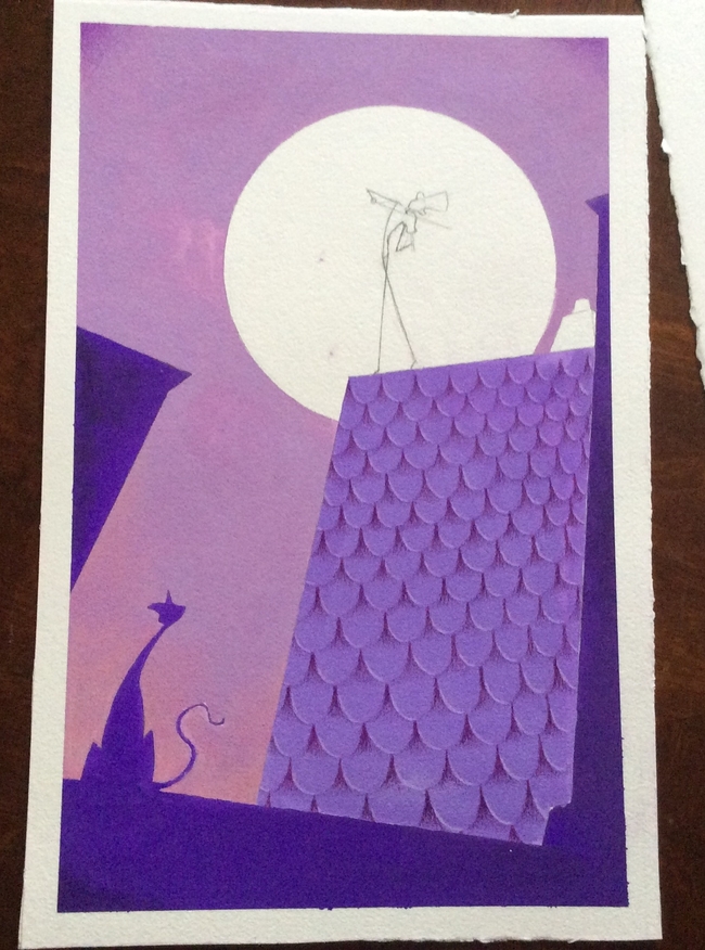
@Jana @mattramsey @kimchizerbe. Here is the reworked piece. I think I might bring the right side of the foreground a bit more in. Besides that, how does this look?
-
I think that works a lot better actually!
-
I like the composition better, but I do think the mouse should be there instead of the cat. As a closeup silhouette the mouse taking up the space feels closer and makes the picture feel deeper. The moment felt more intimate with the mouse there. (Am I making sense?) Also, the fiddler is a grasshopper (am I correct?) so the cat seems out of scale.
I love the color and painting style in the original. I hope that is not changing.
-
Thant looks better, @Eric-Castleman !
-
@Eric-Castleman
I like the composition better now. If you plan to bring some more things on the right side, be careful not to push the fiddler more to the middle. You might add something only to the bottom right corner. Is that what you meant?
Actually I am not sure if I interpreted right that the mouse was the shadow on the roof or is it the real mouse (or cat now)? -
definitely seems like a better balance and more dynamic composition to me now.
-
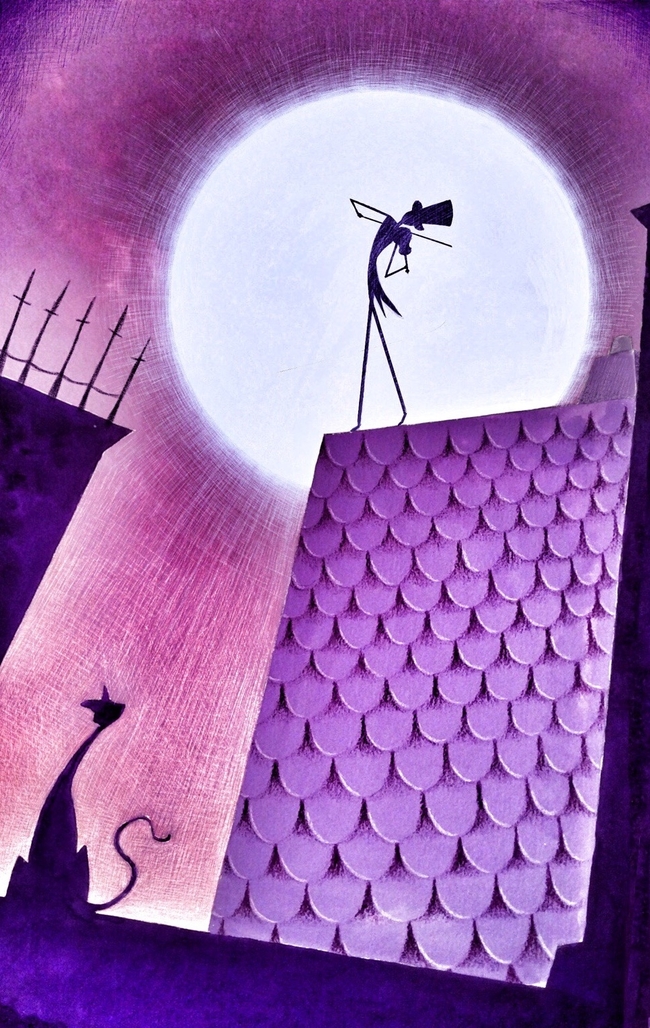
Trying a different style, and am wondering what you all my think. I am using gouache and colored pencils.
-
Love the texture of the tiles and the color palette!
-
@Eric-Castleman I really dig this. I was thinking you could tell a bit more story if you had a trail of little mice behind the fiddle player...almost like he's the pied piper like character and the cat is watching all the little mice with great interest.
-
@smceccarelli thank you! Trying gouache and colored pencils really surprised me as to how neat of textures I could pull off.
@evilrobot great insights. I was thinking a something similar as well. I was going to add a mouse next to the cat, to insinuate that the music was so good that they stopped and enjoyed it together.
-
I finished it digitally, but am very conflicted about using filters. I went overboard I feel, but can't help but love the final outcome. Any thoughts on using filters?
-
I really love the poses of the fiddler and the cat and the graphic style of the whole piece.:-)
But somehow I liked the shyness of the original piece more than the digital version. I find the texture in the sky a bit too much. -
I love this style with the gouache and pencils, it's very clean and defined yet textured. I actually prefer the earlier version - the finished one has some really nice finishing touches, yet I like the gentleness of the first piece, and the soft sunset feel of the colours. Maybe you could turn the opacity down on your filter layers, or do it selectively so that the man in the moon has the highest contrast, but it's more restful elsewhere. But great work overall!