Help with picking a thumbnail
-
@mcucchi thank you. That one was my original idea for color
")
-
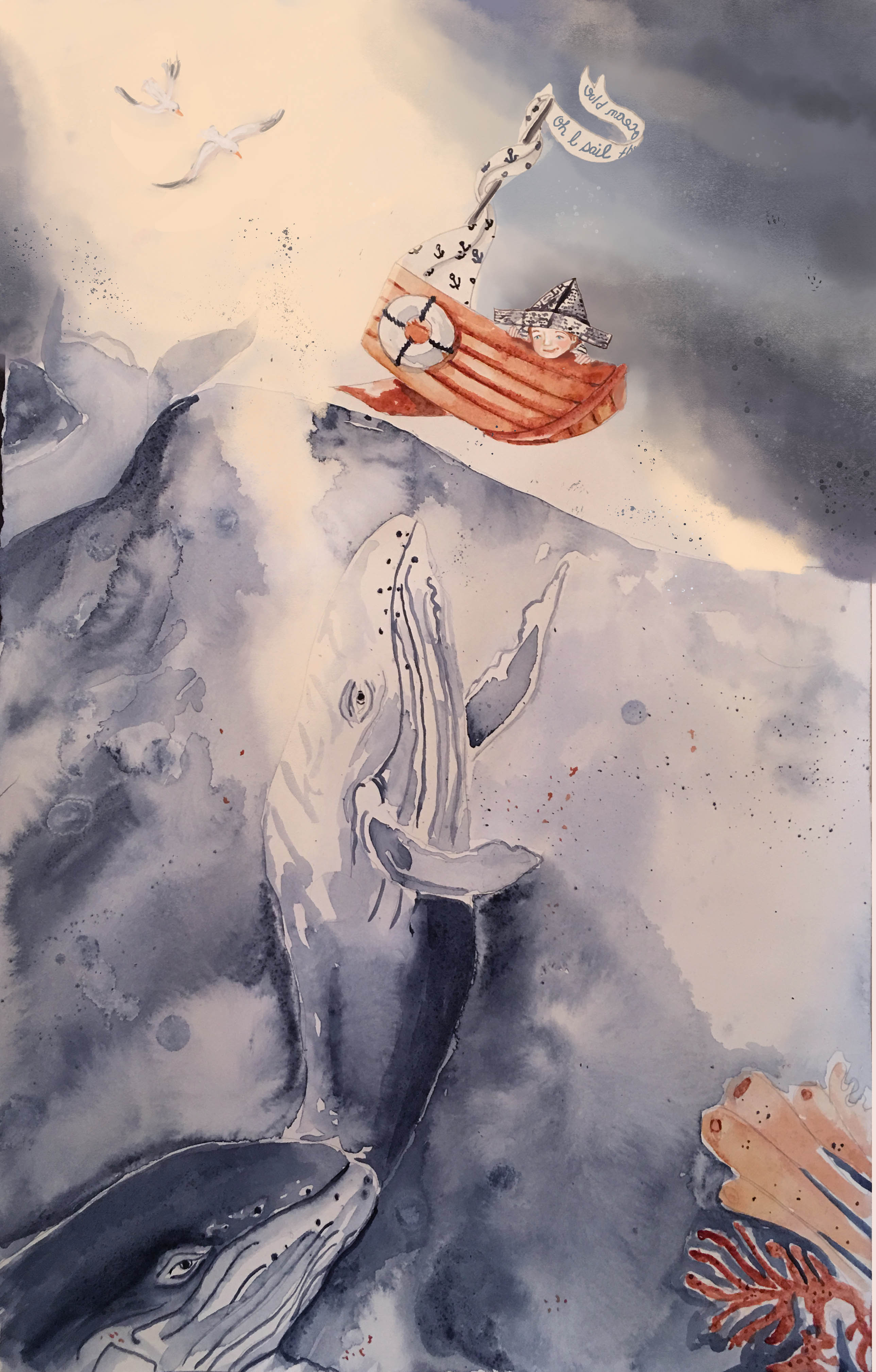
I like the bottom middle too. The oranges and blues have great contrast. Great lighting!
-
@bharris thank you. I appreciate your help
-
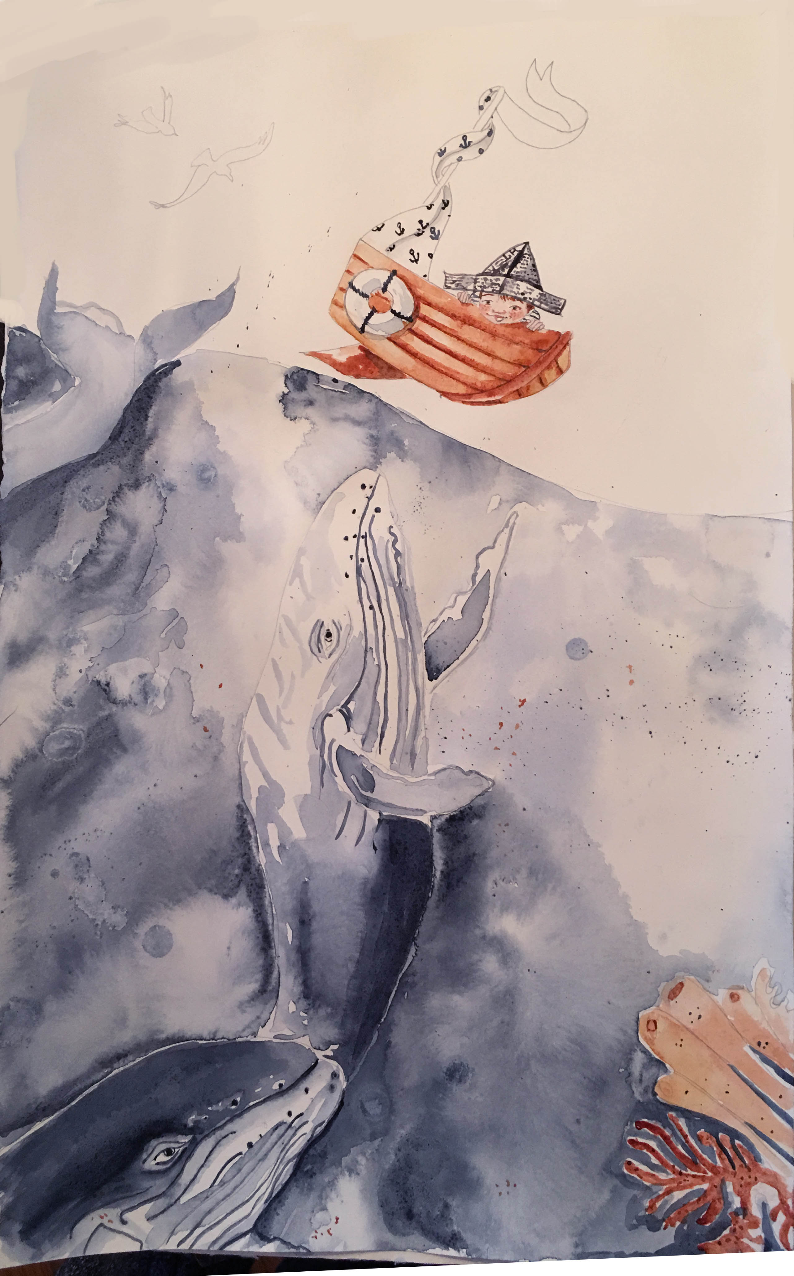
With the amazing Turbocharging your creativity class ending, I now have some time to play around, still have some work to go, not happy with the face, I may paint a new one and layer it in photoshop. I was anxious to start painting and rushed the process of drawing the boy, and I knew I would regret it, also trying a limited palette
-
Hi everybody, this is a mix of watercolor and digital-Does the digital stick out like a sore thumb? I think I am too close to it-the water whales and boat are watercolor the boy, sky and birds are digital- Really wondering if I should repaint the whole thing watercolor only?? All thoughts welcome-thanks!
-
@lmrush Pretty colors!
As far as repainting it goes, the digital sky does have a very different texture than the watercolour ocean, but maybe that works since the sky should be fluffier and the ocean should be wetter anyway.  I really like how you've done the seagulls.
One thing I might darken a bit is the very light patch of sky to the lower right of the boat. The contrast between it and the dark part of the sky pulls the eye there, away from the boat. Also, I think the way you had the light around the upper part of the boat and little sailor in your thumbnail was more effective at highlighting the boat than the dark sky.
Thank you for sharing your process images here--it's really fun to see an illustration come together!
-
@K.-W. Thank you so much for the help, because the sky is digital I can easily lighten around him and the boat-thanks!