Dog and Orchestra Illustration
-
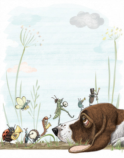
This is a really fun piece … And just some things to try but not that necessarily that need to be "fixed"… Maybe a suggestion of sky color (done loosely) to possibly create a smoother transition between the ground and the white background may even help to make the bugs and dogs seem more tied together. You could also try doing a color overlay to possibly unify the piece if you feel like it still disjointed. Might help, might not help… You'll never know until you try.
But, honestly… These are just experimenting type steps you have a great illustration now.
-
I love it.
-
Thank you for all the feedback. Super helpful. Several good suggestions to work it out better. I'll post revisions when I have them.
")
-
@MirkaH
I found this photo. Hope it helps!
https://www.dreamstime.com/stock-photo-profile-tired-basset-hound-puppy-laying-full-body-dog-its-head-ground-image57203284Mara
-
@MirkaH I love your illustration!
-
here is where I got today. I wanted the background to be faded so it doesnt fight with the main image. should the bugs be a little brighter still?
-
@Mara thanks that is really a cute picture. i looked up a bunch, but didn't see that one. I added a paw from memory on there. hope it looks like it fits.
-
@MirkaH Love it!
-
I think the softer line on the first dog’s profile was nicer.
In Photoshop I removed the grey cloud and it looks lovely. I haven’t figured out how to add images here to show you.
-
This is beautiful! I agree that the grey cloud is distracting, I think just lightening it a bit would solve that. I think maybe brightening the bugs a TINY big might be good too. I love this! I think the pale sky is just asking for some story text up there, or you could put your name and logo and send this out as a post card.
-
@Sarah-LuAnn You are right. This was what I had thought about having as the cover page for my portfolio, so my name would be in big text in the middle of the page. which was why I was originally thinking of having a white background or a faint background so its not too distracting. But with the way it is now, I think its too busy to have a cover page with my name. granted I've never seen anyones illustration portfolio before, so don't have much to compare to. lol personally from my art background less is more, but with illustration, it seems there is more leeway with how things are put together.
-
just lovely
-
I miss the soft sketchy lines outlining the dog's face. I do think the bugs could be a bit more intensely colored--I prefer the more intense warm colors of the first image. (I'm not sure if you mean bright as intense or bright as in clear--closer to primary colors)
-
@anthemsweet Also, as I am looking at both images, it looks like you got rid of a lot cross hatching, but I really miss it. I think it looks fresher and more lively with it.
-
thanks everyone. I need to go back and work on it some more.
@anthemsweet the cross hatched lines are still there. its hard to see the details when you have to reduce images a lot to make them attach here.
-
Delightful!
-
@MirkaH I love the details on the dog, beautiful!