Feedback
-
Hello Art Friends,
(I'm still working on the under drawing and quickly threw in some tone.)
I'm looking for feedback on my composition before I really start setting the details on the village and landscape below.
This is just a practice piece I'm working on. Thanks for your time.
-
I think you have some good stuff going on here! A few thoughts:
I don't know what your plan is for the color of the baloon, but I would make it different from the color of the sky so it reads more easily.
Right now your composition can be pretty much split down the middle. I know the perspective would be harder, but I think it would really add something if you were to put the baloon at more of an angle. I can't think how to explain what I mean so here is a very quick rough sketch:
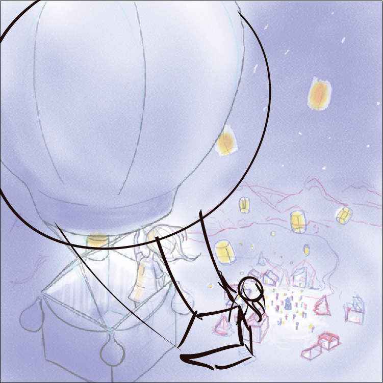
Not perfect but maybe it gives the idea? Just a little more curve and movement, and break out of that half and half composition you have going on already.Anyway, those are just my thoughts, take them or leave them. Looks like a fun piece, have fun whatever you do with it!
")
-
@Sarah-LuAnn Thanks for the draw over. Those are always helpful in seeing other ways to go with the illustration. I appreciate you taking the time.
I have no real colour plans put out right here, and I agree. It was more of a grab a shade to quick get something out.
-
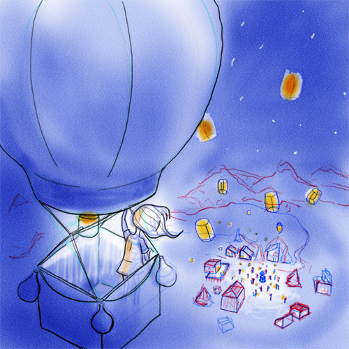
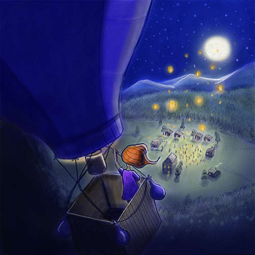
Here's an update @Sarah-LuAnn. While I really liked the draw over for the reason's given above, to me it made it seem very windy. I'm trying to capture a more serene feeling for this illustration so I angled the balloon a bit more. I'm not sure if this is a good enough compromise or if I should go back to the beginning.
My next struggle is the scenery. I'm the type of illustrator that avoids a lot of elements and items. I'm trying not to do that this time and just need general feedback. These are such tiny but large elements and I'm struggling about how much detail to include.
Extra Info: Night Scene.
Let's connect!
www.amandawall.ca
www.facebook.com/AmandaWallCS
Instagram: @amandawall_cs -
I think its already looking more interesting than the original sketch. Pretty cool what adding some fun angles can do
-
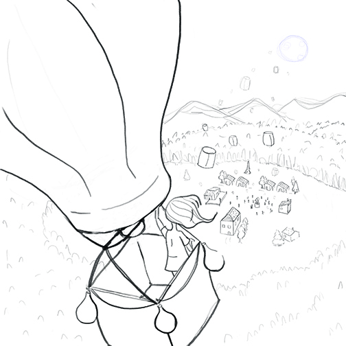
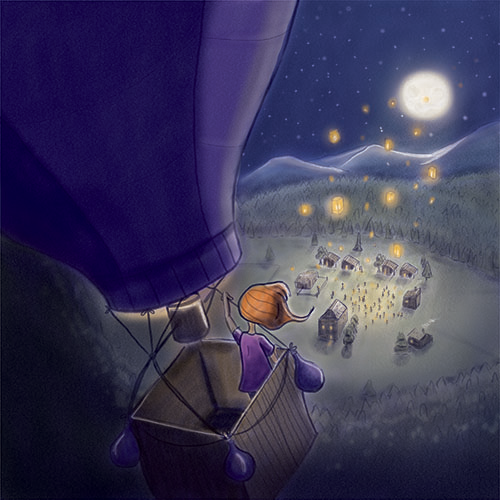
@AWall This is looking good! I think it looks better with the horizon higher like you have done in this latest version - i though i would mention one thing that pops into my head with this - i feel like we don't need to see so much of the balloon top - it feels a bit like it is drawn maybe too small so that it will fit into the composition - i think that just the basket alone tells us all we need to know and then we can picture the rest in our minds or see it in the previous or next panel - but i think it looks too small to me at the moment - feel free to ignore this ...you are most likely quite finished by now
- i did a quick thumbnail of what i was thinking (it's a bit sketchy)
-
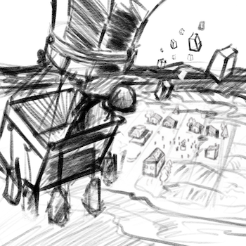
I was thinking the same thing @Kevin-Longueil suggested also thinking it would be nice to have one of those lamps super close and large in the foreground it would help to cover up that corner at the bottom of the balloon and help create some framing of the main character.
-
Thanks @Kevin-Longueil , @evilrobot @Sarah-LuAnn
I went back and double checked my balloon drawing and the balloon is the right size compared to the basket for the reference I used. There are quite a few style of balloons it turns out. I do see what you mean and am considering cropping the image.
This image is kind of driving me nuts and I'm starting to tire of it. I figured I'd show and update though of were I'm at now in terms of colour and the drawing tweeks I did.
-
Sorry.. grabbed the wrong file type.
Let's connect!
www.amandawall.ca
www.facebook.com/AmandaWallCS
Instagram: @amandawall_cs -
It's turning out really cute!
-
@AWall The only thing that is missing is the warm glow of the 'burners' within the balloon. You would be able to see some of the heat and light through the fabric. Plus, a little more on the rim of the basket and on her hair. Just an observation, I hope it helps? Regards, Rob.
")
Site: Idrawcreatures.com
Shop: RobinSleeDesigns.etsy.com -
@RobinSlee Thanks for the feedback! I'll grab some night references and work on that.