(Closed, Thanks Everyone!!)
-
Hi everyone! I'm Jessica annnd I'm very new. Greetingsss. I'm trying to build up my portfolio, but I'm only into my second image and I've gotten stuck. No matter how much I try, I cannot seem to get this image to work for me! I haven't been able to move past the first stage, because I keep changing things in the composition. Can anyone take a look and give me their thoughts? I have the most recent image, but I also have an old version because I think it actually has a better flow. Aughhh. Help.
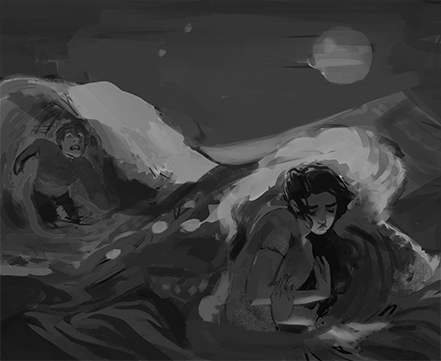
Here's the latest version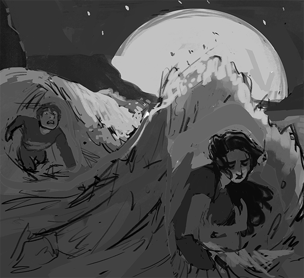
And an earlier version -
I agree that your first composition does have better flow with the waves because the perspective is spot on. To go along with your set perspective is to enlarge your subject in front a bit. Just do that little fix and then your ready to move forward.
") Your doing a great job!
Your doing a great job! -
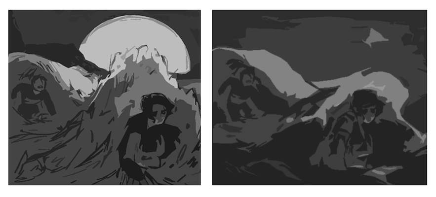
@Perrij Welcome to the forum Jessica! This looks like the start of another very nice piece for you - it feel like the moon is an equal partner in this composition and that is possibly part of the story so i'm not sure if moving the moon out of the shot would be helpful...but it would allow you to cheat with the lighting a bit more if we were not quite sure where the moon was - i like Elena's idea of enlarging the foreground and reducing the sky if we don't need the moon - i think that somehow you need to get the area of highest contrast to be where you most want the viewer to spend time - right now the light on top of the waves is the strongest pull - i sent these through the "cutout" filter set to "5" in photoshop to see what the contrast looks like when simplified - i think making sure you have light on dark or dark on light going on where it is important is the main thing... anyways i'm sure this will turn out great ...you have a very interesting portfolio - very few pieces but they are very good!! Love the "Victory" piece!
-
Hey guys, thank you so much for taking the time out to respond, because this thing was really killing me. Thanks especially to Kevin for demonstrating for me! I'm not surprised to hear that this is an issue of perspective, ughhh perspective is my worst enemy. And Kevin you make some great points ahhh I'm just so happy you two gave me some tips. And you've both got some great portfolios yourselves!
-
Hi there! I really like the illustration and the comp. What I think is, perhaps you can do value comps without details. Than you can see what is working. Maybe its nice to lighten up the characters. The area's with The biggest contrast alway draw most attention. You can work really small when you try out values, 1-2 inch works fine cause the brain cimposes at that size. Good luck, keep beleiving in your piece.