Society of Visual Storytelling

    SVSLearn Forums

    • Register
    • Login
    • Search
    • Recent
    • Tags
    • Popular
    • Users
    • Groups
    • Search

    50 Things Challenge

    General Discussion
    28
    50
    11989
    Loading More Posts
    • Oldest to Newest
    • Newest to Oldest
    • Most Votes
    Reply
    • Reply as topic
    Log in to reply
    This topic has been deleted. Only users with topic management privileges can see it.
    • smceccarelli
      smceccarelli Pro SVS OG @Stephanie Hider last edited by

      @Stephanie-Hider Not that backward. I actually love ProCreate brushes better than Photoshop brushes. I even asked the ProCreate service center if there is a way to export their brushes into photoshop, but there isn't (the brush engines are different). I was trying to find out why I like them so much, and I believe it is the pressure-sensitivity algorithm - it seems closer to how a natural brush or pencil behaves. Recently, I have been playing with ClipStudioPaint, and I think the way brushes behave in that software is much closer to ProCreate - very very nice. I can see why people prefer CSP for sketching and inking (I do not think the painting flexibility is close to Photoshop, though I may be wrong)...
      But yes...abundance problems!

      Anyway, I need to get going with color on this one. I will start today!

      1 Reply Last reply Reply Quote 1
      • Stephanie Hider
        Stephanie Hider last edited by

        I really really love how CSP paints. I wish Kyle would do brushes for it but I have a ton so I shouldnt complain and only use 3 or 4 of them on a regular basis. I literally cut my painting time in half if not more painting in CSP. So glad to see others like it too 😃

        http://stephisdoodling.com
        http://stephaniehider.com
        https://www.instagram.com/stephhider/

        1 Reply Last reply Reply Quote 0
        • smceccarelli
          smceccarelli Pro SVS OG last edited by

          So, I did try out the extreme background/foreground separation - I do like it. This piece was such an experiment on so many levels that I feel confused about it being successful or not. But I am quite proud of it at this moment...
          alt text

          DanetteDraws Kevin Longueil Leontine 3 Replies Last reply Reply Quote 6
          • DanetteDraws
            DanetteDraws @smceccarelli last edited by

            @smceccarelli Oh, you were MOST DEFINITELY successful! This is so very awesome in so many ways. I could look at it for hours!

            https://danettebyatt.com
            Twitter @DanetteDraws
            Instagram @DanetteDraws

            1 Reply Last reply Reply Quote 0
            • Dulcie
              Dulcie SVS OG last edited by

              It looks amazing @smceccarelli - congratulations on a wonderful piece! It works on so many levels - colour, value, composition - and it's really interesting to look at with all the details. A really great way to fulfil the challenge 🙂

              www.dulciemascord.com
              https://www.instagram.com/dulciemascord
              https://twitter.com/dulciemascord
              https://www.facebook.com/dulciemascord

              1 Reply Last reply Reply Quote 0
              • evilrobot
                evilrobot SVS OG last edited by

                This looks amazing. I love it.

                http://www.palacioillustration.com/

                https://www.scbwi.org/illustrator-gallery/illustrator-detail/?illustrator_id=84142

                https://www.pinterest.com/evilrobot2/pins/

                https://twitter.com/MyEvilRobot

                1 Reply Last reply Reply Quote 0
                • Eric Castleman
                  Eric Castleman last edited by

                  Uber gnarly! Love it!

                  EricCastleman.com

                  SCBWI profile
                  https://www.scbwi.org/members-public/eric-castleman

                  1 Reply Last reply Reply Quote 0
                  • Ed O
                    Ed O last edited by

                    AMAZING! It looks fantastic : ) @smceccarelli

                    1 Reply Last reply Reply Quote 0
                    • Kevin Longueil
                      Kevin Longueil SVS OG @smceccarelli last edited by

                      @smceccarelli Blown away!! This is so good!

                      Portfolio: kevinlongueil.com
                      https://www.instagram.com/kevinlongueil/

                      1 Reply Last reply Reply Quote 0
                      • Judy Elizabeth Wilson
                        Judy Elizabeth Wilson SVS OG last edited by

                        This is so great. It has a wonderful nautical pirate atmosphere aswell as loads of things. Congrats!

                        Website http://www.judyelizabethwilson.com/

                        Instagram https://www.instagram.com/judyelizabethart/

                        Sharing positivity through art.

                        1 Reply Last reply Reply Quote 0
                        • Leontine
                          Leontine @smceccarelli last edited by

                          @smceccarelli lovely textures, awesome drawing! Very cool.

                          Leontine
                          "A picture is worth a thousand words."

                          https://leontineillustrator.com
                          https://www.instagram.com/leontine.illustrator/
                          http://www.facebook.com/leontineillustration

                          1 Reply Last reply Reply Quote 0
                          • K. W.
                            K. W. last edited by

                            Wow!!! Congratulations on the experiment and beautiful result! I hope I can be half as good as you someday. 🙂

                            1 Reply Last reply Reply Quote 0
                            • NoWayMe
                              NoWayMe last edited by

                              OMG @smceccarelli This is amazing!

                              I love the color separation idea! And the warm vs cool colors. I am just wondering if you tried the alligator in a warmer color... Especially his coat. It is a very cool green and it contrasts a lot with the rest of the foreground (maybe that was the plan, if so, my comment is useless!)

                              For example (minus the pink that appeared on certain area that where already warmer) :

                              0_1492129799694_Sans titre-1.jpg

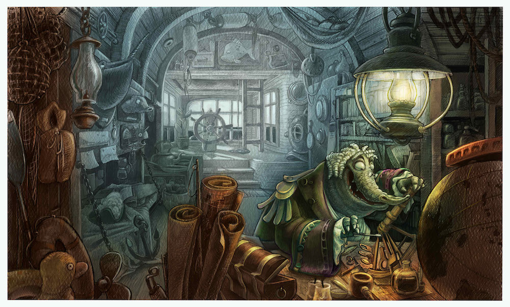
                              But it already looks great 🙂

                              noemiegionetlandry.squarespace.com
                              noemie_illustration on Instagram

                              smceccarelli 1 Reply Last reply Reply Quote 1
                              • smceccarelli
                                smceccarelli Pro SVS OG @NoWayMe last edited by

                                @NoWayMe Thank you! It does look nice with the brownish coat - I will give it a try!

                                1 Reply Last reply Reply Quote 0
                                • First post
                                  Last post