Finished piece, though it isn't the style I want, I still am interested in feedback.
-
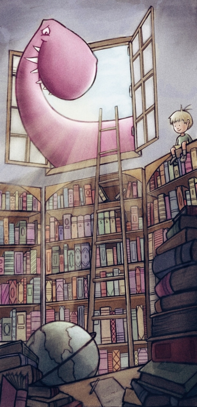
Here it is. It still has a few things to fix, but it is pretty much done. Any thoughts?
-
I love it! It looks really nice, love the soft textures...consistent throughout and really nicely crafted piece. Love the light and dark-to light foreground/background values, they make the piece work very well. Maybe it wasn't the style you were aiming for, but personally I think it looks really professional - great work!
-
@Dulcie thank you!! I really just did this picture to challenge myself to create clutter, as well as a bunch of objects that would require different colors, yet at the same time have to work together. I wanted to see if I could use almost every color and get it to still work.
Also, every single aspect to this picture has SVS influence to it. So, this is essentially seven months of me being here. From looking at Lee White's work and trying to create an interesting foregrand, to getting the values correctly via Will Terry, to chracter design via Jake Parker. Also, I do not think I would have colored the dino purple/pink if I hadn't seen your purple dragons.
-
I really like this style and I like the long composition. I think the whole middle of the image is really successful. The books in the foreground and the top part with the window falls apart a bit because there are a lot of perspective issues. I think if you sort out those issues this would be a nice portfolio piece
-
boy standing in front of window might put him in a better spot for successful design and the dragon would be looking more at him... pretty cool though.
-
I really like it. Love how the light shines through and the colors you chose work really well together. The bold black lines with the softer colors-really nice.