Society of Visual Storytelling

    SVSLearn Forums

    • Register
    • Login
    • Search
    • Recent
    • Tags
    • Popular
    • Users
    • Groups
    • Search

    Cat ! finished illustration

    Illustration
    6
    12
    2450
    Loading More Posts
    • Oldest to Newest
    • Newest to Oldest
    • Most Votes
    Reply
    • Reply as topic
    Log in to reply
    This topic has been deleted. Only users with topic management privileges can see it.
    • audrey dowling
      audrey dowling last edited by

      Hi everyone,
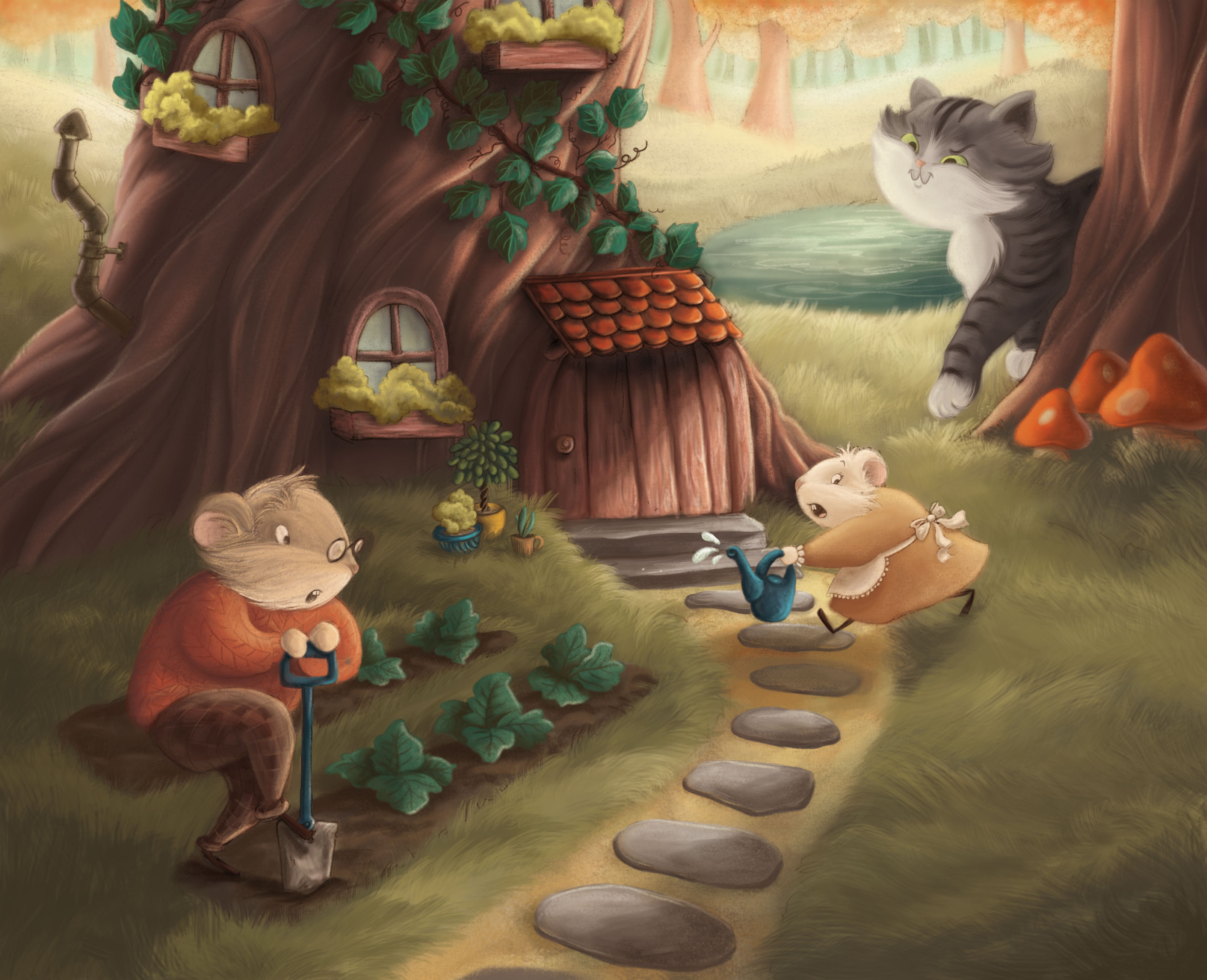
      Can I have your opinion on this piece?
      Is it consistent enough with the 1st one I did with the mice?
      0_1489419310341_cat-web.jpg

      0_1489419386120_cup-of-tea-web.jpg

      website: https://audreydowling.wordpress.com/
      twitter: https://twitter.com/audreydowling
      facebook: https://www.facebook.com/Audrey-Dowling-Artist-Illustrator-498582176906242/timeline/?ref=bookmarks

      Rich Green lmrush 2 Replies Last reply Reply Quote 10
      • Rich Green
        Rich Green SVS OG @audrey dowling last edited by Rich Green

        @audrey-dowling Hi Audrey, I always enjoy your work.

        I do have a few questions/comments for you:

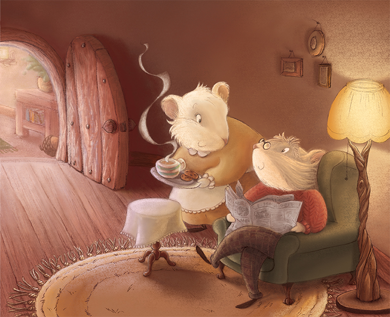
        Is this supposed to be the same door shown in both pieces? As right now the door from your interior scene has the handle placed on the other side of the door. It has the metal nail heads on it as well. If that is the same door as the one on the front of the tree you might need to make sure those little details are the same.

        Also there is more sense of texture in the interior scene overall, and there is none of that texture in the outdoor scene. Everything is much more smooth/digitally clean. So from a style consistency you may want to consider adding in some texture to the outdoor scene to help them feel like they are creates using the same materials/techniques.

        But otherwise, in terms of the characters and such - yes very easy to tell they are consistent and the same.

        One last note - right now the lady mouse is running like she has spotted the cat - but she is looking behind her back like there is something that is chasing her from outside the frame. Something I think you might want to try is to have her eye looking at the man mouse or towards the front door instead and see if that helps it reads better!

        Nice work!
        Rich

        www.richgreenart.com instagram.com/richgreenart/

        1 Reply Last reply Reply Quote 1
        • audrey dowling
          audrey dowling last edited by audrey dowling

          thanks for the advice rich, I will do that later 😉
          I also just noticed that mr mouse's eye should be closer to the nose

          website: https://audreydowling.wordpress.com/
          twitter: https://twitter.com/audreydowling
          facebook: https://www.facebook.com/Audrey-Dowling-Artist-Illustrator-498582176906242/timeline/?ref=bookmarks

          1 Reply Last reply Reply Quote 0
          • Eric Castleman
            Eric Castleman last edited by

            I love these compositions, and don't want to impose by giving my suggestions, because I might not be at a level to properly critique you. However, a trick I do with all of my art is that I run it through a photo filter, such as snapseed, and see if my values are working, as well as see if the filters somewhat suggest textures I could use, as well as show me where things would look better darker or not. Here is what they looked like after the filter.

            0_1489447321508_Snapseed.png

            Notice how the texture really brings the piece together, as well as the contrast from the show behind the door could be a great place to highlight the light/dark distinction.

            0_1489447664034_F8064606-173B-4298-88A2-59215495D897-2023-000002340151FDBF_tmp.png

            The second image I saw thqt the cat's face was the same value as the background, and no matter what filter I flipped to, it could contrast the characters face from the background.

            So those are my thoughts. I think the compositions are great, and just a little adjustment really knocks it out of the park.

            Hope I didn't overstep with my two cents 😉

            EricCastleman.com

            SCBWI profile
            https://www.scbwi.org/members-public/eric-castleman

            dimablue 1 Reply Last reply Reply Quote 2
            • dimablue
              dimablue @Eric Castleman last edited by

              @Eric-Castleman Very good point. Perhaps a good idea would be to bring the pond higher so it contrasts with the cat's face. It works for the chest, less reflective light in the water.

              1 Reply Last reply Reply Quote 2
              • audrey dowling
                audrey dowling last edited by

                thanks for your replies
                how does this work?
                I've added texture, and reworked the values like you suggested. I also added the nails in the door ^_^ (didn't change the place of the knob as this is not the same door as the other picture so it doesn't matter)

                0_1489490588928_cat-web3.jpg

                website: https://audreydowling.wordpress.com/
                twitter: https://twitter.com/audreydowling
                facebook: https://www.facebook.com/Audrey-Dowling-Artist-Illustrator-498582176906242/timeline/?ref=bookmarks

                Rich Green DanetteDraws 2 Replies Last reply Reply Quote 1
                • Rich Green
                  Rich Green SVS OG @audrey dowling last edited by

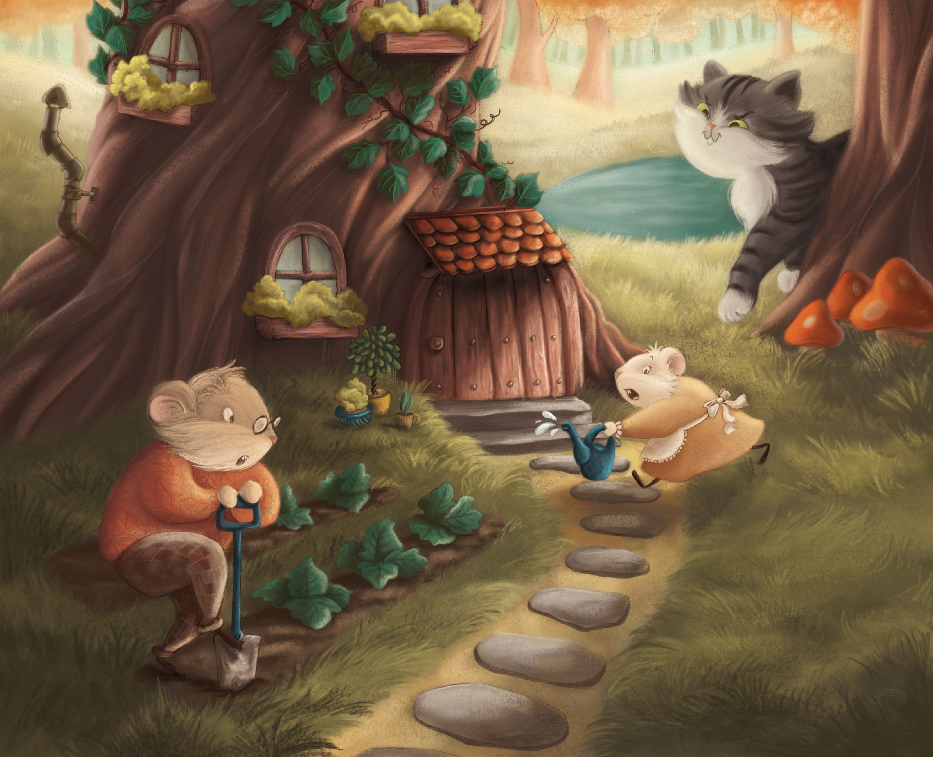
                  @audrey-dowling Hi Audrey! First of all I think that small change to the placement of where her eye is looking - works perfectly now! You see she is alarmed and you see the cause of the danger. And now she is looking at him to give him warning. Just great!

                  Also I think those little nail heads on the front door give it a bit more importance in the scene now as well - it helps me to know that she is running to get inside and safely behind it.

                  Really nice job!

                  www.richgreenart.com instagram.com/richgreenart/

                  audrey dowling 1 Reply Last reply Reply Quote 2
                  • audrey dowling
                    audrey dowling @Rich Green last edited by

                    thanks @Rich-Green !

                    website: https://audreydowling.wordpress.com/
                    twitter: https://twitter.com/audreydowling
                    facebook: https://www.facebook.com/Audrey-Dowling-Artist-Illustrator-498582176906242/timeline/?ref=bookmarks

                    1 Reply Last reply Reply Quote 1
                    • DanetteDraws
                      DanetteDraws @audrey dowling last edited by

                      @audrey-dowling Hi Audrey! I love this - and great job with keeping character consistency between the pieces.
                      Just one thing is throwing me off with your latest piece: the perspective seems off to me between the two mice. Mrs. Mouse looks a tad bit too small to me. Or, Mr. Mouse is slightly too large - either way. Another thing that would help here is making the stones in the path have an even greater size difference than they do now - largest to the front, much smaller close to the house. Same thing with the cabbages (carrot tops?) - right now they're the exact same size, but they should have a variation in size too.
                      You have such a sweet style! Is this a full dummy you're putting together (with your own manuscript)? Or just a couple of portfolio pieces?

                      https://danettebyatt.com
                      Twitter @DanetteDraws
                      Instagram @DanetteDraws

                      audrey dowling 1 Reply Last reply Reply Quote 2
                      • lmrush
                        lmrush Pro SVS OG @audrey dowling last edited by

                        @audrey-dowling Did you see Giuseppe's tweet about mailers and coffee? Your postcard was on his desk!!!!! These are so cute!

                        Lisa Rush
                        www.lisarushgallery.com
                        www.facebook.com/ArtbyLisaRush/
                        www.instagram.com/lisarush11/

                        1 Reply Last reply Reply Quote 1
                        • audrey dowling
                          audrey dowling @DanetteDraws last edited by

                          @DanetteDraws thanks for this danette, I will fix that. I actually fixed it on the 1st illustration too, as I thought that mr mouse was too small comparing to mrs mouse
                          Not a full dummy, even though I have the storyline thought out. But for the moment I ficus on illustrating so it's just for my portfolio
                          I saw that @lmrush and there was not many cards to compete with this week! 🙂 hope they will grab some attention somewhere...

                          website: https://audreydowling.wordpress.com/
                          twitter: https://twitter.com/audreydowling
                          facebook: https://www.facebook.com/Audrey-Dowling-Artist-Illustrator-498582176906242/timeline/?ref=bookmarks

                          lmrush 1 Reply Last reply Reply Quote 2
                          • lmrush
                            lmrush Pro SVS OG @audrey dowling last edited by

                            @audrey-dowling I am sure they will, they are sweet images!

                            Lisa Rush
                            www.lisarushgallery.com
                            www.facebook.com/ArtbyLisaRush/
                            www.instagram.com/lisarush11/

                            1 Reply Last reply Reply Quote 0
                            • First post
                              Last post