Another Oz piece :) Emerald City Gates
-
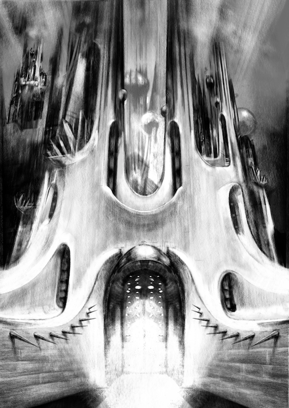
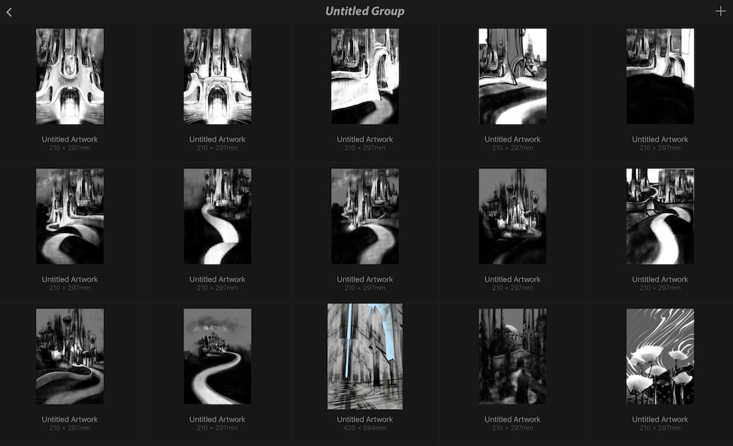
Here is the latest from Oz - This is what i have come up with for the Gates of the Emerald City - in the book "The Wonderful Wizard of Oz" the doors of the Emerald City are almost too bright to look at..that is why i have them so washed out - i included thumbnails of previous versions....there is something about a few of them that i like - i am thinking i will incorporate some of those ideas into the "Fighting Trees" image - (also started on the Poison Poppies - the latest version of which is at bottom right of the thumbnails image) Anyways .. thank you for looking - any comments or critique always much appreciated
")
-
OH MY GAAAAWD!!
When I saw the title, I was expecting a childlike illustration! This looks epic. Did you do the values digitally or in graphite?
I do have a feeling that this gate is meant to be a bit epic, so I think a bit wider angle view would help it a lot. But you can put atmospheric perspective on it too make it look epic as well I guess. Love it ! -
@Kevin-Longueil YEEHAW!
This thang is awesome! -
@Nazuba Thank you Nazuba! I've been doing all of the Oz pieces on the iPad Pro using the Procreate app - also using only one brush for all of them (a Pencil by Nickolai Lockertsen) - i will try a wider angle and see how it feels - really appreciate the kind words and feedback!
...I just noticed a creepy and unintentional face looking out of the window on the left... gotta fix that!
@Tyson-Ranes Thank you Tyson! -
@Kevin-Longueil I didn't notice the face till you pointed it out. I would leave it. Better yet go add creepy faces to all your pieces, it would make for a cool effect
-
@Chip-Valecek That would be creepy Chip! I had to change it though - it was really throwing the scale off with the giant face in the window - and i think it looked Too creepy
-
@Kevin-Longueil maybe your next series "The Upside Down of Oz"
-
@Kevin-Longueil what if the spikes leading up to the door were more crystalline in shape? Not so uniform? Kinda like what you have on the balconies.
-
@Chip-Valecek That is funny you mention "upside down" Chip - i had had a thought as i was working on it that this drawing looks better upside down:)
-
@mattramsey Thank you for the feedback Matt! - i gave the spikes facets thinking they should be crystalline in some way like the balconies but i think it is worth going more crystalline as you suggest and see how it looks - i have a feeling the spikes may be too sinister - i did need something to defend the low windows of a fortress city though was the thinking - some half logic at work - really appreciate your thoughts.
-
This drawing is wonderful - the sense of scale, the atmosphere of the piece, everything works. It is mysterious and unsettling without being overly aggressive.
Talking of that, I agree that the spikes look a bit .... out of tune? I think there should be something there, but the spikes seem not to fit the rest of the architecture and give a sense of danger - I remember the city of Oz feeling foreign and strange but not dangerous. Maybe some crystals as suggested (then I would probably put them on the sides of the path rather than on the walls....would not be able to say why, just a gut feeling. -
@smceccarelli Thank you Simona - i really appreciate your feedback! - "mysterious and unsettling without being overly aggressive" is such a great thing to hear! - i've been working on spike alternatives yesterday and today - i think i will have to come back to it later though - i am hearing you and Matt for sure and see your point - there is a foreshadowing in the spikes but i think you are right and it might be too much - in the book a young girl is sent (presumably to her doom) by a deceitful old man through dangerous lands to kill a powerful and evil witch - so i have this feeling that the Emerald City holds great danger for the travelers - i think i am too attached to the spikes mostly for this reasoning (kinda funny really) so i will take a break on it for a bit and come back to it when i feel more objective minded - once again I really appreciate you taking the time to share your feedback!!