Society of Visual Storytelling

    SVSLearn Forums

    • Register
    • Login
    • Search
    • Recent
    • Tags
    • Popular
    • Users
    • Groups
    • Search

    Skulduggery Pleasant illustration

    Projects
    9
    30
    7342
    Loading More Posts
    • Oldest to Newest
    • Newest to Oldest
    • Most Votes
    Reply
    • Reply as topic
    Log in to reply
    This topic has been deleted. Only users with topic management privileges can see it.
    • audrey dowling
      audrey dowling @Sarah LuAnn last edited by

      better now isn't it?
      0_1490964564387_valuecomp3.jpg

      @Sarah-LuAnn I'm on the 6th one right now, I love that series. they're great books 🙂

      website: https://audreydowling.wordpress.com/
      twitter: https://twitter.com/audreydowling
      facebook: https://www.facebook.com/Audrey-Dowling-Artist-Illustrator-498582176906242/timeline/?ref=bookmarks

      1 Reply Last reply Reply Quote 2
      • audrey dowling
        audrey dowling last edited by audrey dowling

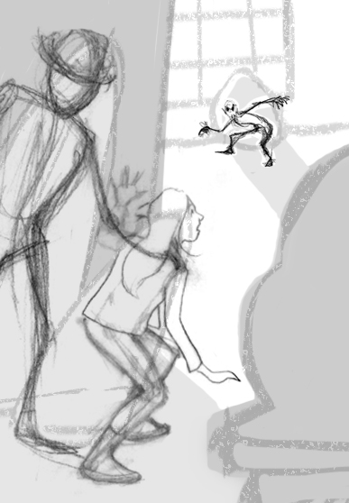
        I haven't had much time to work on it lately so here I am now
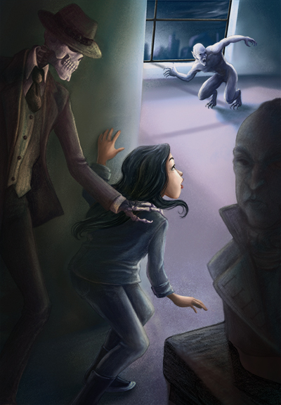
        I will have to work on the perspective but the overall composition is ok I think. what do you think?
        0_1491750732702_valuecomp.jpg
        I'm going to refine my sketch now
        (why oh why do I always make complicated illustrations??? )
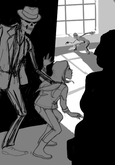
        website: https://audreydowling.wordpress.com/
        twitter: https://twitter.com/audreydowling
        facebook: https://www.facebook.com/Audrey-Dowling-Artist-Illustrator-498582176906242/timeline/?ref=bookmarks

        1 Reply Last reply Reply Quote 1
        • audrey dowling
          audrey dowling last edited by audrey dowling

          and now
          0_1492012334862_valuecomp.jpg
          a far cry from the first sketch already 😃
          do you see any mistake in the perspective and values?
          because of the value structure, I'm tempted to make the final version black and white. what do you think?

          website: https://audreydowling.wordpress.com/
          twitter: https://twitter.com/audreydowling
          facebook: https://www.facebook.com/Audrey-Dowling-Artist-Illustrator-498582176906242/timeline/?ref=bookmarks

          Tyson Ranes 1 Reply Last reply Reply Quote 2
          • Tyson Ranes
            Tyson Ranes @audrey dowling last edited by

            @audrey-dowling this has really great depth with your tone and lighting. Cool!

            audrey dowling 1 Reply Last reply Reply Quote 1
            • audrey dowling
              audrey dowling @Tyson Ranes last edited by

              thanks @Tyson-Ranes 🙂

              website: https://audreydowling.wordpress.com/
              twitter: https://twitter.com/audreydowling
              facebook: https://www.facebook.com/Audrey-Dowling-Artist-Illustrator-498582176906242/timeline/?ref=bookmarks

              1 Reply Last reply Reply Quote 0
              • Rapteev
                Rapteev last edited by

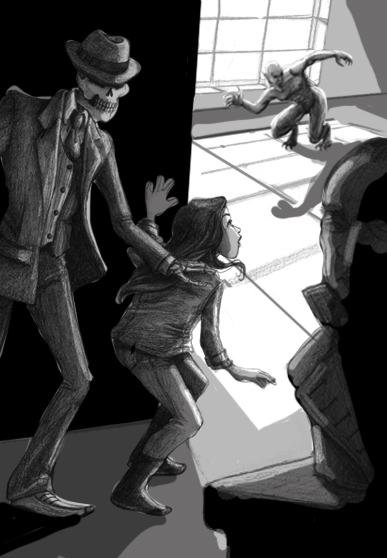
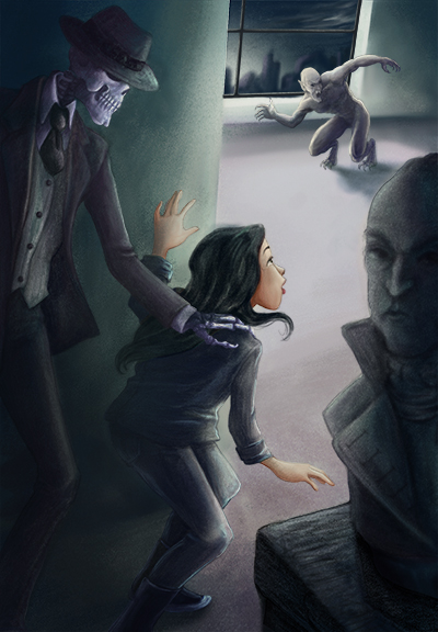
                I love the strong values you've got going on here. Really sets the mood well. My only criticism would be that I think Skelly's intent would be more readable if he was looking at her, and not in the direction of the viewer/bust. Imagine if you were pulling a child away from a hot stove- you'd be looking at the kid as you did it.

                audrey dowling 1 Reply Last reply Reply Quote 1
                • audrey dowling
                  audrey dowling @Rapteev last edited by

                  that's a good point @Rapteev , thanks
                  now I have to learn how to draw a skeleton's profile 😃

                  website: https://audreydowling.wordpress.com/
                  twitter: https://twitter.com/audreydowling
                  facebook: https://www.facebook.com/Audrey-Dowling-Artist-Illustrator-498582176906242/timeline/?ref=bookmarks

                  1 Reply Last reply Reply Quote 0
                  • Bob Crum
                    Bob Crum last edited by

                    This is shaping up to be a nice story! Well thought out for sure.
                    You asked, in a thread above, if there were any issues with perspective so I thought I would throw something together (I don't have my Cintiq in the office today so the pen tool will have to do).
                    0_1492104555396_1492012342206-valuecomp_jpg___100___Shape_19__RGB_8___.png
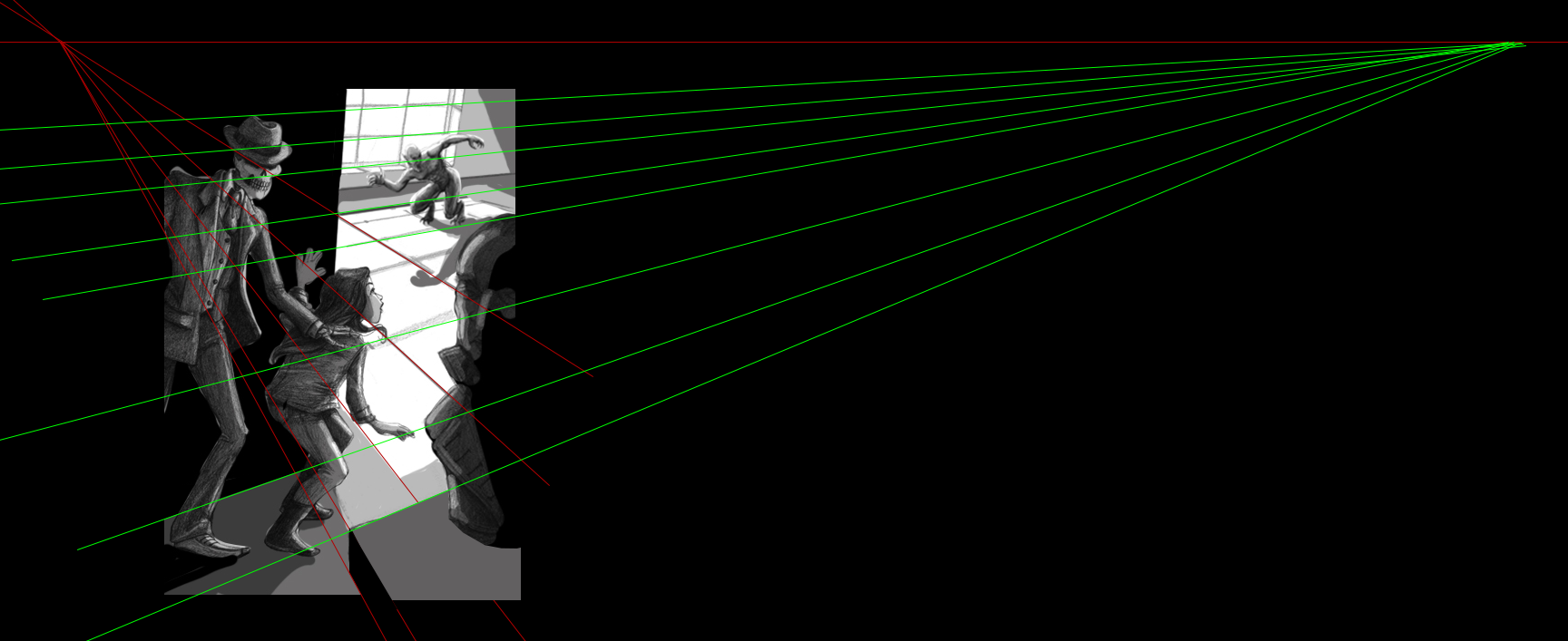
                    I increased my canvas size to WAAAYY out there - so i could find your vanishing points. I'd say that, for the most part, you have a pretty consistent piece here! BUT I had to take issue with the furniture in the foreground and the wall behind the skelly and girl. Using the points that I extrapolated from your exiting lines, I fixed the pieces. I think it is much more believable now.
                    Also, you mentioned that you might leave it black and white... while I LOVE the idea of starting all my paintings with tones of black and white, I feel that adding color typically deepens the perception of quality (and perception is reality to clients). To that end, I put together a triptych of the composition - left (before) - middle (after) - right (two colors).
                    0_1492104837883_1492012342206-valuecomp-1_jpg___100___Shape_14__RGB_8___.png
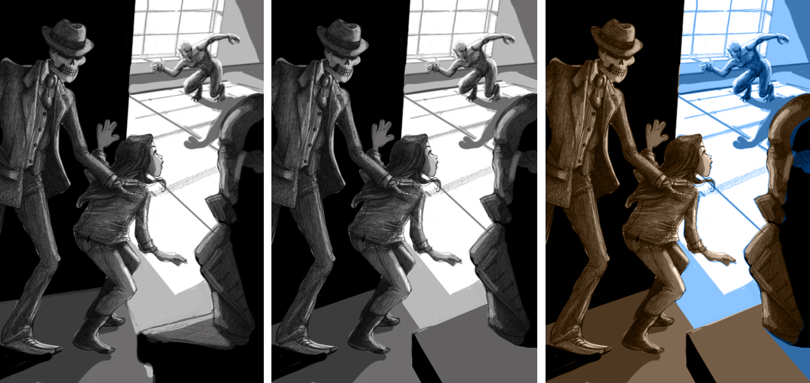
                    You can see that just adding two colors to the composition makes it more dramatic. I can feel the moonlit interior of the room because it is contrasted with a warm foreground. This even gives you a neat opportunity to make a light blue highlight on the edges of the figures, thus defining them even more in the composition.
                    Wordy as it may be, I hope you found this a little helpful - I like your piece a lot or I would not even try.
                    Good luck!

                    audrey dowling 1 Reply Last reply Reply Quote 1
                    • audrey dowling
                      audrey dowling @Bob Crum last edited by

                      thanks for your advice @Bob-Crum ! it's very right and interesting
                      I'm also considering doing it (almost) monochrome. I will try a few colour themes and see which looks best

                      website: https://audreydowling.wordpress.com/
                      twitter: https://twitter.com/audreydowling
                      facebook: https://www.facebook.com/Audrey-Dowling-Artist-Illustrator-498582176906242/timeline/?ref=bookmarks

                      1 Reply Last reply Reply Quote 1
                      • audrey dowling
                        audrey dowling last edited by audrey dowling

                        This is where I am so far. Still a lot to do
                        I'm hanging on to it but I'm going through a rough patch at the moment. I feel a lifetime away from the rendering quality I would like to achieve. It's like I aim too high every time and the end result is far from what I had envisaged...
                        Also I always get to a point in the coloring where I feel like I don't have a clue what I'm doing
                        it's so disheartening 😞
                        0_1493399566062_wip.jpg

                        website: https://audreydowling.wordpress.com/
                        twitter: https://twitter.com/audreydowling
                        facebook: https://www.facebook.com/Audrey-Dowling-Artist-Illustrator-498582176906242/timeline/?ref=bookmarks

                        1 Reply Last reply Reply Quote 2
                        • Rapteev
                          Rapteev last edited by

                          Audrey, it's great! You're being too hard on yourself. I've said it before, and I'll say it again: those horrible feelings of inadequacy, nine times out of ten, reach their climax immediately before a level up. It's a consequence of seeing things you didn't see before, and a huge indicator that your eye for polishing is developing well. I guarantee there will have been a point in your art journey where you'd have looked at that piece and thought "Never in a million years will I be that good." And yet, here you are, being that good!

                          1 Reply Last reply Reply Quote 1
                          • audrey dowling
                            audrey dowling last edited by

                            thanks for the reminder @Rapteev . you're completely right and I've known that already but we tend to forget about it when we see everything black. thanks for the boost!

                            website: https://audreydowling.wordpress.com/
                            twitter: https://twitter.com/audreydowling
                            facebook: https://www.facebook.com/Audrey-Dowling-Artist-Illustrator-498582176906242/timeline/?ref=bookmarks

                            Rapteev Tyson Ranes 2 Replies Last reply Reply Quote 0
                            • Rapteev
                              Rapteev @audrey dowling last edited by

                              @audrey-dowling I think we all have those days 🙂

                              1 Reply Last reply Reply Quote 0
                              • Tyson Ranes
                                Tyson Ranes @audrey dowling last edited by Tyson Ranes

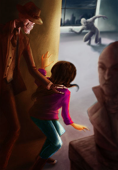
                                @audrey-dowling I took your graphic and warmed up the foreground a little and slightly blurred background. I really like this composition and the only tweaking I saw off the bat was creating more depth with contrasting warmer foreground with cooler background, also points of high contrast in the foreground where you want to draw the viewers eye makes it pop more as well and less contrast in the background. I just selected the foreground and tweaked it in the adjustments on Photoshop. 0_1493524186089_SVSForumFriend2.jpg

                                Will Terry 1 Reply Last reply Reply Quote 0
                                • audrey dowling
                                  audrey dowling last edited by audrey dowling

                                  you're right in what you say @Tyson-Ranes
                                  the difficulty is that the scene happens in the dark. It's at night, the museum is closed, they're sneaking in and the vampire guards the place, so no light is on. Their clothes are also black. It makes the warm light implausible. That's why I tried to work on a monochrome palette
                                  I wonder what artists go for in cases like this: do they stick to what the book says or do they deviate to make the image look better? I'd be very curious to know what you think and advise, instructors @Will-Terry @Jake-Parker @Lee-White ?

                                  website: https://audreydowling.wordpress.com/
                                  twitter: https://twitter.com/audreydowling
                                  facebook: https://www.facebook.com/Audrey-Dowling-Artist-Illustrator-498582176906242/timeline/?ref=bookmarks

                                  Tyson Ranes 1 Reply Last reply Reply Quote 1
                                  • Tyson Ranes
                                    Tyson Ranes @audrey dowling last edited by

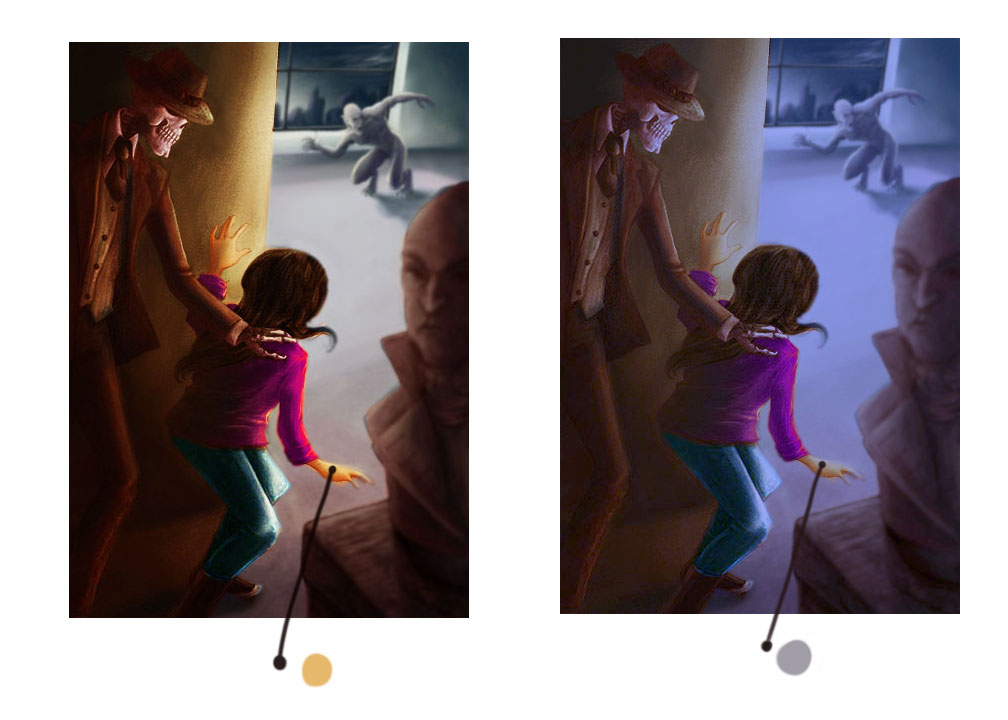
                                    @audrey-dowling your right! The warm color is out of place for this environment and doesn't look right for this setting. I don't know what year this illustration is supposed to take place in but if it's current allot of buildings up to code have to have exit lighting which has a faint glow or sometimes night lighting.i am stumped as to the solution and I have a couple things I'm working on now one in peticular that has sat unfinished because of it and I really like it so I know how it can be a little frustrating getting down the road with these things! You are awesome God bless you!

                                    1 Reply Last reply Reply Quote 0
                                    • Will Terry
                                      Will Terry @Tyson Ranes last edited by

                                      @Tyson-Ranes Hi Audrey - You can still have warm tones that are actually cool. All color relationships are relative to the colors they appear with in an image. It's hard to believe that the grey tone is the top of her hand in the second image but it's true. All the colors are "glazed" cool in cool light. I hope this helps. 0_1493740476685_1493524193217-svsforumfriend2.jpg

                                      SVS Instructor
                                      http://willterry.com/

                                      1 Reply Last reply Reply Quote 3
                                      • audrey dowling
                                        audrey dowling last edited by

                                        thanks for your answer @Will-Terry
                                        that's what I have been struggling to find for the last few days (the right warm-cool colors), not completely realizing I was, but god, colors are hard for me!
                                        I'll explore some more

                                        website: https://audreydowling.wordpress.com/
                                        twitter: https://twitter.com/audreydowling
                                        facebook: https://www.facebook.com/Audrey-Dowling-Artist-Illustrator-498582176906242/timeline/?ref=bookmarks

                                        1 Reply Last reply Reply Quote 1
                                        • audrey dowling
                                          audrey dowling last edited by

                                          does this work better?
                                          0_1493817380006_wip2.jpg

                                          website: https://audreydowling.wordpress.com/
                                          twitter: https://twitter.com/audreydowling
                                          facebook: https://www.facebook.com/Audrey-Dowling-Artist-Illustrator-498582176906242/timeline/?ref=bookmarks

                                          1 Reply Last reply Reply Quote 3
                                          • Laurie
                                            Laurie last edited by Laurie

                                            Just chiming in at the end.... @audrey-dowling your illustration looks great - the changes in lighting you have made are fascinating....don't really have anything helpful to add - i struggle with the lighting and color issues in my own work.

                                            www.lmuggliart.com
                                            www.instagram.com/lmuggliart/
                                            www.facebook.com/LMuggliArt/

                                            1 Reply Last reply Reply Quote 1
                                            • First post
                                              Last post