Reworked piece after Wills critique
-
After the Youtube critique session from Will terry's channel , I've reworked this piece its for a new storybook.
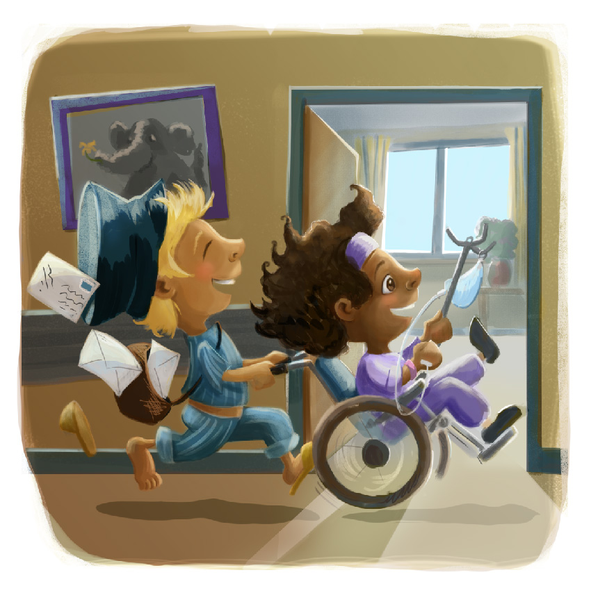 version 1
 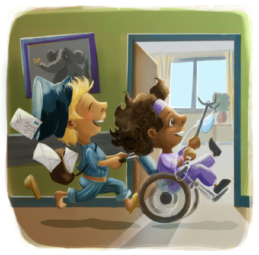 version 2. let me know what you think...
Leontine
"A picture is worth a thousand words."https://leontineillustrator.com
https://www.instagram.com/leontine.illustrator/
http://www.facebook.com/leontineillustration -
Beautiful!
-
@Leontine - wow its amazing how a few small changes have such a nice impact. Looks great Leontine!
-
It is a lovely piece ,saw the critique video, it is very interesting the difference a few small changes can make.
-
The changes are a great improvement on what was already a lovely illustration! I do have 2 suggestions...1) add subtle fingers to the girl's hand holding her IV--like the boy's toes. And 2) try a different color for the walls. I know Will suggested green, and green is a better choice than your tan color, but this green feels a little too sickly for a hospital. I suggest trying a pale blue-green. Color pick the doorframe and then desaturate and lighten it. Make sure it isn't as blue or as saturated as the boy's pjs. You could even explore putting a darker shade under the wainscoting...as long as it doesn't blend too much with the boy's pjs. It really is a lovely illustration!
Twitter: @Joy_Illustrated
Instagram: joy_illustrated
Website: joyheyer.com -
That background made a big difference with how the blonde one pops out! Nice work!
-
Very fun piece love the action!
I think overall the color palette has a lot going on with several very saturated and dark colors. I'd probably start by collecting reference images of children's hospital wings to see what they do. Brightening up the walls and choosing a less saturated green will help the characters stand out. Also the trim being the same color as the boy's pjs makes his pants kind of blend into it. If you squint at this image the character silhouettes get lost in the background. I'm not sure how you work in Photoshop (if that's what you're using) but I would usually separate the characters from the background so that I could play with other options, color shifts, etc, easily.
-
@Joy-Heyer @natiwata Thanks for the suggestions! I think I will rework it again. Personally I am really not happy with the outcome. There's just something not right. But we learn by trial and error, so I am sure in the end it wil work out.
Leontine
"A picture is worth a thousand words."https://leontineillustrator.com
https://www.instagram.com/leontine.illustrator/
http://www.facebook.com/leontineillustration -
@Leontine I personally find it very hard to go back to finished pieces, But If we care about what we do, we figure out whats wrong and give it another try. So I hope you don't mind me adding a couple points here.
Iit really helps if you know what are the light sources that are in play here. The way you have your shadows now and the green tone looks like it has a warm light?lamp that we would light up during the night. Does it help tie up the story moment with your previous scene (what is on the previous page of the storybook)?
I agree that a green colour is probably not a good choice for a hospital. So maybe make it a bright daylight scene where everything is under a neutral, diffused light since its bright daylight outside and have the walls be paler and brighter?
Also, is the photo frame behind the mail boy really important? This moment is about these two kids, and everything else is stage dressing. My eyes keep going to the intersection of his hat and the photo. I would play with the size of the size, shape and color of the photo frame too, and maybe try a bright color instead of the grey, very subtly, that will help uplift the image more, especially if you are going with a paler wall.
Lastly, the wheel you added is not matching up on the left and right edge.
I wish you all the best and Looking forward to the next version!
-
@Nazuba Thank you for your comments. I will recolor the illlustration because I really don't like the way it is now. Ill take the lightening tips with me as I recolor. Thank you again!