A forgotten Pirate
-
Happy Easter guys

Any harsh criticism and feed back from you guys will be much appreciated thank you XD.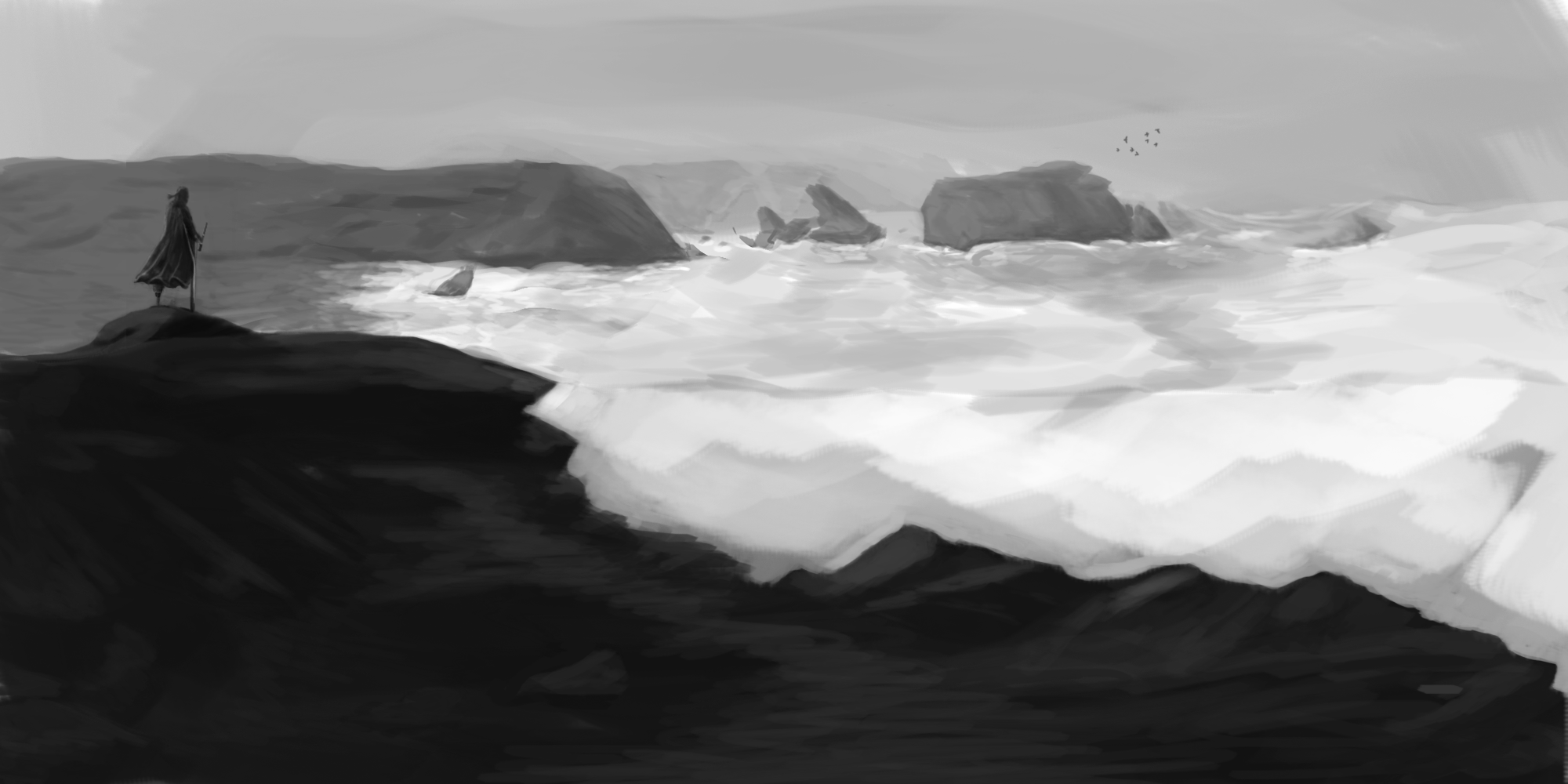
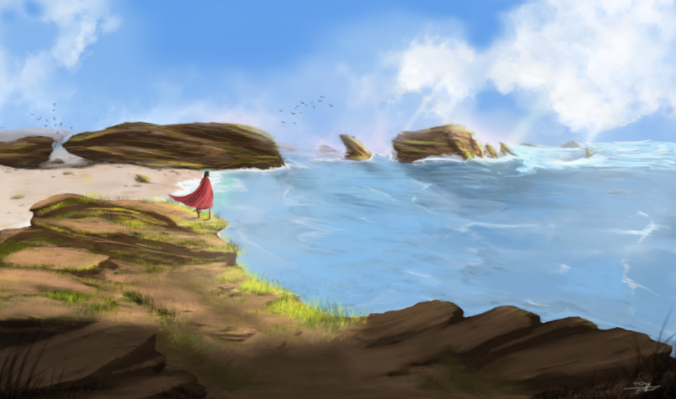
Colored:
-
Hi Sami, I really like this piece... I really like the mood of the b/w version.
I see the composition of the two has changed slightly between the b/w and the coloured version. My one thought would be, for me, some of the energy of the sea has been lost between the b/w and coloured, maybe? Given how much his cloak is blowing in the coloured version I'd probably expect to see a little more evidence of waves/choppiness on the sea. You have some of this in the right hand most part of the sea, but it drops away very suddenly just below the rocks...
I do really like the colour palette used. There's a really pleasing richness to it...
I grew up in the southwest UK near the coast and so this type of scene is close to my heart - also who doesn't like pirates :). The good kind of pirate that is, not the nasty kind though
") And of course, the rum!
And of course, the rum!Anyway, just some thoughts - others might have some better suggestions
— James H —
-
I love the colours you've chosen. The biggest issue I have is that he looks like he's on stilts. I get that he's a pirate, so a peg leg would communicate that message well, but it reads like both of his legs are not actual legs, which confuses me a bit. The left leg reads as a peg leg, but the right one looks like a stilt. Next I would say that the form on the rocks he's standing on is a bit confusing. The depth is just ever-so-slightly off. I think it's your edges causing that. Other than that, I really like the composition and the clouds are awesome. I think it just needs tightening a bit, but you're so close!
-
Hello, my two cents worth. I like the first composition - the forgotten pirate looks more lonely when silhouetted against the sky. Also, I think the black and white adds a lot of drama, the second scene the colors are almost cheerful. And finally, I would lighten the background behind the pirate in the b&w piece - he will pop more as a dark figure against a light background. Cool piece.
-
Hi, really cool piece so far, very dramatic. I agree with @Rebecca-Hirsch about the first composition being stronger. In the first one he's contrasted against he sky and doesn't flow with the curve of the landscape, which kind of hides him in the second.
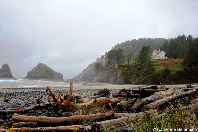
I also think the colors could add a lot more impact, especially with that great red cloak. I live near the Oregon coast and I pictured that bw image being colored in a pallet like we have here. See reference image:
Good stuff!
Nat Iwata
www.iwataillustration.com -
@JamesH
Thank you so much for your feedback, i am sorry for my late reply tho!
i agree with you totally, the sea in the first piece is more present and powerful, i will be working on that for surethank you
-
@Rapteev thank you
I can see what you mean exactly, i am gonna work on the legs for sure cause like you said it's kinda weird for two legs to be wooden
also i think i am gonna reconstruct the form of the rocks so it looks more naturalthank you for your advises
-
oh thank you, i am gonna light the background behind the pirate for sure that's an awesome advise thank you so much, and i agree the first piece is more dramatic, for some reason colors made it look more vivid and cheerful!.
thank you.
-
@natiwata
thank you for your feed back
and your right the first competition is stronger,
thank you for reference pic i think i am gonna repaint the peice based on the mood in the reference you provide thank you