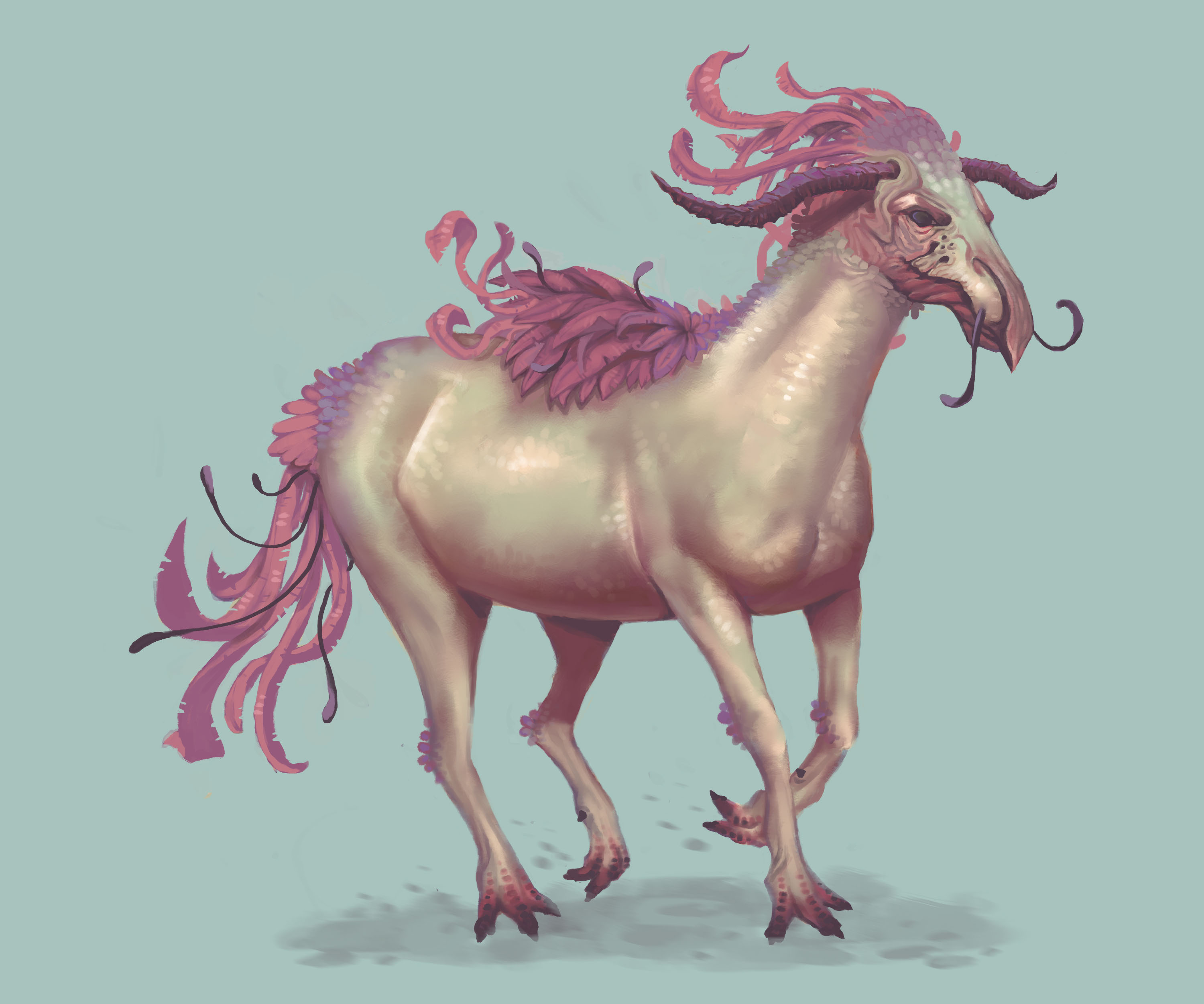
creature illustration
-
Hi people, This is a recent illustration I did of an alien horse creature. I'm quite happy with it though I feel like I could have exaggerated the form/anatomy a lot further. I have yet to add a background too.

http://lilyhosegood.deviantart.com/art/Alien-Horse-541840989
-
Impressive! I love the rendering of it and the color palette. I agree, I think in order to make it feel a little more alien you should exaggerate some forms. But then again, change it up too much and it's not a horse anymore.
-
@Jake-Parker Thank you
 yeah, I'll try to push the forms a bit while still keeping it readable as a horse like creature. I suppose it's just about finding a good balance.
 -
This is really sweet and really creative. I suggest taking the color and light class. It is I think the most helpful--actually toss up between that and the mastering perspective class...regardless--you should take the class then try this same design again and see how much you improve, then post both pics as a before and after...I know my eyes were opened after taking the time to learn...
-
Beautiful color and design here. Your brush strokes are very nice and controlled.
If I could add any suggestions, it would be two things. First, the mane, tail, and head appear to be painted slightly sharper than the body, which makes them feel pasted on a little bit. I'd just add some sharper shadow strokes from the head and mane detail being cast on the body to unify them. The next thing deals with anatomy. That back hip to leg anatomy seems off a bit. It could be that the leg is coming forward and it's just hard to show that well. I would move his right back leg back which would do two things. It would give you a more dynamic pose (you typically don't want both legs doing the same thing) and it would make that anatomy much easier to draw.
The way you painted the head is GORGEOUS! I wouldn't mind seeing that as an image by itself in your portfolio.
-
Lily, what are your twitter and instagram handles, I want to share this on our company social media.