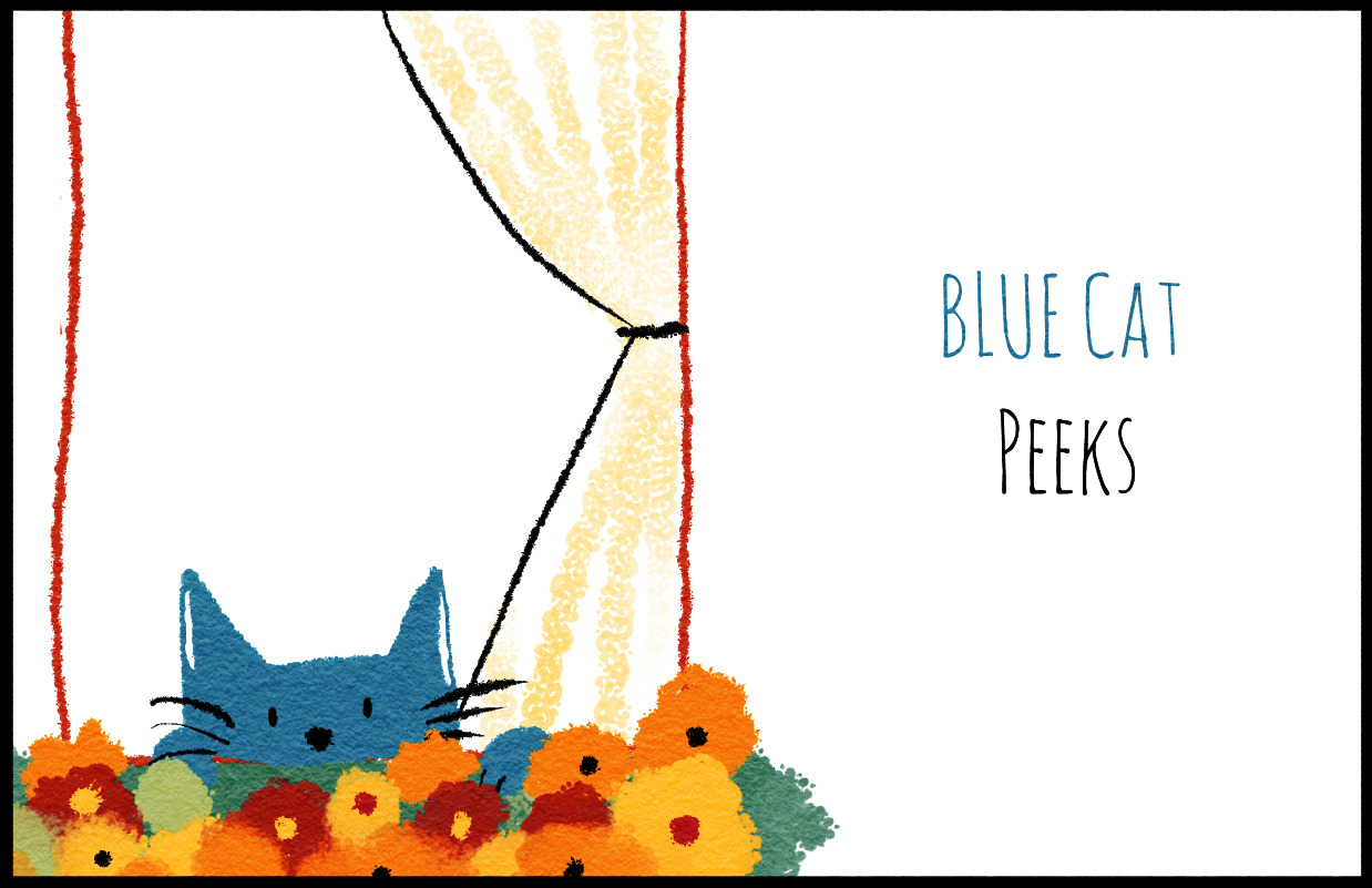
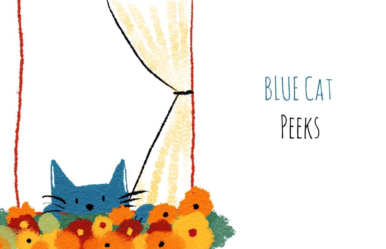
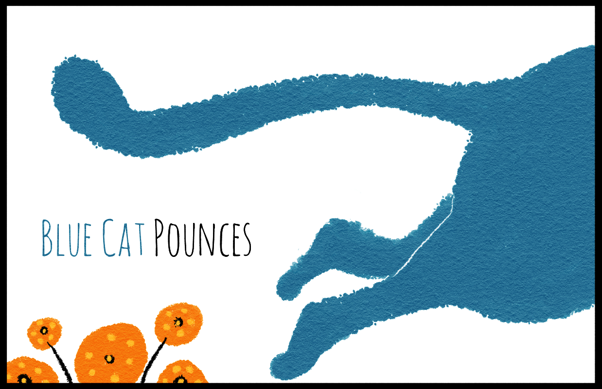
Society of Visual Storytelling

    SVSLearn Forums

    • Register
    • Login
    • Search
    • Recent
    • Tags
    • Popular
    • Users
    • Groups
    • Search

    Sketching Blue Cat

    Sketchbook
    8
    20
    3348
    Loading More Posts
    • Oldest to Newest
    • Newest to Oldest
    • Most Votes
    Reply
    • Reply as topic
    Log in to reply
    This topic has been deleted. Only users with topic management privileges can see it.
    • Charlie Eve Ryan
      Charlie Eve Ryan Pro SVS OG last edited by Charlie Eve Ryan

      Sketching Blue Cat
      I should have a border on these.

      0_1492723662339_Catbluewindowvase4sm.jpg

      0_1492723694641_BlueCatPeekssmall.jpg

      Happy Creating
      www.charlieeveryan.com

      1 Reply Last reply Reply Quote 6
      • Eric Castleman
        Eric Castleman last edited by

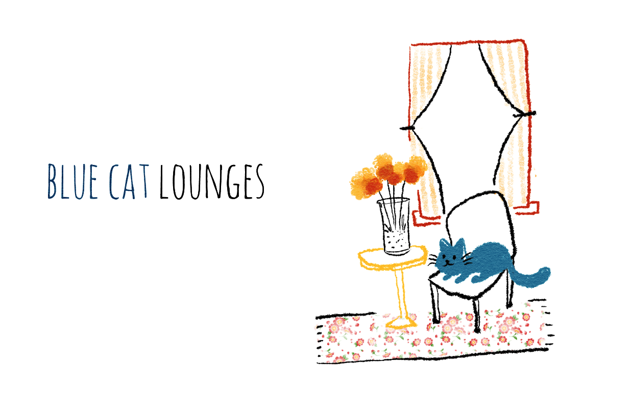
        This is real good. The simplicity yet obvious intention is very good.

        EricCastleman.com

        SCBWI profile
        https://www.scbwi.org/members-public/eric-castleman

        Charlie Eve Ryan 1 Reply Last reply Reply Quote 1
        • Charlie Eve Ryan
          Charlie Eve Ryan Pro SVS OG @Eric Castleman last edited by

          @Eric-Castleman Thanks Eric 😃

          Here it is with a border this time.

          0_1492780412791_BlueCatPeekssm2border.jpg

          0_1492780565945_BlueCatPouncesSmBorder.jpg

          Happy Creating
          www.charlieeveryan.com

          1 Reply Last reply Reply Quote 2
          • Charlie Eve Ryan
            Charlie Eve Ryan Pro SVS OG last edited by

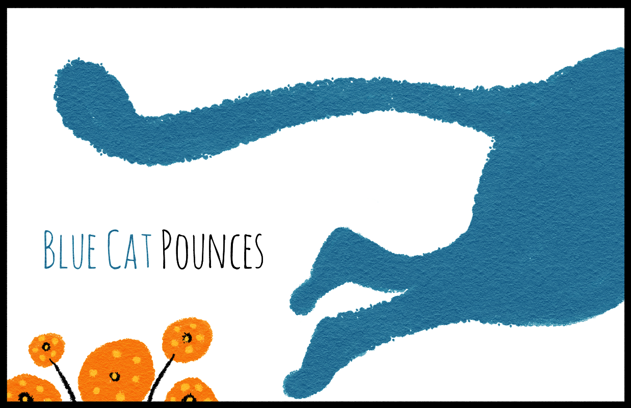
            Tried to fix the legs on the blue cat pounce with a better reference and separating the legs with a thin white line and help define the shape.

            0_1492782047827_BlueCatPounces3bordersm.jpg

            Happy Creating
            www.charlieeveryan.com

            1 Reply Last reply Reply Quote 2
            • Eric Castleman
              Eric Castleman last edited by

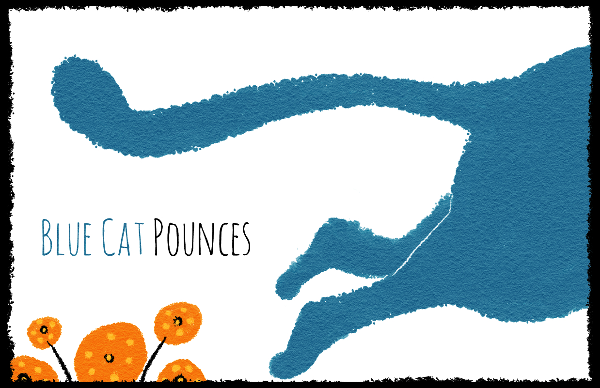
              Have you tried making the border with the same ink texture you are using on the flower stems? Idk if it would work out better or not, but it might be interesting to see.

              EricCastleman.com

              SCBWI profile
              https://www.scbwi.org/members-public/eric-castleman

              Charlie Eve Ryan 1 Reply Last reply Reply Quote 0
              • Charlie Eve Ryan
                Charlie Eve Ryan Pro SVS OG @Eric Castleman last edited by

                @Eric-Castleman Nice idea...here it is. I think it's a good call, feels more natural to the scene. What do you think?

                I may try on the other pieces too.

                0_1492786167963_BlueCatPounces3border4texSMALL.jpg

                Happy Creating
                www.charlieeveryan.com

                Rich Green 1 Reply Last reply Reply Quote 2
                • Sarah LuAnn
                  Sarah LuAnn SVS OG last edited by

                  I like the textured border, but it does call more attention to itself than the plain one did. Hmm.

                  I always love your texture. So distinctive. I see it and say, "OH! Charlie did that one."

                  sarahluann.com

                  Charlie Eve Ryan 1 Reply Last reply Reply Quote 1
                  • Rich Green
                    Rich Green SVS OG @Charlie Eve Ryan last edited by Rich Green

                    @Charlie-Eve-Ryan Hi Charlie Eve - roughing up the border definitely was a good call - looks so much more cohesive this way! One thing that does not quite fit is how thin you made the line to separate the cats legs. I am wondering if it might look better just a little bit thicker and with the same sort of texture that is on the edges of the cat? As right now its the only thing that thin/smooth in comparison?

                    www.richgreenart.com instagram.com/richgreenart/

                    1 Reply Last reply Reply Quote 1
                    • Eric Castleman
                      Eric Castleman last edited by

                      Yes, I like that!

                      EricCastleman.com

                      SCBWI profile
                      https://www.scbwi.org/members-public/eric-castleman

                      1 Reply Last reply Reply Quote 1
                      • Charlie Eve Ryan
                        Charlie Eve Ryan Pro SVS OG @Sarah LuAnn last edited by Charlie Eve Ryan

                        @Sarah-LuAnn Thanks so much Sarah, that is very kind. I love your textures and line too, very distinct style. I may try some more textured borders. I like the look of them but borders can be a pain when printing. 😛

                        @Rich-Green and @Eric-Castleman Thanks, guys!

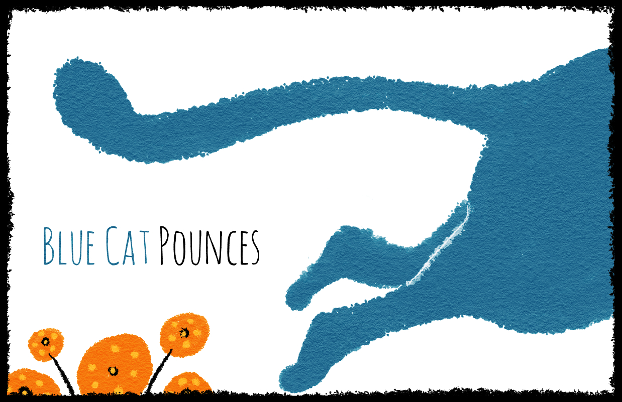
                        Here is one with a texture white thin line. I like the naturalness of it but not sure it defines the shape enough. Maybe if I use that thin line in other pieces in this series it won't look at out of place. Hmm

                        0_1492790922156_BlueCatPounces3bordertex2sm4small.jpg

                        Happy Creating
                        www.charlieeveryan.com

                        1 Reply Last reply Reply Quote 1
                        • Eric Castleman
                          Eric Castleman last edited by Eric Castleman

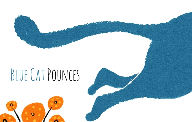
                          Here is my attempt. I think your shapes have more true form and your texture is free, so when you make a line cutting through to define contrast you want the same rules to apply. So an intentional line with free texture.

                          0_1492794467808_C8B2B103-D4ED-4850-8A52-54E45089F320-285-00000028CA447FBE.png

                          EricCastleman.com

                          SCBWI profile
                          https://www.scbwi.org/members-public/eric-castleman

                          Charlie Eve Ryan 1 Reply Last reply Reply Quote 2
                          • Charlie Eve Ryan
                            Charlie Eve Ryan Pro SVS OG @Eric Castleman last edited by

                            @Eric-Castleman Ohhh, I like that!

                            Happy Creating
                            www.charlieeveryan.com

                            1 Reply Last reply Reply Quote 1
                            • natiwata
                              natiwata SVS OG last edited by

                              Really nice simplicity yet appealing design! Is this for your new book?

                              Nat Iwata
                              www.iwataillustration.com

                              Charlie Eve Ryan 1 Reply Last reply Reply Quote 1
                              • lmrush
                                lmrush Pro SVS OG last edited by

                                love love your work-thanks for sharing!

                                Lisa Rush
                                www.lisarushgallery.com
                                www.facebook.com/ArtbyLisaRush/
                                www.instagram.com/lisarush11/

                                Charlie Eve Ryan 1 Reply Last reply Reply Quote 1
                                • Charlie Eve Ryan
                                  Charlie Eve Ryan Pro SVS OG @natiwata last edited by

                                  @natiwata Thanks Nat! This is a BB idea I am working up and freshening up my portfolio.

                                  Happy Creating
                                  www.charlieeveryan.com

                                  1 Reply Last reply Reply Quote 0
                                  • Charlie Eve Ryan
                                    Charlie Eve Ryan Pro SVS OG @lmrush last edited by

                                    @lmrush Blush, thanks!!

                                    Happy Creating
                                    www.charlieeveryan.com

                                    DanetteDraws 1 Reply Last reply Reply Quote 1
                                    • DanetteDraws
                                      DanetteDraws @Charlie Eve Ryan last edited by

                                      @Charlie-Eve-Ryan Beautiful work, as always!

                                      My graphic designer side is SO loving your layout and type treatment too (it's hand-lettered I take it?). Especially the 'Blue Cat Pounces' spread - the layout is wonderful! And I really like @Eric-Castleman's solution to the white line separator.

                                      Just wondering - is the black border supposed to be a graphic element on the page, or just to define where the page edges would be since the background is white? If it's the latter, I'd suggest going back to the simple smooth line, but make it much, MUCH lighter/thinner. There's far too much attention drawn to it right now. On all of my own white background pieces I'll make the stroke about a 50% grey and I think it's around a .25" thickness (for example, one of mine). That way, you can see where the edge of the page is, but it doesn't call attention to itself.

                                      https://danettebyatt.com
                                      Twitter @DanetteDraws
                                      Instagram @DanetteDraws

                                      Charlie Eve Ryan 1 Reply Last reply Reply Quote 2
                                      • Lee White
                                        Lee White SVS Team SVS Instructor Pro SVS OG last edited by Lee White

                                        Great!

                                        And you are right about the border! Are you trying to give me a heart attack??!!! thanks for including it in the next posts. ; )

                                        SVS Faculty Instructor
                                        www.leewhiteillustration.com

                                        Charlie Eve Ryan 1 Reply Last reply Reply Quote 2
                                        • Charlie Eve Ryan
                                          Charlie Eve Ryan Pro SVS OG @DanetteDraws last edited by

                                          @DanetteDraws Thanks so much, Danette. 😃 The font is called Amatic. I don't have a graphic designer background but I do like playing with simple shapes, space, and text. I really should take a class on it at some point. I would probably enjoy it.

                                          Great tip on the border too, I'll try that!

                                          Happy Creating
                                          www.charlieeveryan.com

                                          1 Reply Last reply Reply Quote 1
                                          • Charlie Eve Ryan
                                            Charlie Eve Ryan Pro SVS OG @Lee White last edited by

                                            @Lee-White Lol I thought of you the second it loaded. I know you are itching to fix that first post!!

                                            My tablet Clip Studio Paint program background is charcoal gray so everything looks "framed" when I paint it and then I post it to a white background and the whole design gets lost. Grr, sorry 😃

                                            Happy Creating
                                            www.charlieeveryan.com

                                            1 Reply Last reply Reply Quote 0
                                            • First post
                                              Last post