Progress from 2014
-
Hello everyone!
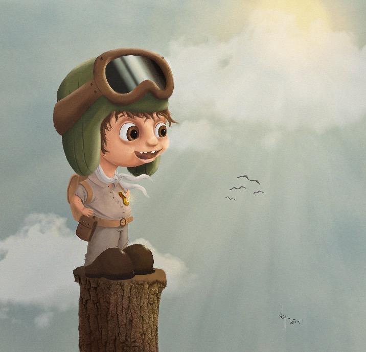
I recently came across a painting I did in 2014, and I remember at that time I was reallllly proud of myself! But of course I learned a lot in the past 3 years (in great part because of SVSlearn) and I quickly started sketching a 2017 version of the same painting. I am debating if I should continue working on it or not, so I thought I would share it here and see if you have any comments. I feel it might be a little boring...
2014
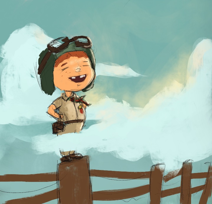
2017
-
So much improvement! I love the second version!
If it feels boring, I think it might be the lighting. Everything has a slight glow, but overall the light source is a little dull/neutral. If you pump up that sunshine to really get a brilliant glow, I think the atmosphere will feel more airy and bright!
Here's a similar lighting situation from Pascal Campion, if that helps.

I love the free, youthful excitement you captured in that cute lil face!
-
@MissMarck Thanks!! I will definitely try this. I LOVE Pascal Campion, definitely one of my favorite artist
")
-
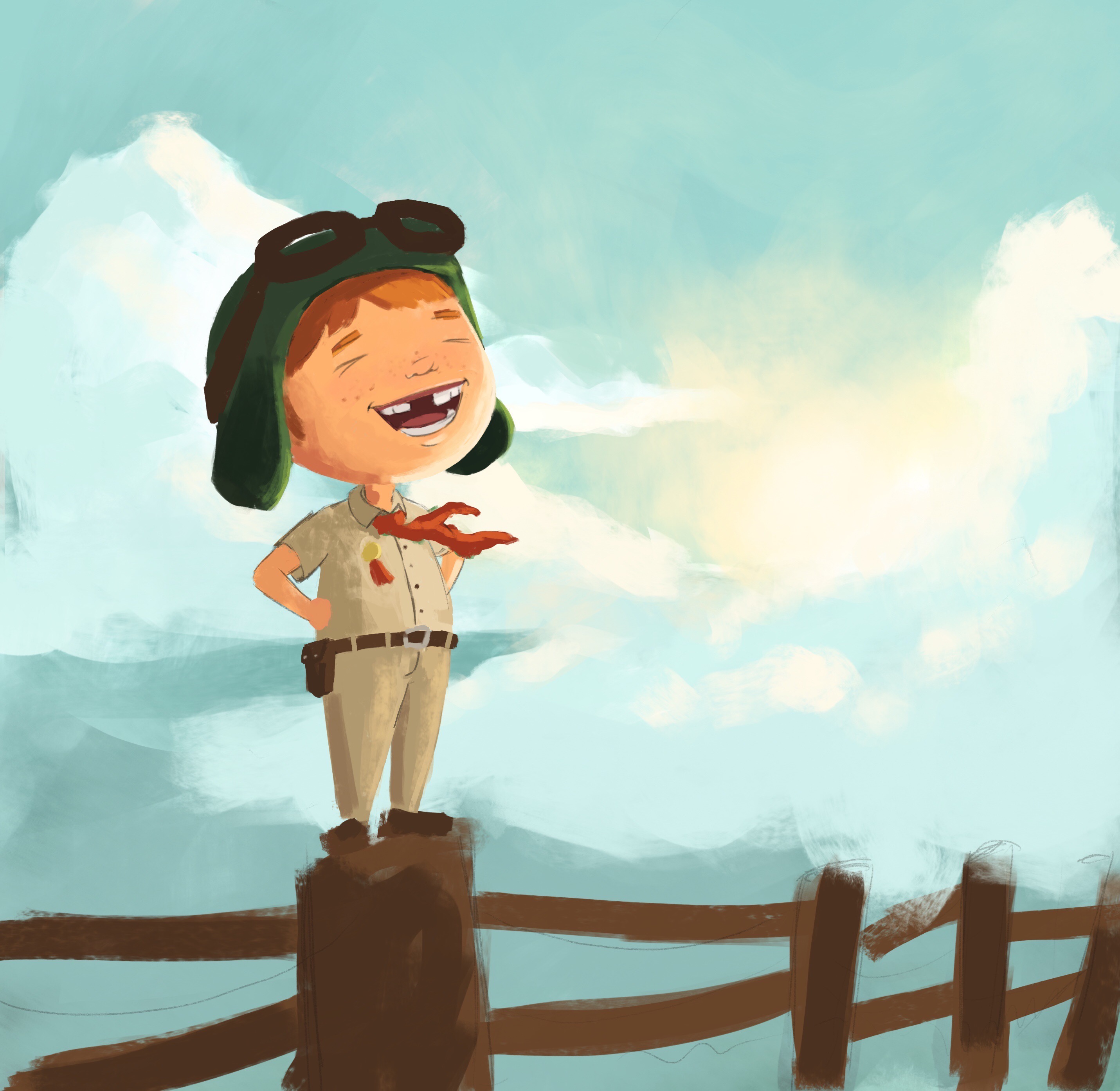
I worked a little more on it (still very rough). I am trying to focus on light and colors (one of the areas I am struggling with the more). Let me know what you think
-
Very nice! It's been great seeing all your work!
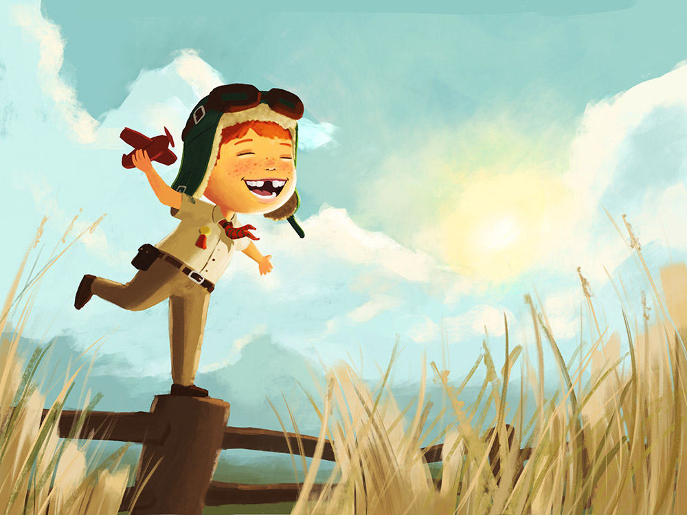
The color looks great! The character design is cute! But that pose has to go! Take your hand and block out the characters head so you can only see the body. You will see that his gesture is standing straight up and down and doesn't have much life to it. You are doing all the story telling in the facial expression. I make my animation students color all their characters in so they are only a silhouette. This takes away the face and leaves only the gesture.
With that said, you need to think about who this kid is. How would he stand? Would he be off balance? Would he actually be sitting on the fence post? or balancing? You see where I am going with it. There is so much you can do here with that pose to add to the story telling.
I look forward to seeing what you come up with. : )
SVS Faculty Instructor
www.leewhiteillustration.com -
@Lee-White You are so right! I was focusing so much on improving the execution that I completely forgot the first principle you guys are always focusing on " STORY!" At least is was still very rough, so not hard to change!
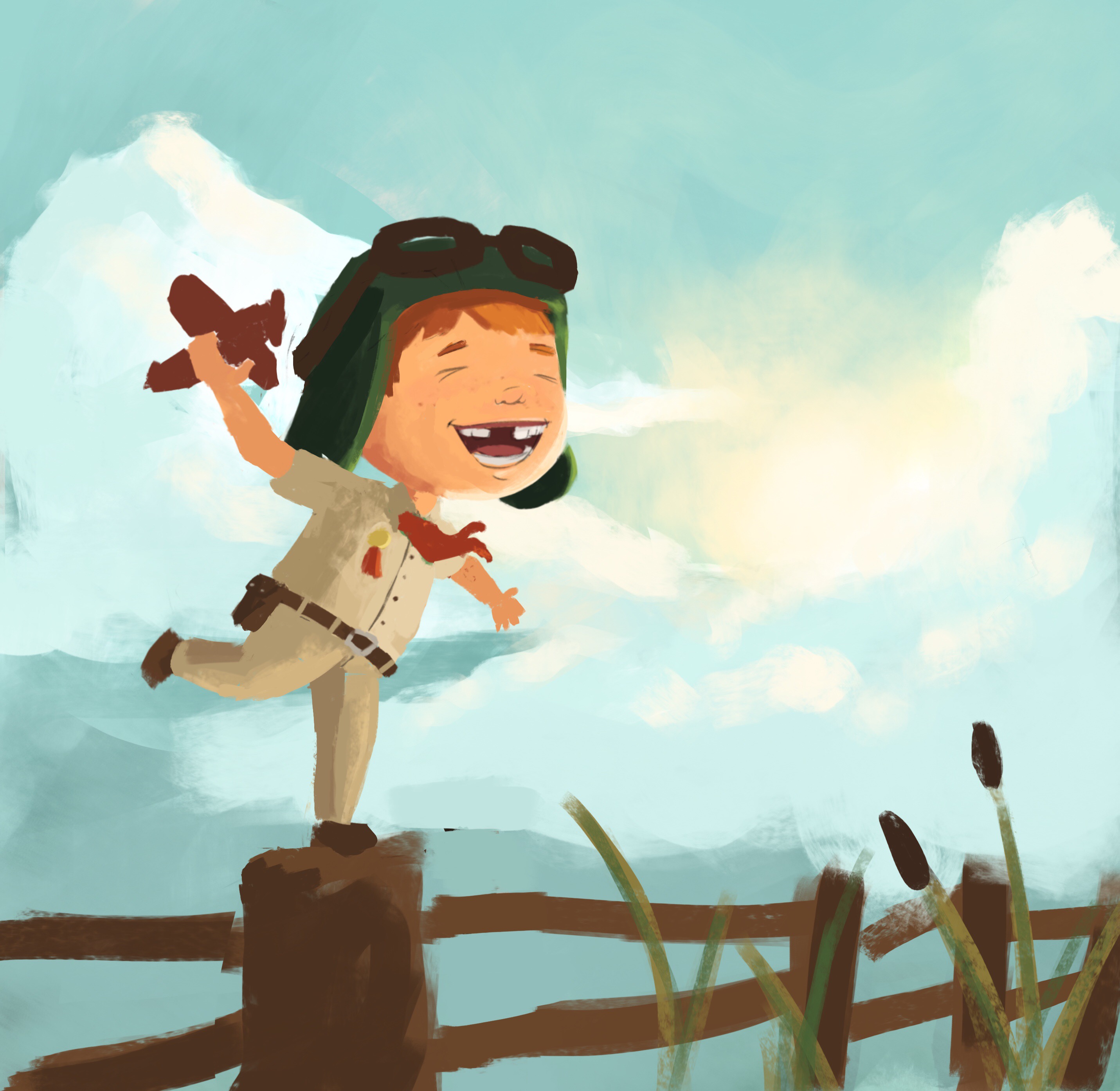
I reworked it this morning. Since my little explorer is wearing an aviator hat I decided to push this aspect, give him a plane and make him think he is flying!
I included long grass in the foreground, I am not sure if it works, but I want the viewer to know that the post he is on is not high, he is just imagining that his head is in the clouds.
Thanks again for the comment!
-
This newest one is SO CUTE!! The new pose and the lighting give it so much atmosphere and personality!
-
#nailedit
-
Adorable!
Such a clear story now. Love the colours you have in the sky, too. -
Here is where I am now! I was really encouraged by @Lee-White #nailedit so I decided to push this piece further and maybe try to get a portfolio piece out of it. I decided to change the square format because it felt a little awkward. Also, I looked at Lee's website and noticed that he has NO square images. So I decided there is probably a good reason behind this and changed the format to a "landscape" format (if anyone has an opinion about square images, I would love to hear it!)
I will continue to share updates
Any critique is welcomed!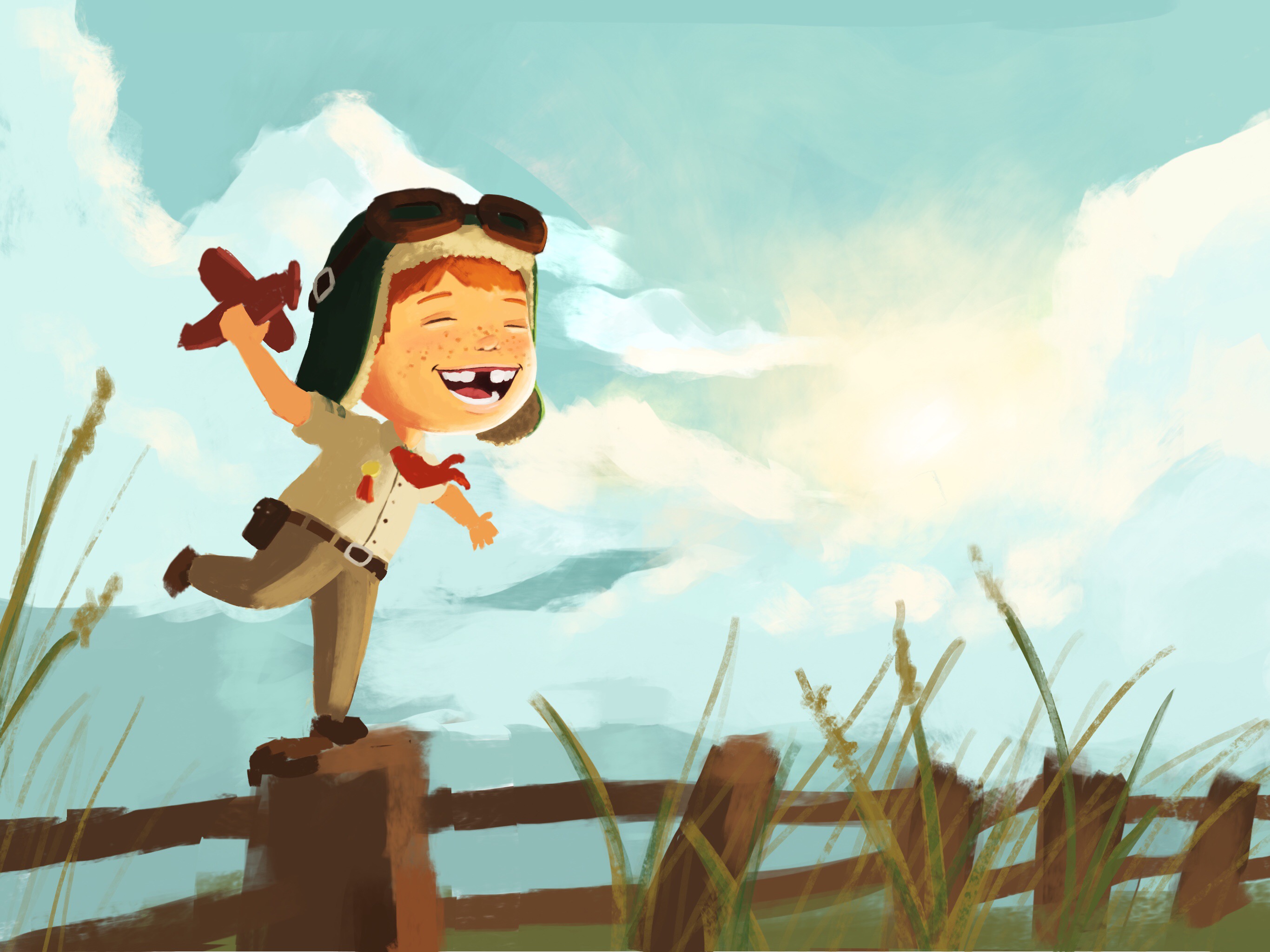
-
In this particular case, I think the landscape helps a lot. Square images are fun design challenges, but this definitely looks good as a landscape!
Love, love where this image is going! -
So fun to see the improvement! I've been wanting to come back to an old piece and rework it in order to see the comparison, because I always love to see the comparison. Someday...
-
Another update!
Any tips on how I can improve it ?! Did I went overboard with the grass ?!
Thanks!
-
@MissMarck Thank you so much!!
-
@Sarah-LuAnn I have a few that I would like to rework, let see if I have the courage to do so!
-
Hi @NoWayMe - absolutely love the latest update! The warmth from the colour palette is brilliant and the modified pose definitely makes the illustration more dynamic! It really makes me believe the character is a dreamer with big ambitions!
Just a small thought – to my eye the gap in his teeth doesn't look quite right? It looks very slightly too big for 1 tooth and slightly too small for 2 teeth?
I really like the grass as you have it now, and really really like the sky... definite positive comparison with Pascal Campion (also one of my absolute favourites too)
Good Work!
— James H —
-
@JamesH Thanks James! You're right for the gap between the teeth! Now it's bugging me too, I'll definitely fix it!