New painting I'm working on
-
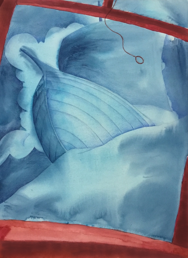
This is a new piece I am in the middle of, and am debating on adding a character into it digitally ( nightmare). Do you think this piece stands on its own design wise? I was thinking along the lines of emphasizing seeing a huge whit crashes on the waves while,looking out the window. Sorta akin to something by Chris Van Allsburg., where you see just a boat in the sky. Any thoughts?
-
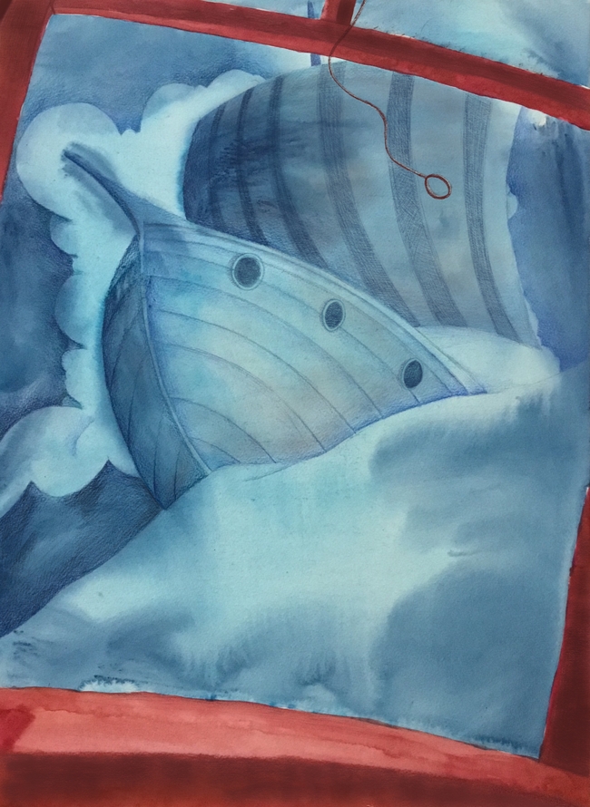
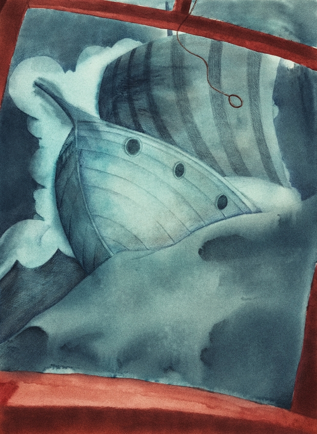
Put some more details onto it.
-
Nice angle and color contrast, and really nice watercolor textures. I understand it is a work-in-progress, but at the moment the value contrast is really low - it's all medium range, apart from the bottom part of the frame, so there is no dynamic in the values to match the dynamic of the image.
I do feel it needs a focal point of sorts: at the moment it feels very empty, like a background. It does not need to be a character: it could be a particularly violent wave, or a bird flying over the storm, or a piece of broken mast falling...something that makes up the focal point of the image... -
@smceccarelli thanks for your input.
Here is a question I have been wondering: what determines where the darker values should be in a picture? I usually always have the darker values upfront, and it go lighter as it reaches back, but sometimes I see that it is the other way around. Do you know what this is called, or how to determine when to have the values switched up?
-
I think what you are talking about is atmospheric perspective - at least that is the real life phenomenon that makes everything in the background lighter and with less contrast than the foreground. But in illustration things can get less "realistic" for a variety of reasons. Making everything in the front dark and almost like a silhouette is a technique introduced by Disney in animation, to achieve depth of field (the feeling of a 3D space) on the screen. The theory is, your eyes would register the presence of a foreground object but move past it, to concentrate on the interesting stuff going on in the mid ground. That definitely works, but is not always applicable. I believe the most important principle is that the focal point is your master. It must stand out in terms of contrast, color saturation, amount of detail/texture or sharpest edges, or any combination of those, or all together. The rest of the image is subordinate to that. So if contrast is your guiding principle, your focal point must have the highest contrast - wether it is light on dark or dark on light.
The best discussions around this are in Gurney´s book "Color and Light" - he goes into great depth around the subject of value and value contrasts...or Loomis´ "Creative Illustration". -
@smceccarelli wow
 !!!! You always knock it put of the park! Thank you for the great explanation!
 -
I'm trying.....I can't believe I am this much trash with color and value. Before coming to SVS, I would have never thought I sucked at it, but I never realized that I mainly did black and white comic stuff, and single characters on a piece of paper with no environment. I need to find some monk who is a master of color and live with him in the hills somewhere.
I am going to study the color and light class again.
-
When it is a single character without backgrounds and foregrounds I think I handle color rather well. @smceccarelli
-
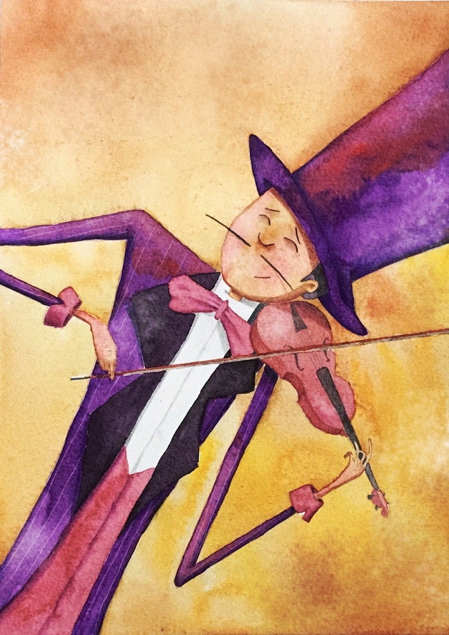
Indeed, this iis a beautiful piece with a nice complementary color scheme! The way I was told, in characters the focal point is invariably the face. My thesis mentor showed me a trick that I still use today: at the end of a painting I put a soft mask around all faces and selectively increase saturation and contrast with an adjustement layer on the faces. Just very subtly, but it does help in most cases.
I use curves or levels adjustments on almost all illustrations anyhow - normally not at the end but after the first pass. This has thought me a lot about value contrast by itself..
I think this illustration does not need any of that, it´s nice and rich by itself. The only thing I notice is that the attention is drawn to the bow and the violin because they have a lot of details, while the face is very simple, so it comes in second in terms of attention. I think this is fine though, because they are all very close together.. -
@smceccarelli Great trick!
-
I think if you had some subtle shift in colour between the subject and the background, it would help pop it off the page a little more. Even if you desaturated the background a teeny bit. I'd just have a play with it in Photoshop until you find some semblance of harmony that you like. Most of my best stuff comes from just messing around with various buttons-- I like pressing buttons when I don't know what they actually do. It's a rock 'n' roll lifestyle I lead.
")
-
@smceccarelli yes, I agree with you. I think Irivelle is really good at what you are talking about. In fact, I watched her video on faces while doing this one. However, I just need to get better at predicting how the colors will look when they dry, because the face had much more attention drawn to it before the reds in the face faded a bit.
-
@Eric-Castleman Hi, its a nice idea:-) Iam guessing that your brown window is a part of a boat, right? Then I am not sure about its shape. It seems to me, that upper part doesn't fit the bottom part. Bottom part shows the roundness of the boat, but the top part seems to be bend other way. I might be wrong, but thats how it looks to me. I also thought that it could look cool with a few tiny people on the boat. This would create some focal point.
")