-
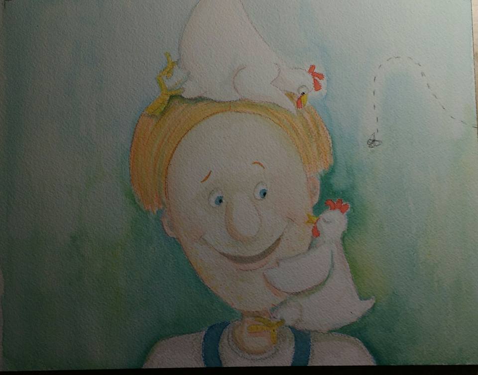
I've been playing with colors, etc. (just what I already had n my palette. Used a little prismacolor too. I think it needs a bit more contrast but I think I basically like the colors so far. Input?
Marsha Ottum Owen
-
@Marsha-Kay-Ottum-Owen Love seeing you doing value checks and studies like this Marsha! All of your hard work is really paying off and things are looking so nice!
-
@Rich-Green Thanks for your support, Rich
")
-
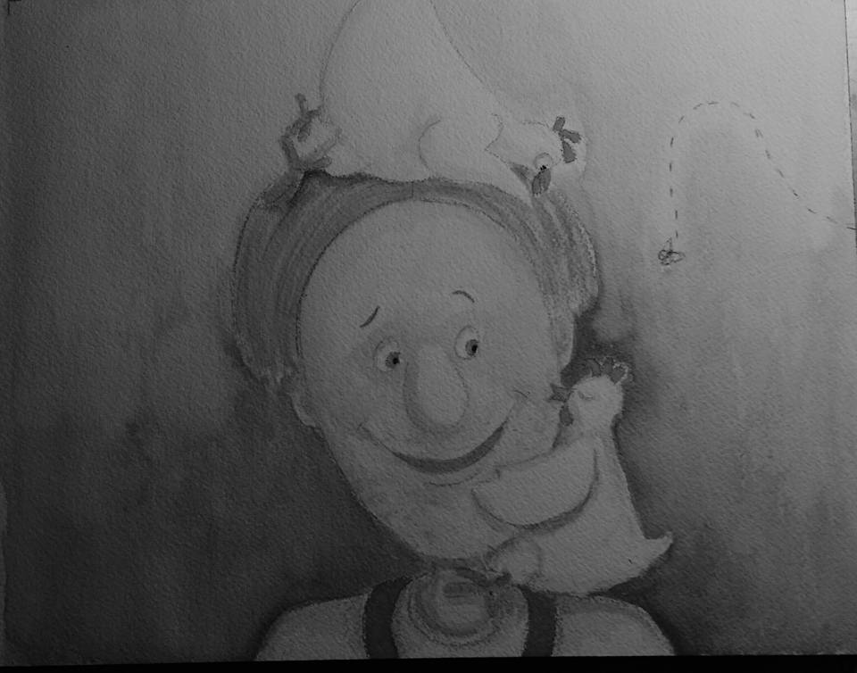
Yeah, I agree, that value study is paying dividends! Use Jake Parker's trick and bring the photo up in Photoshop, then desaturate it. You'll be able to see if the values are working in the way you'd hoped. I think you're right, it does need some more contrast, but it definitely looks like it's heading in the right direction, and the palette is lovely.
-
@Rapteev Thank you for the input. I don't really know how to do photoshop-I'm old school but the black and white photo is really helpful for me. Still haven't started my real painting on the pages...I think I will be doing it next week though. Trying to do some reviewing first