3rd Thursday For September
-
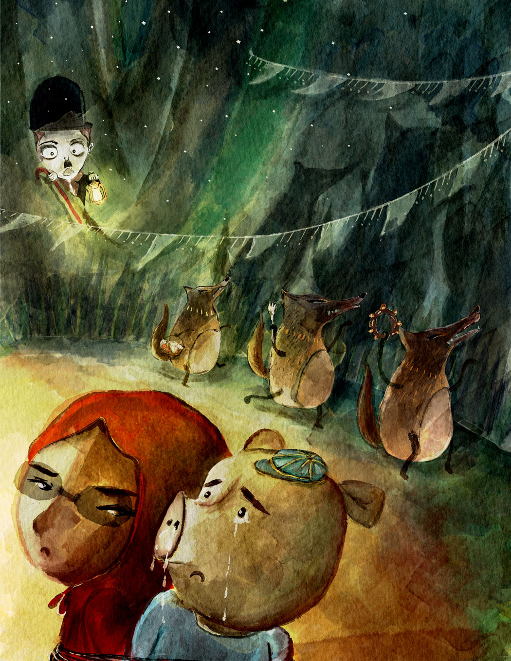
@Naroth-Cow I love how this is turning out -- the color and texture, and the expressions of the characters really bring your concept to life. I love the pig's drippy nose

I might suggest changing something about the rope binding the two foreground characters, so that it's not parallel to and flush with the bottom of the page. I think if you had it more askew, so that it got more cropped off on the pig side, we would still get the impression that they were bound together.
-
@Maile-McCarthy I see what you mean there I'm going to change it a bit. I never had the rope in the first place then I added one, I guess I might not need it at all. Thank you for the advice!!!
-
Here my one more take on the piece.

-
Oooh...they are going all out! Party flags and everything! Red looks so mad, i love it hehe!
-
Really great work!
-
@Lynn-Larson @Steve-Young
Thanks guys I want to add some color to the flags but hopefully it's not to much of attention grabbing. Is it ok that we use 3rd Thursday piece for portfolio? -
@Naroth-Kean yes, that's one of the objectives to make pieces for your portfolio.
-
@Naroth-Kean I'm loving this. The wolves' shadows read so much better now.
-
Looks so good @naroth-cow!
-
@Rich-Green Thanks a lot Rich!