New (ish) piece.
-
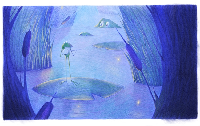
I've always wanted to do something with multiple light sources and fireflies. This is somewhat along that vision. However, I really am stuck on the background part of the image and trying to figure out if another color might help push the foreground a bit more.
-
@Eric-Castleman I like the dreaminess of the piece. And that banjo playing frog is great!
I did a very quick paint over to give some food for thought.
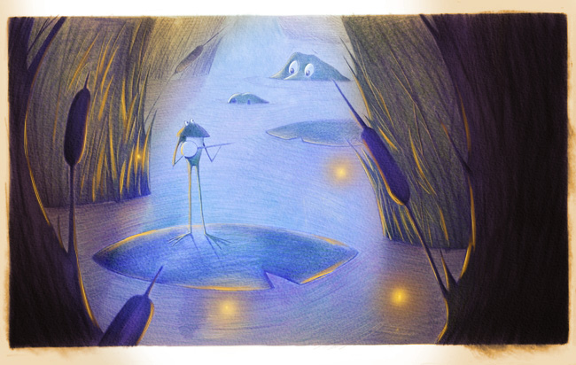
Basically, I treated the foreground as a comfy little cove that is lit by the fireflies. Since they are orange and are a light source, they are lighting everything within the cove according to their orangish glow. The foreground is darkened to contrast it with the moonlight/ambient light of the background where the crocodile/alligator is at (since there are fireflies, I'm assuming it is night or at least twilight), which is in the blue, purple, green hues.
Maybe I darkened it more than is necessary or than you wanted and similarly I may have made it more orange than you wanted, but I wanted to push it far enough so that you can see it.
I think that the composition could be pushed a little further in an angular & offset way. It might enhance the looming danger if the eye-line from the frog to the crocodile/alligator is more angled and if the foreground-midground-background foliage are a little more jagged/offset from one another (though, that could become distracting if done too much). Also, If this is meant to be a 2-page spread, the 2 main characters are riding pretty close to the seam down the center.
Hopefully this helps give you some thoughts! Love what you are doing already!
Scott Monaco | QuietYell.com
IG/FB/LI: @QuietYell
IG-2: @QuietYellSketches
TW/PIN/BEH/DEVART: @ScottMonaco
SCBWI: http://bit.ly/1r8Dmqr -
@QuietYell love your take on it. It definitely highlighted some areas to add more light. Thanks for your time, I really appreciate it!
-
@Eric-Castleman Sure! Glad to throw some thoughts into the mix! Look forward to seeing what you do!
-
@Eric-Castleman Hi, If you want to listen to the opinion of newbie, then these are my comments
")
- its a very nice idea I like your subtle bluish version of colours
- in my eyes, middle and background join together too much, as values are very similar, so you might want to darken the middle more
- i find it disturbing that one of the water sticks (water grass or whatever you call it, sorry for my English;-) is touching the crocodile
- I agree with @QuietYell that crocodile could be turned more into direction of the frog
- perhaps you could make the frog bigger and see how it looks? Its not easily noticeable
Have a nice day!
- its a very nice idea
-
How nice! I am working on a 'firefly' piece aswel. Its hard putting in the right colors because night time is deceiving. The 'croc?' in the background is attracting much attention, perhaps tone him down a bit? Scott certainly has given it a push, perhaps you can use his suggestions? Good luck!