Society of Visual Storytelling

    SVSLearn Forums

    • Register
    • Login
    • Search
    • Recent
    • Tags
    • Popular
    • Users
    • Groups
    • Search

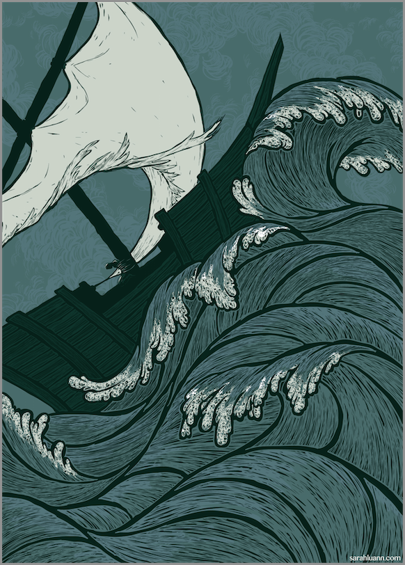
    Ship in a stormy sea

    Illustration
    18
    29
    12822
    Loading More Posts
    • Oldest to Newest
    • Newest to Oldest
    • Most Votes
    Reply
    • Reply as topic
    Log in to reply
    This topic has been deleted. Only users with topic management privileges can see it.
    • Rob Smith
      Rob Smith last edited by

      Really great line work and technique! I like the clouds better in this last version. Some of your other sketches were great as well. I would explore some of those options as well.

      1 Reply Last reply Reply Quote 0
      • Steve Young
        Steve Young last edited by

        This is looking really good, I would highlight the waves a little, and add some shadow to them as well, so they pop.

        Never give up, always push yourself two steps further than you believe you can go.

        1 Reply Last reply Reply Quote 0
        • Maile McCarthy
          Maile McCarthy @SarahLuAnn last edited by

          @SarahLuAnn I keep flipping back and forth between the old and new images. It's so hard to decide, but I think I prefer the newer version with the grouped clouds.

          Twitter @MaileMcCarthy
          www.mailemccarthyillustration.com

          1 Reply Last reply Reply Quote 0
          • Jason Goss
            Jason Goss last edited by

            Love the work, that texture is so satisfying, the only comment I would make is in regards to the way the sail passes through the man tied to the mast, it appears to be a part of him. It feels like a tangent... maybe you could attach the sail to the mast? That way the sail still carries the eye down to the man? Beautiful work either way!

            1 Reply Last reply Reply Quote 0
            • Ben J Hutchison
              Ben J Hutchison last edited by

              have you ever checked out Yuko Shimizu's work? She was what I first thought of when I saw this. BTW, what portions are by hand and what are digital or is it all digital? I do think the clouds add something but at the same time everything else on the page is lined in black. The sky does need something....

              http://www.benjhutch.com | https://instagram.com/benjhutchison/ | https://twitter.com/benjhutchison |

              1 Reply Last reply Reply Quote 0
              • Naroth Kean
                Naroth Kean last edited by

                This has turn out so nice I always admire people who can awesome line work because I suck at it.

                http://narothkean.com
                https://twitter.com/narothkean
                https://www.instagram.com/narothkean

                1 Reply Last reply Reply Quote 0
                • Sarah LuAnn
                  Sarah LuAnn SVS OG last edited by

                  I am familiar with Yuko Shimizu's work, I follow her on tumblr. I'm flattered that this reminded you of her work!

                  I go back and forth a lot between digital and physical--I don't have a cintiq, just a tablet, so the actual drawing parts are easier for me with pencil and paper. So my process starts with thumbnails on paper, I scan those and enlarge my favorite thumbnail, print that out, draw in more details, scan that in, make any needed fixes, print a pale version which I ink over, I scan THAT in, put the scanned inked drawing into illustrator, and then I do the full colored detailed version there. So ultimately the final piece is all in vector, which is really nice for re-sizing and such 🙂 And I end up with a lot of physical printed-then-drawn-over versions of the picture, which I just stick in a box, for lack of anything better to do with them.

                  As far as line work goes, I was terrible at it not so long ago and I'm still trying to get better. A brush pen helped me a lot to vary my lines and give them a more natural flow.

                  sarahluann.com

                  1 Reply Last reply Reply Quote 0
                  • Rich Green
                    Rich Green SVS OG last edited by

                    I really love how this piece turned out @sarah-luann! The moody blue really catches my eye. And all of the detailed line work in the waves is stunning. I think your process is really working for you so keep up the great work!

                    www.richgreenart.com instagram.com/richgreenart/

                    1 Reply Last reply Reply Quote 0
                    • Thrace
                      Thrace last edited by

                      This piece is just beautiful, great job!

                      1 Reply Last reply Reply Quote 0
                      • Sarah LuAnn
                        Sarah LuAnn SVS OG last edited by

                        Thanks! I wasn't entirely satisfied with the clouds in that last version, so I made a few little changes and called it done. This is the final version:
                        Screen Shot 2015-09-03 at 8.54.39 AM.png

                        sarahluann.com

                        Maile McCarthy Fabienne 2 Replies Last reply Reply Quote 3
                        • Maile McCarthy
                          Maile McCarthy @Sarah LuAnn last edited by

                          @Sarah-LuAnn I love how this turned out! I think it was worth all that trial and error with the clouds: not too busy, not too flat. It's amazing that you can create a sense of clouds receding into the background with just line.

                          Twitter @MaileMcCarthy
                          www.mailemccarthyillustration.com

                          1 Reply Last reply Reply Quote 0
                          • Steve Young
                            Steve Young last edited by

                            Well done, pat on the back!

                            Never give up, always push yourself two steps further than you believe you can go.

                            1 Reply Last reply Reply Quote 0
                            • Naroth Kean
                              Naroth Kean last edited by

                              very nicely executed!

                              http://narothkean.com
                              https://twitter.com/narothkean
                              https://www.instagram.com/narothkean

                              1 Reply Last reply Reply Quote 0
                              • Fabienne
                                Fabienne @Sarah LuAnn last edited by

                                @Sarah-LuAnn Just have to say: Excellent! I love the the impression from linocut prints.

                                1 Reply Last reply Reply Quote 0
                                • johntatulliart
                                  johntatulliart @Sarah LuAnn last edited by

                                  @Sarah-LuAnn I love this all the way through the process. Only thing i wish is that the man tied to the mast was bigger so they could become a bigger part of the "stormy" emotion I am feeling. Love it.

                                  www.johntatulli.com

                                  1 Reply Last reply Reply Quote 0
                                  • Jonathon B
                                    Jonathon B last edited by

                                    Somehow I missed this entire thread, which is a bummer cause these are DOPE! Nice job. I love your woodcut look. The only thought I have (and this may totally be unecessarily picky) is I kind of want to see the back of the boat go completely off the page. That little shape between the wave and the boat is drawing my attention for some reason. Anyway it's a killa illu-stration.

                                    https://www.facebook.com/JonathonBeeBaker

                                    1 Reply Last reply Reply Quote 0
                                    • First post
                                      Last post