Treehouse WIP for critique :)
-
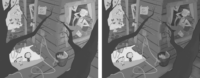
@NoWayMe To be honest, I see the guy first. Any one else? I think if you made that side slightly darker, with less contrast, it might help, though I'm not the greatest at values.
Something like this. Original is on the left.
-
I think I see the guy first - he is the biggest and has the biggest contrast.
Apart from that, you are crunching your value range. That can be a conscious choice (there are many wonderful pieces that only use a fraction of the value range), but here you may miss an opportunity to control your focal points. Here is an histogram of your values: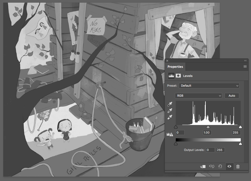
Basically, the darks (on the left) and the lights (on the right) are not populated at all. Here is what happens if you use all the range (basically, I stretched your value range so that the darks get darker and the lights get lighter - left is the original. As you can see, the effect of crunching the value range in the mid tones is like putting a haze on the picture.
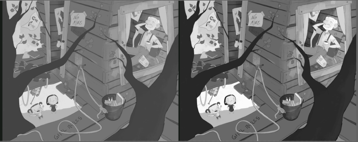
You should not do this over the whole picture, as I have done - it was just to show the effect of using the whole range. If you extend your value range only where you want the focus, you can make it pop much better.
-
Excellent tip @smceccarelli !!! Thanks!

Thanks @TessW and @Charlie-Eve-Ryan !
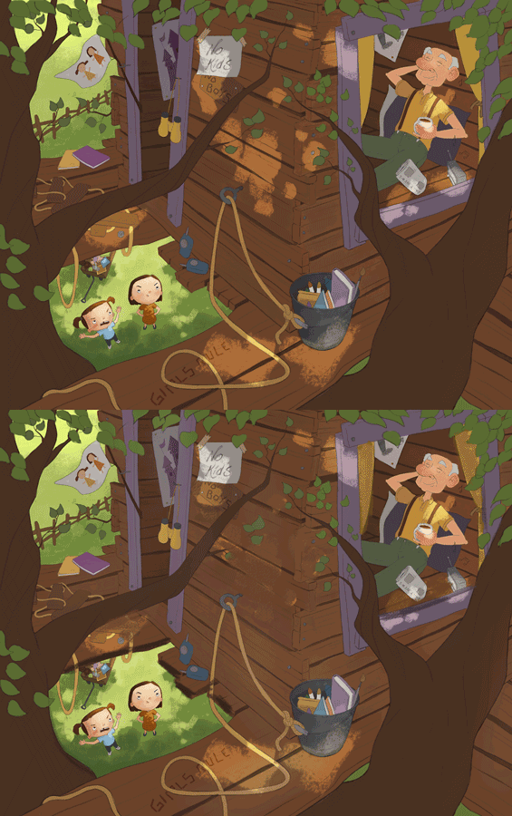
There is probably not one correct answer to this question, but do you think I should try to have the grandpa as a second read or is it working better if he stays the first read ? I like what @TessW did with the shadows, however I was planning to add dappled light so maybe it will increase the focus on the grandpa even more...
Any thoughts ?!
Thanks! -
I see the grandpa first too. I like what @TessW did too. I think having Grandpa as a second read is great. If it was the other way around I don't think it is as funny.
-
I like the values in the last one on the right that Simona posted. With higher contrast.
-
Hi everyone!
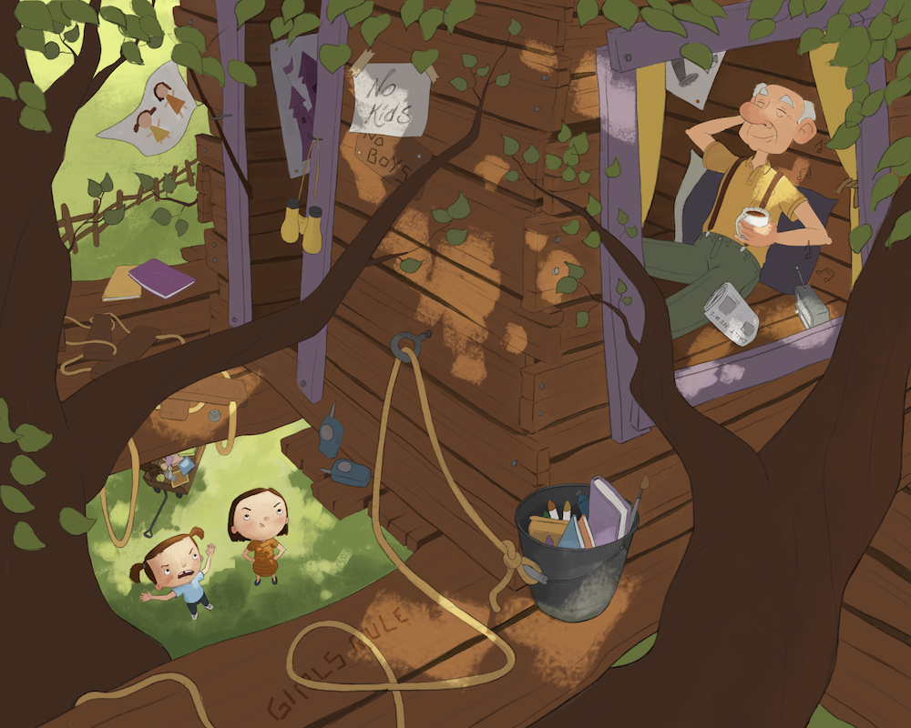
I am in the final stages of this, but I wanted you opinion on lighting.
I like the dappled light, but I am afraid it is too distracting. If I want the lighting to work, I kind of have to go with dappled light since it's what would most likely happen in a tree. Do you feel it's too distracting ?Also, do you see anything else I should modify ? I still have to add details to grandpa and rework the girls a little.
Thanks!
-
@NoWayMe Hmm, tough one. I think if you added some shadow to the edge of the boards surrounding the girls, it would bring more attention to them. I also think that if you eliminate that strong dappled light patch in the middle, it will allow us to go back and forth between your two focal points better. I'm also wondering how it would be to bring up the value of the tree house a little bit? Not sure if it would improve the piece or not.
It's really shaping up! You're almost there!

-
@NoWayMe I like it! The eyes closed and teh hand behind the head looks very relaxed!
-
I like what @TessW mentioned about the shadows on the boards around the girls. Also, if you are going to use the dappled light, I think it needs to be brighter, about as bright as the lightest grass color. I assume this is to be a sunny day, and as large as those patches are, that would be full sunlight coming thru. Right now, the white of the "No Kids" sign, and the grandpa's shoulder are working.
Or perhaps blur the dappled light mark some (and a bit brighter), and give it a more rounded leaf shape. If you google dappled light, most are blurry due to the distance between the opening and the surface being lit. You could even use it as a trail of sorts between the girls and the grandpa leading the eye.
-
@tombarrettillo Excellent suggestions!!! Love the idea of using the light to guide the eye, this is brilliant!