I'm stuck
-
@aska I do love older illustrations, but I don't think that it is something that will bring the paychecks in at the moment. Some of the older illustrations I didn't start appreciating until I spent some time really studying them. Do kids and parents these days want to devote the time to acquire a taste for this sort of work? It also does come down to fun for me. I have a lot of fun at the drawing stage, but in the painting stage, something becomes tedious for me so maybe that is a signal I should change something. I just wish I knew what!
")
-
@alfredbaudisch Thank you!
-
@Christine-Garner Thank you!
-
@JeaneBean i understand you need to earn money. However i also believe that its better to find your niche that follow some fashion. Good luck with adjusting your style, so you are happy with it, but dont adjust it in a way that is easy to sell. Maybe its an idealistic view, but at least you will enjoy your work;) iam not a proffesionalist, just a hobbyst, so sorry if its a pack of BS
-
@JeaneBean No problem. I actually think you could keep things on the light side, as I've seen that aesthetic before and it works. You have a lot working for you- you just need to figure out how to control your focal point a bit better.
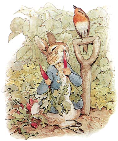
For example, this illustration by Beatrix Potter is pretty light to mid tone, but she pops the foreground figures out by a little more contrast in her line work and accents of color.
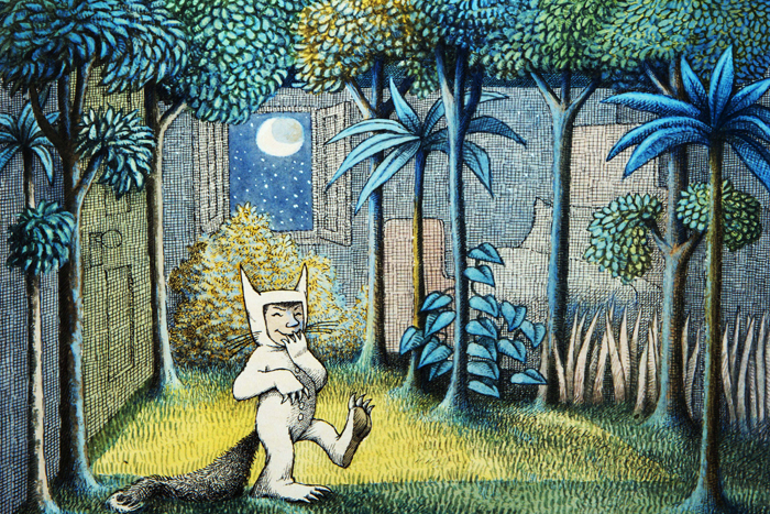
Or this one by Maurice Sendak. Notice how busy his background is? But the boy pops out by how light he is and how little texture he has over his whole body.
Anyway, like I said, I really like your style! I would just make more of it and watch how you order it. Maybe do more with kids in it and make a few more black and white images if you also want to tap into middle grade books?
Website: www.tessawrathall.com
Instagram: www.instagram.com/tessawrathall_art/
-
Your work is really nice but I noticed that your characters seem more whimsical than your back grounds which feel more realistic(the third image is a good example) as well possibly some of your color choices could be brighter the image with the buttery flies is an example. Hope my ideas help you
-
@JeaneBean I guess they know what they like
-
As previously mentioned and demonstrated I think there are a few things that you could do (maybe even in Photoshop to your existing images) to help improve the dimension in them. I don't think you have an old style by any means - especially when it comes the figures and compositions. If you are looking for a challenge to help shake things I would try a color palette challenge. Find a color scheme with no more than 5 colors, and try and create an illustration based on that. A "trendy" color scheme might help you bring your prior knowledge into a fresh light.
As a side note, I really like the second image. I wouldn't necessarily say you need to focus on "darker" imagery, but the composition, form, and color choices in that piece are really nice.
Tyler J. Hallstrom
One Drawing at a Time.
https://www.tylerjhallstrom.com/ -
@aska I totally agree with you. It is such a fine line to navigate!
-
@TessW Great examples! Thank you! I really like how Beatrix Potter did hers with the lines of different weights. Perhaps I will try that in the future.
-
@Tyler-Hallstrom I think you are spot on on the color. I didn't notice it until I had uploaded everything to my website but I have a tendency to use the same three colors over and over again. It seems that everything I make is red, green and yellow. I also noticed that I unconsciously decorate my house in these colors, too. I think I will pick some different color palettes and see what happens. Thanks for the great tips!
-
@JeaneBean No problem! Personally, I love using https://coolors.co/ to help generate ideas. Sometimes it can be fun just to start with a color scheme and let that help lead you to the story and your image.