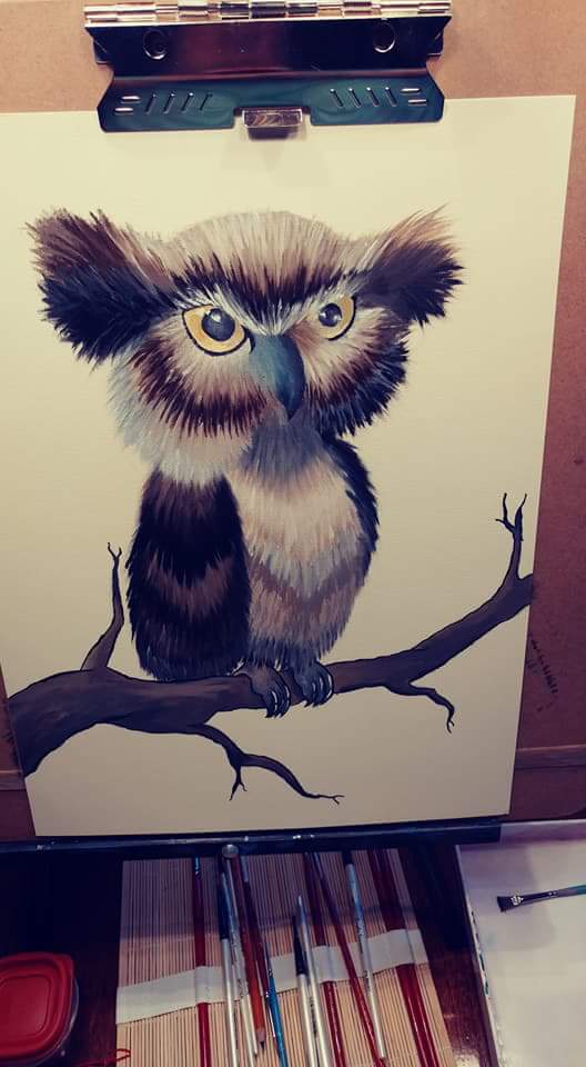
Looking for some outside feedback
-
-
Welcome to SVS Learn Amber! I am an art teacher, and have been taking classes here for awhile, but just recently got connected into the forums component of this program.
First off - congratulations! It's very exciting to step back into the world of art and illustration, and I hope that it is something that you will continue to stick with.
As far as this image in concerned there area a few notes/suggestions that I have in terms of this piece overall.
-
I think this image needs a background. You have a lot of really interesting textural work with your brush present in the owl, and I think that you could bring some of that sensibility to the background of your image.
-
There are a few inconsistencies in terms of the shape dynamics. Even with a more illustrative style I would say that you could improve your shape selections and the relationship to one another.
-
Something that I am sure you could pick up right away is line weight variation. It is evident that you have pretty good dexterity when it comes to your brush control, and that is a valuable skill to have. Use that to your advantage, and think about how you can add thick and thin lines in you image to help provide visual interest to the image as a whole.
Overall, I think that is a great starting point to jump back into the world of illustration with, and I hope you continue to enjoy all of the opportunities illustration brings!
Tyler J. Hallstrom
One Drawing at a Time.
https://www.tylerjhallstrom.com/ -
-
@Tyler-Hallstrom Thank you so much for the feedback and I can definitely see how each point applies so much. Looking at it I can see that it would definitely benefit from having a background however I'm really not sure how to do so I've never been great in that area and I don't know if I added a detailed back ground if it would be distracting and if I just added color variations it might be too bland. Any tips for selecting a background?
-
I think @Tyler-Hallstrom has some great points, but I don't think it needs a back ground.
Overall I think it's a great piece, especially if you're still a little rusty! I do take some issue with your tree branch design and there's some symmetry problems, but I think it's easy fixes.
Here's a drawover I did:
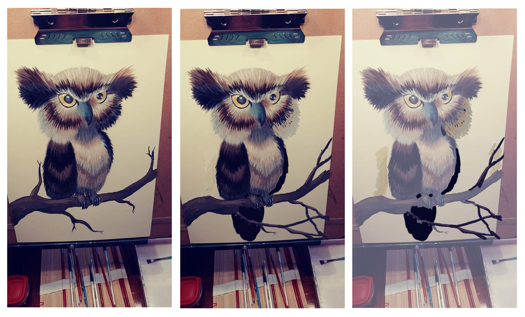
It helps to go out and look at tree anatomy when you're drawing branches. I rarely see trees with short, stubby branches like you painted. If that's a deliberate design choice, then I think they are pretty evenly spaced, and they call attention to themselves. I think if you make them longer they form a nice visual foundation to set your owl design on. They lead the eye from the edge of the canvas up to your character.
I also added tail feathers since most owls have them and I think it helps ground the design a little more.
Great piece, thanks for sharing it! Hope to see some more from you!
-
@Jake-Parker Thanks I love the tail feathers! I had thought about them in the beginning and then I guess totally forgot but it looks great. Also the tree branches its another hard spot for me my trees always look super awkward so I try to avoid getting too in detail with them but the draw over looks really good thanks for the tips!
-
@ambiirae I like it a lot.
Did you have a reference for this? I ask because the section of the beak where it meets the feathers (left hand side as you look at the painting) seems a little "smudgy/vague"--just wondering if the picture didn't turn out at that part. I think there might be more over lap of the feathers.
You did a great job on the feathers (forms, lighting, etc). After hitting some of the points Jake and Tyler mentioned you might take a second look at the eye and beak details--that area is probably the first place people will look. The eyes are pretty much on the same level of detail/expertise as the feather but the beak seems like it could use more attention.
-
Thank you guys so much you're awesome! I can remember ever being so excited to do revisions. Its really helps to have the draw overs and pointing out the parts I forgot to go back over and re detail is great can't wait to fix it up and repost!
-
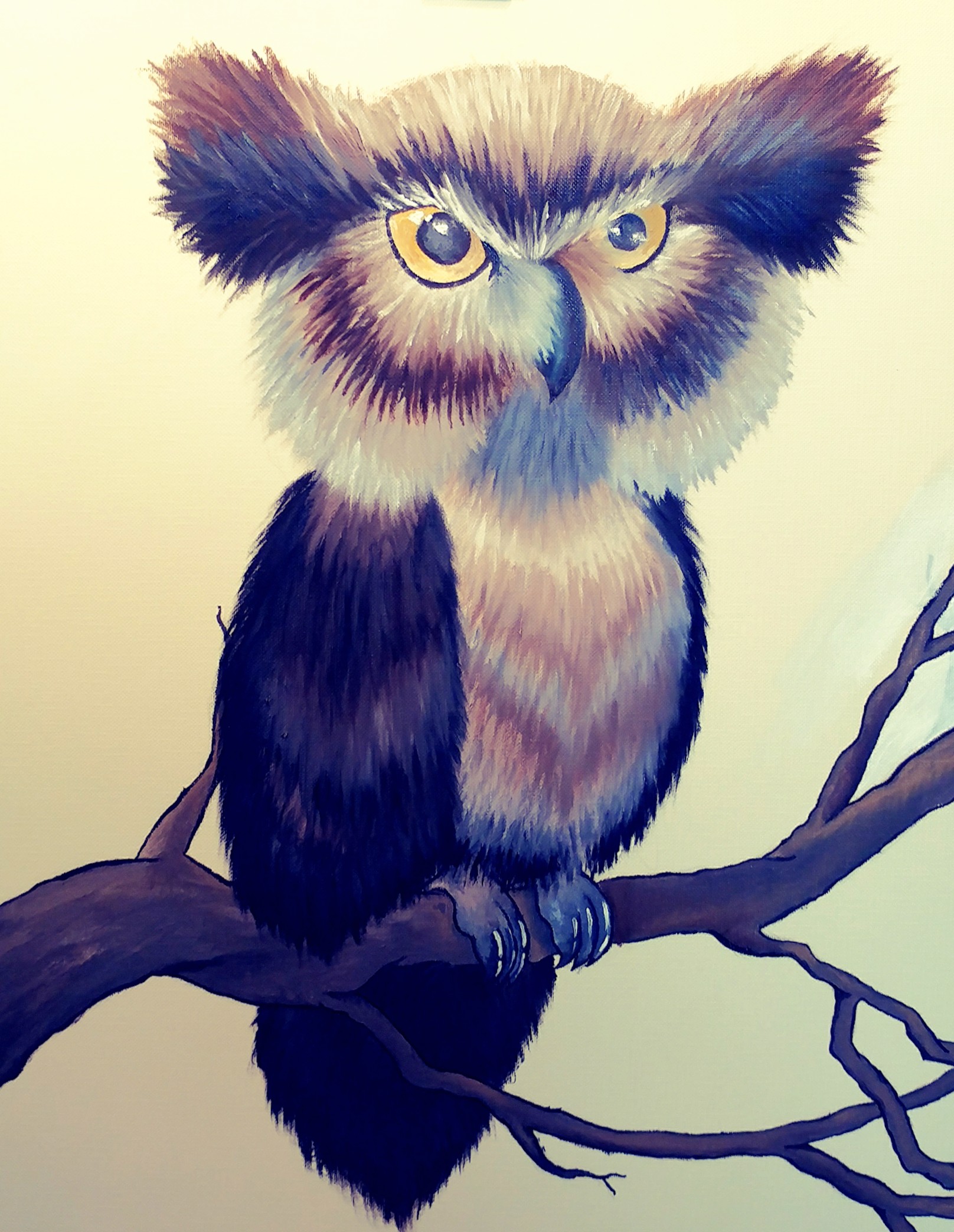
Okay so I finally got a chance to get into the revisions this morning and here is what I came up with.. Sorry I'm not very savy with a scanner so I keep taking photographs of this piece
-
Looks great! The branches and tail really help fill out some of the negative space in the background, and eliminates the need for something fully rendered. Great suggestion @Jake-Parker
-
So glad you did the revisions. They really improved the painting. This owl is quite the character. It's very cute and I want to cuddle it's face.