Will's "Draw 50 things"
-
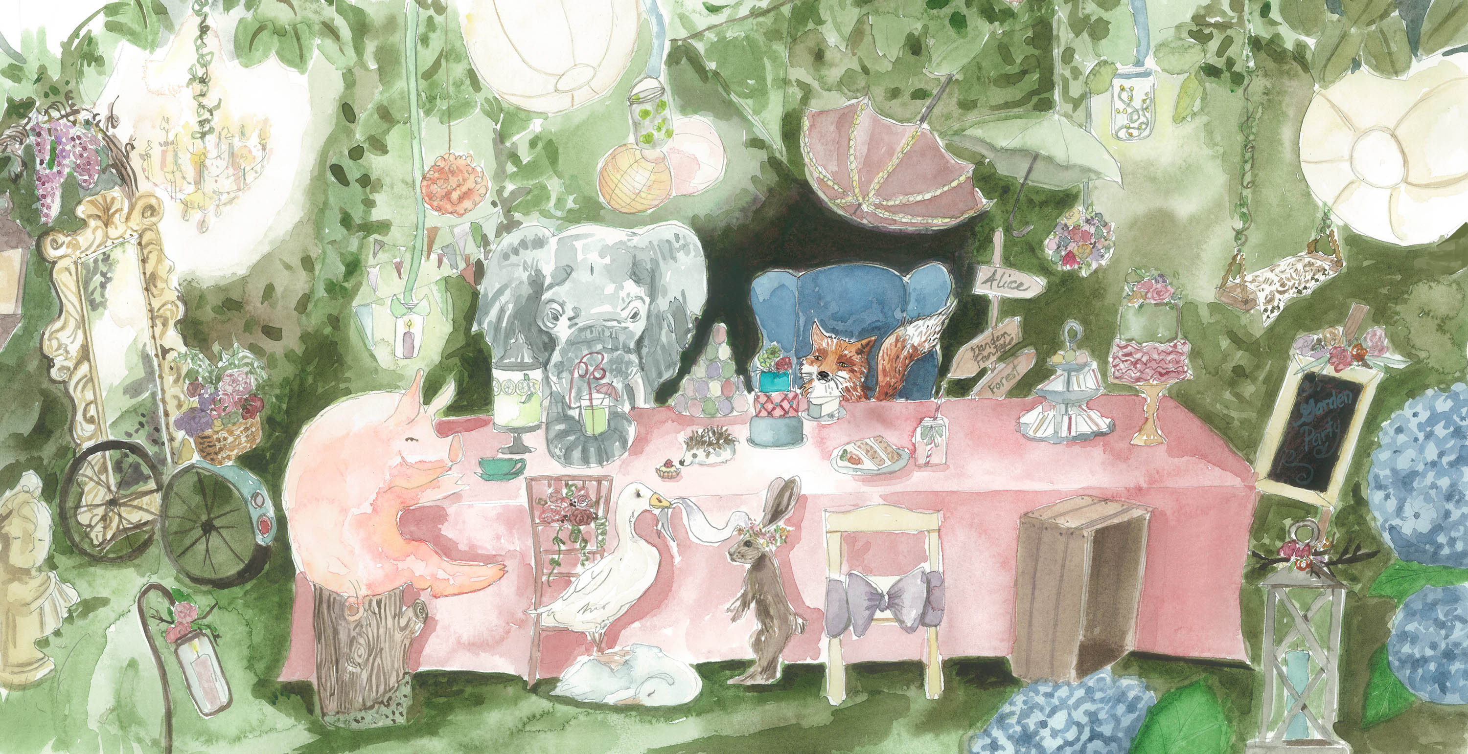
I have to say this was so much fun, thank you @Will-Terry for this awesome challenge. I have already signed up for the critique and I am so looking forward to it.
-
@lmrush Very cute and fancy
") I like the antique colors :-0
I like the antique colors :-0 -
Lots of stuff going on in this one! I like the color palette, I would say you should try and some spaces to add darker values to help round out the value scale. You have a lot of mid-tones currently present.
Tyler J. Hallstrom
One Drawing at a Time.
https://www.tylerjhallstrom.com/ -
@Tyler-Hallstrom Thank you and I completely agree, maybe I will play around with photoshop before I try it on the original-thanks for your time
-
Overall- so cute! Love the color palette and looseness. You've captured a nice ambience. I want to go to this party!
I'm just seeing a few readability problems.
- The pig could stand out a bit more through some detailing and contrast. It's blending in a bit with the table cloth.
- The elephants trunk could be defined more.
- There is a tangent happening with the crate and the hydrangea, It looks the crate is popping forward quite a bit and it doesn't quite read that it's behind the flower.
Other than that. I wonder what a fancier table cloth would look like? Everything seems so girly and ornate. Maybe a tiny bit of lace or a scalloped edge?
Anyway, you should be very proud! I would love to see a couple more of these type of illustrations and make them look like part of the same set. Maybe a portrait of one of these animals and one or two more scenes using the same style and similar color palette.
Website: www.tessawrathall.com
Instagram: www.instagram.com/tessawrathall_art/
-
@TessW Thank you so much Tess, it is always so much easier to see these things when someone points them out. Thank you for your kind words and taking the time to help, I will definitely try to make the improvements, enjoy your weekend!
-
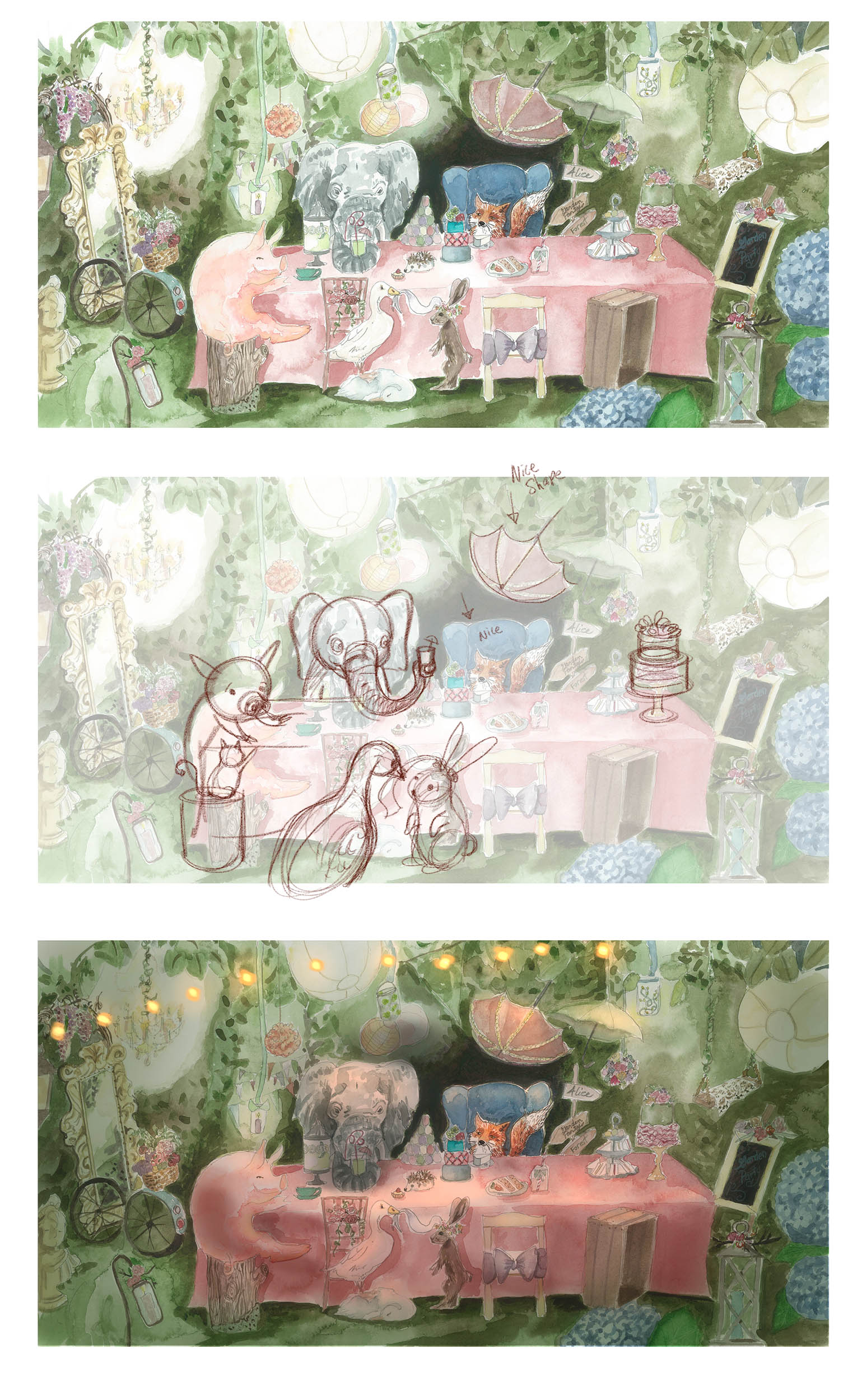
Hi Lisa,
I love the feel of this! A few suggestions: Shape really matters to covey your story and make your characters more legible...take advantage of the attributes of each animal - for instance - the elephant has a really long trunk so play with that shape - turn him/her 3/4 view to get a better silhouette. The pig starts to flatten out but if you put that character behind the table the overlapping will create more depth. Same with the duck and rabbit - because they are closer to the viewer you can make them bigger and crop them out for more impact. Watch the ellipses on shapes like your cake and don't use same color as background as that will camouflage it from your viewer.
On the painting side: If you show a lot of white contrast spots in your illustration they will each beg for attention - think a class of kids all vying for your attention by yelling at the same time. Restrict your white "hot spots" to lights and highlights and try to limit them...I replaced the spherical lights with a string of lights to indicate overhead ambient lighting. If you have strong lights on the left and right and top of your illustration your shadows will be too complicated to render.
I really hope this helps!
Will
@lmrush 
Will Terry
-
@will-terry-art OMGosh so much better!!!!! I am so excited to do the corrections!!!!! Thank you Will for you time on the draw over. I am so happy I came across you on you tube and found SVS. Can I share my image with your draw over on my social media? Thanks again!
-
@lmrush My pleasure
...and yes...