Society of Visual Storytelling

    SVSLearn Forums

    • Register
    • Login
    • Search
    • Recent
    • Tags
    • Popular
    • Users
    • Groups
    • Search

    Taking a picture to the next level

    General Discussion
    6
    11
    2372
    Loading More Posts
    • Oldest to Newest
    • Newest to Oldest
    • Most Votes
    Reply
    • Reply as topic
    Log in to reply
    This topic has been deleted. Only users with topic management privileges can see it.
    • Jeanne.M.Bowman
      Jeanne.M.Bowman last edited by

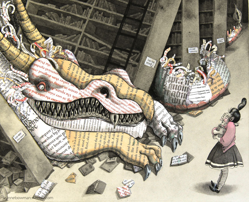
      I want to be published! I have been working on my portfolio and just finished this piece which I like and am excited about. I'm wondering what I might do to take it to the next level where an art director would think it was of publishable quality. (other than get a better scan or photo of it. I am not great at digitizing my work yet) What do you guys think? 0_1497566675032_bookwyrm_JeanneBowman2017.jpg 0_1497566688463_detail2.jpg 0_1497566710476_bookwyrmdetail1.jpg

      instagram.com/jeanneillustrates
      jeannebowmanillustrates.com

      TessaW 1 Reply Last reply Reply Quote 2
      • TessaW
        TessaW @Jeanne.M.Bowman last edited by

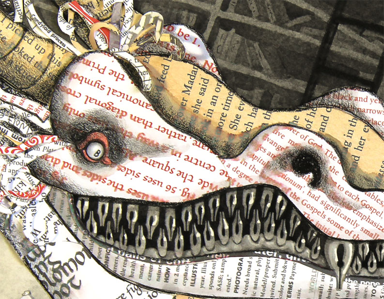
        @JeaneBean Love it! Really strong work. My only suggestion would be to tone down the tail as it starts to recede into the background. Maybe will just a very light wash or with a bit of that charcoal/graphite. That will let the focal point between the dragon and the woman read better.

        Website: www.tessawrathall.com

        Instagram: www.instagram.com/tessawrathall_art/

        Jeanne.M.Bowman 1 Reply Last reply Reply Quote 1
        • rcartwright
          rcartwright last edited by

          Ok so overall this is really nice piece I would say that the issue I see is with the dragon's tail taking your eye out of the picture into the corner I feel like you don't need that last bit of tail or possibly darken the back area with a soft shadow to close in the space. Nice work on the using the book text texture that is great

          https://www.scbwi.org/members/richard-cartwright/
          https://www.instagram.com/richardwcartwright/
          https://www.pinterest.ca/richcartwright3/art-of-richard-cartwright/
          https://www.richardwcartwright.ca/

          Jeanne.M.Bowman 1 Reply Last reply Reply Quote 0
          • Kevin Longueil
            Kevin Longueil SVS OG last edited by

            @JeaneBean Super nice!

            Portfolio: kevinlongueil.com
            https://www.instagram.com/kevinlongueil/

            Jeanne.M.Bowman 1 Reply Last reply Reply Quote 0
            • tombarrettillo
              tombarrettillo last edited by

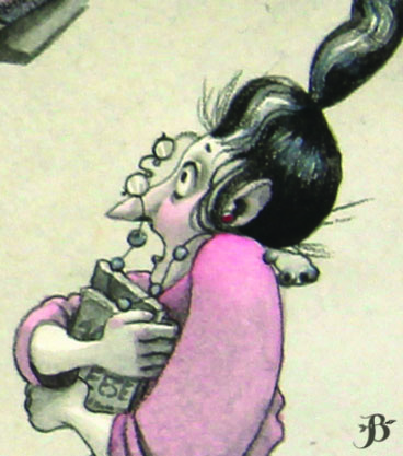
              Really nice concept. Maybe give the librarian a more extreme reaction, considering the size of the creature. Or even take it the opposite direction and have the librarian "shh-ing" the creature.

              https://www.youtube.com/@tombarrettart

              Jeanne.M.Bowman 1 Reply Last reply Reply Quote 0
              • smceccarelli
                smceccarelli Pro SVS OG last edited by

                Very nice piece and clever concept and execution! There are two aspects you may want to consider:

                • You could give the image a bit more space to the right. It feels crowded or cropped there, with the librarian too close to the edge of the image, as well as the trail of the dragon. This could also solve the fact that, at the moment, there is no real place to put text (assuming this would be a book spread.)
                • The face of the librarian does not read well - neither from far away nor in the closeup. I would consider eliminating the glasses. They are positioned in an awkward way anyhow (they do not look as if they are flying off the face) and they mess up with the silhouette of the profile, making it a hard read. If you want to keep them, maybe they should be flying further away from the face, so as to clear up that area.
                Jeanne.M.Bowman 1 Reply Last reply Reply Quote 1
                • Jeanne.M.Bowman
                  Jeanne.M.Bowman @TessaW last edited by

                  @TessW Good point! I think I'll tackle it with photoshop, perhaps! Thank you!

                  instagram.com/jeanneillustrates
                  jeannebowmanillustrates.com

                  1 Reply Last reply Reply Quote 0
                  • Jeanne.M.Bowman
                    Jeanne.M.Bowman @rcartwright last edited by

                    @rcartwright Thank you! I think that is a good idea with darkening the tail. I am going to attempt to do it in photoshop.

                    instagram.com/jeanneillustrates
                    jeannebowmanillustrates.com

                    1 Reply Last reply Reply Quote 0
                    • Jeanne.M.Bowman
                      Jeanne.M.Bowman @Kevin Longueil last edited by

                      @Kevin-Longueil Thank you!

                      instagram.com/jeanneillustrates
                      jeannebowmanillustrates.com

                      1 Reply Last reply Reply Quote 0
                      • Jeanne.M.Bowman
                        Jeanne.M.Bowman @tombarrettillo last edited by

                        @tombarrettillo Good ideas! Thank you!

                        instagram.com/jeanneillustrates
                        jeannebowmanillustrates.com

                        1 Reply Last reply Reply Quote 0
                        • Jeanne.M.Bowman
                          Jeanne.M.Bowman @smceccarelli last edited by

                          @smceccarelli Thank you! I will certainly give them both a try. I see what you mean about the cropped edge. After I had laid down the paint I wished I had given it more room as well. I can see what you mean about the glasses. I think I shall try to eliminate them in photoshop. Thank you!

                          instagram.com/jeanneillustrates
                          jeannebowmanillustrates.com

                          1 Reply Last reply Reply Quote 0
                          • First post
                            Last post