Society of Visual Storytelling

    SVSLearn Forums

    • Register
    • Login
    • Search
    • Recent
    • Tags
    • Popular
    • Users
    • Groups
    • Search

    Would love a critique

    General Discussion
    7
    16
    2128
    Loading More Posts
    • Oldest to Newest
    • Newest to Oldest
    • Most Votes
    Reply
    • Reply as topic
    Log in to reply
    This topic has been deleted. Only users with topic management privileges can see it.
    • R
      RajSolankiArt last edited by

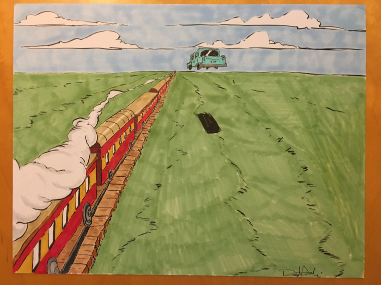
      Hey all! So I rarely get on the forum, and I realized it's such a cool place to have an art community and get critiqued. So I thought I'd post a drawing I did last night and see if anyone was willing to critique this one. I recently went through the perspective class and am trying to work on that.

      Thanks!

      Raj

      0_1498578212208_image1 (2).JPG

      www.instagram.com/rajsolankiart
      www.facebook.com/rajsolankiart
      www.twitter.com/rajsolankiart

      Eric Castleman Jason Bowen 2 Replies Last reply Reply Quote 3
      • Eric Castleman
        Eric Castleman @RajSolankiArt last edited by

        @rajsolankiart I think it is awesome. I would suggest redoing it so you can get rid of the marker look, but that is about it. Or maybe add some details on the ground.

        EricCastleman.com

        SCBWI profile
        https://www.scbwi.org/members-public/eric-castleman

        R 1 Reply Last reply Reply Quote 0
        • R
          RajSolankiArt @Eric Castleman last edited by

          @eric-castleman ya I struggle with getting my copics to look smooth in large spaces, especially with lighter colors. Thanks!

          www.instagram.com/rajsolankiart
          www.facebook.com/rajsolankiart
          www.twitter.com/rajsolankiart

          WithLinesOfInk 1 Reply Last reply Reply Quote 1
          • TessaW
            TessaW last edited by TessaW

            Overall I think it looks great. Your drawing style has a great energy to it and I love your linework. I agree with @Eric-Castleman. I think it's fine if it's just a study, but for a more polished piece, the marker texture isn't quite working. Maybe if you were more consistent with the way you apply it on the grass. Perhaps applying the markers so it follows the perspective as well and make the marks smaller in the background and bigger as it comes forward in space. You might want to think about trying watercolor as well, if you haven't yet.

            The only other thing I see is the wheels of the train. They look more like pot lids. I know you are stylizing, by I think they could have a little more width.

            Really like this and it's the perfect practice for perspective. Well done.

            Website: www.tessawrathall.com

            Instagram: www.instagram.com/tessawrathall_art/

            R 1 Reply Last reply Reply Quote 1
            • Jason Bowen
              Jason Bowen SVS OG @RajSolankiArt last edited by

              @rajsolankiart Try using the markers slower to get a cleaner bleed. Takes longer but looks more pro like. Maybe soften your shadows edge for your car too. Looks great though I like it.

              https://www.instagram.com/jasonbowenoils/

              Jose Ramos R 2 Replies Last reply Reply Quote 1
              • Jose Ramos
                Jose Ramos @Jason Bowen last edited by

                @jason-bowen Nice drawing!
                Well, if I were you, I'd add a row of electric poles on the right side, cause I feel this space is empty.
                And the worstest part could be the train wheels, but you can fix it, just hiden them inside the train, I meant just the bottom half.

                Sorry my english. 😞

                R 1 Reply Last reply Reply Quote 1
                • R
                  RajSolankiArt @Jason Bowen last edited by

                  @jason-bowen that's great! Ya I'll definitely try to slow down next time around!

                  www.instagram.com/rajsolankiart
                  www.facebook.com/rajsolankiart
                  www.twitter.com/rajsolankiart

                  1 Reply Last reply Reply Quote 0
                  • R
                    RajSolankiArt @Jose Ramos last edited by

                    @jose-ramos ya I think you're right about the emptiness on the right side! And my wheels could use some work! Thanks!

                    www.instagram.com/rajsolankiart
                    www.facebook.com/rajsolankiart
                    www.twitter.com/rajsolankiart

                    1 Reply Last reply Reply Quote 0
                    • R
                      RajSolankiArt @TessaW last edited by

                      @tessw just recently bought some watercolor material, so I definitely need to try that out! I agree with the wheels needing some work! Thanks!

                      www.instagram.com/rajsolankiart
                      www.facebook.com/rajsolankiart
                      www.twitter.com/rajsolankiart

                      1 Reply Last reply Reply Quote 0
                      • WithLinesOfInk
                        WithLinesOfInk last edited by

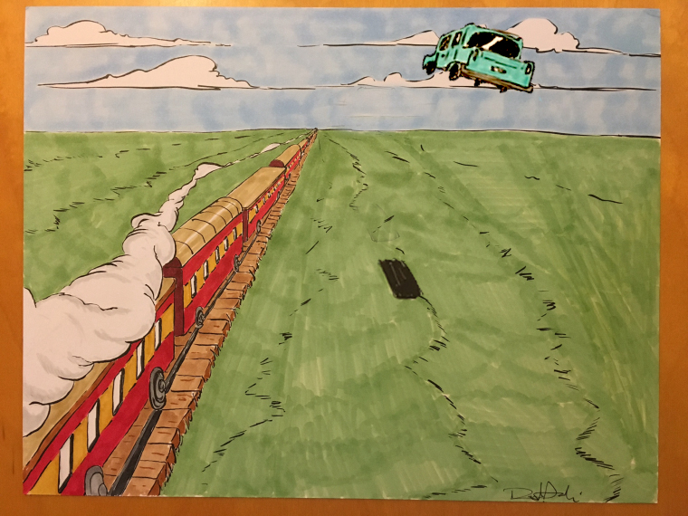
                        This is so cool, I love the color choices and the energy. The marker texture doesn't both me that much but that's just a personal thing. I do think that the car suffers from a few problematic tangents. The wheels are uncomfortably close to the horizon and the top just kisses those clouds and it feels uncomfortable. I think the proximity to the horizon line is also messing with perspective- it makes the car look HUGE. My suggestion would be to move it up farther and to the right a bit so it's overlapping the clouds and not dead center on the page (which gives it a very sturdy, placid feel instead of a dynamic moving action feel). You might play with the angle the car is titled at, the scale and maybe up the saturation a bit? I did a quick mock-up, just playing around.

                        That's my two cents!

                        0_1498594082738_Adjusted.jpg

                        http://Www.lauraslaterillustrations.com
                        https://www.instagram.com/withlinesofink/
                        http://lauraslatersketches.tumblr.com/

                        MOO R TessaW 3 Replies Last reply Reply Quote 1
                        • MOO
                          MOO SVS OG @WithLinesOfInk last edited by

                          @withlinesofink That was a good fix. I think he's doing great as I am also practicing perspective but th ecar felt funny to me. I didn't think I knew what I was talking about but your post made me feel better 🙂 I just didn't necessarily know the solution. Thanks!

                          Marsha Ottum Owen

                          1 Reply Last reply Reply Quote 1
                          • MOO
                            MOO SVS OG last edited by

                            I'm doing the perspective exercises too. This looks really good! I need to try some drawings like this to practice. Thanks for sharing!

                            Marsha Ottum Owen

                            R 1 Reply Last reply Reply Quote 1
                            • WithLinesOfInk
                              WithLinesOfInk @RajSolankiArt last edited by

                              @rajsolankiart Working on a smoother surface can help. I like using vellum for markers because it takes just a little bit longer to dry so you can blend a bit more.

                              http://Www.lauraslaterillustrations.com
                              https://www.instagram.com/withlinesofink/
                              http://lauraslatersketches.tumblr.com/

                              1 Reply Last reply Reply Quote 0
                              • R
                                RajSolankiArt @WithLinesOfInk last edited by

                                @withlinesofink this is amazing direction! Thanks so much! I didn't notice the tangents until you mentioned them, then they stuck out like a sore thumb haha!

                                www.instagram.com/rajsolankiart
                                www.facebook.com/rajsolankiart
                                www.twitter.com/rajsolankiart

                                1 Reply Last reply Reply Quote 0
                                • R
                                  RajSolankiArt @MOO last edited by

                                  @marsha-kay-ottum-owen thanks! It's definitely been a process! my sketchbook is starting to get full of perspective practice

                                  www.instagram.com/rajsolankiart
                                  www.facebook.com/rajsolankiart
                                  www.twitter.com/rajsolankiart

                                  1 Reply Last reply Reply Quote 0
                                  • TessaW
                                    TessaW @WithLinesOfInk last edited by

                                    @withlinesofink That's a really good solution!

                                    Website: www.tessawrathall.com

                                    Instagram: www.instagram.com/tessawrathall_art/

                                    1 Reply Last reply Reply Quote 0
                                    • First post
                                      Last post