Reworking an old piece- pumpkin patch- rendering stage
-
Thanks @Kevin-Longueil and @Chip-Valecek.
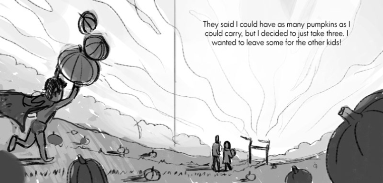
Something more like this? Do you think the cape is ok going out of the frame, or would you keep it inside?
-
@tessw Maybe bring him closer to the gutter but I think part of the cape going off the side is ok.
-
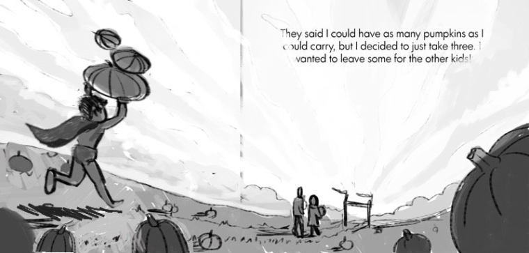
@tessw I am liking this for sure - did a quick cut and paste to see how the cape might look in the frame and with the child scooted forward a bit - it feels like if it is going out of the frame just a tiny bit that it may draw attention to itself - looking forward to where ever you go with this.
-
@Kevin-Longueil 's adjustment to the boy works for me, though you have to watch the parents and that spine gutter. I really love this page and I think it's go a lot going for it as-is, so anything from here would personal opinions or nitpicky haha.
BUT since you invited, here are some things that could be fun to play with!
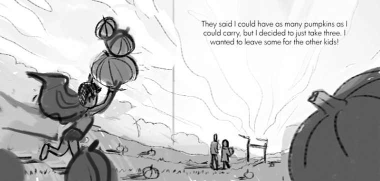
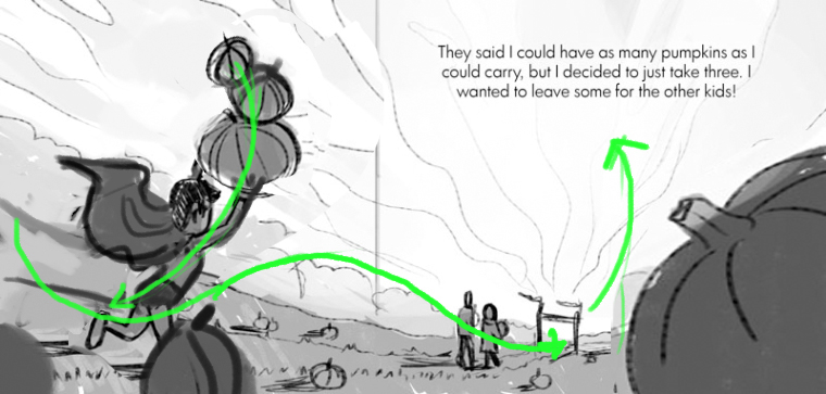
If you move the boy forward in the scene a bit and make sire his spine and the pumpkins give a sense of forward momentum, and stick him a little behind one of the foreground pumpkins, we'll really get the sense he's moving through the space. And it will sell the foreground too.
Enlarge the pumpkin on the right side so the viewer isn't tempted to wander off the page and is instead "bounced" up to the text following the visual hierarchy.
I love it! I can't wait to see your color pass.
-
I actually like the first version. He's marching along with THREE pumpkins on hs head and those up front are completely oblivious (except the other kid). It's like it's just an ordinary day for him but he's a super hero! Is that his family up ahead? The second one is more active but, I don't really have any exact reasons why I like the first one better design wise and if I did I might not know how t say it..but I jusy know I like the first one

-
@kevin-longueil It really does make a difference when it's flipped! I was told at an illustrators conference that action should always go from left to right so.....this really shows that here, Maybe that was why I liked the first one best. Flipped around, I like the second one just as much or more!
-
@tessw Nice pic:-) I really like his pose in the first one and composition in last one (flipped;-). It depends what emotions of the character you want to show. The pose in 1st picture indicates he is very proud with himself. The pose in last picture looks like he is chasing his parents, cause he was choosing his pumpkins for too long and he was left behind.
-
Wow, thanks guys! You've given me a lot of things to think about. I'll have to play around with your suggestions and see what works.
@aska Yeah, that's what I was thinking. I really liked the feel I was getting from the pose in the first one, and I'd rather convey "proudness", rather than rushing.
Thanks so much for all your help.
-
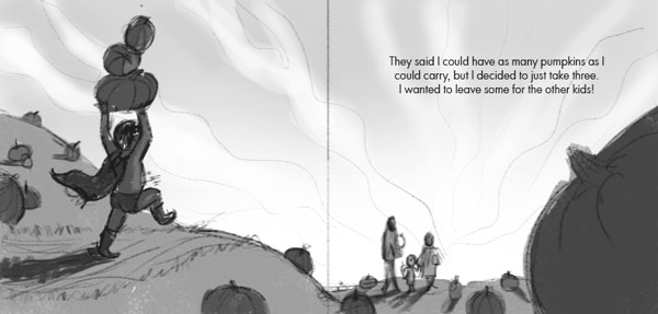
Ok, I kind of changed it a bit, because I was liking the pose in the first one better. I wanted him to look proud and confident rather than rushing after his parents. Do you think this one is working?
-
@tessw Quick question, does the kid have super strength or is he just carrying the three pumpkins? I ask cause it might be cool to have all three pumpkins balance on the left arm and the right arm swinging back like "Look at me" but if he is just a normal boy then this works well.
-
@chip-valecek Hmm, I'll play around with that! He is super strong. . . but just in his imagination, which is why I made it so the parents aren't noticing him.
-
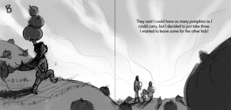
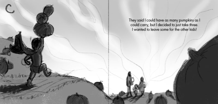
-
I just realized his arm probably wouldn't be swinging that way if his legs were like that, in version c. Oops.
-
@tessw If you did go that route I like B where you can see his face and the confidence he has.
-
Version B looks very cool. However, i think i like the original more. He is more childish there and its cute.
-
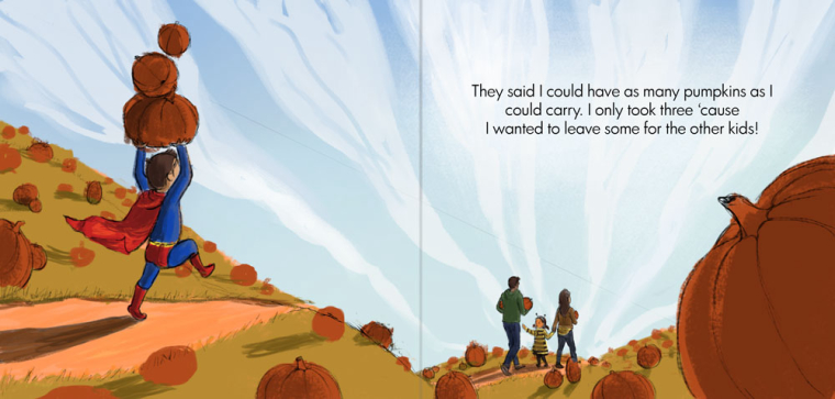
Laying in some colors. . . I'm always nervous starting the colors!
-
@tessw
There is so much about this that is working and that I relate to. Firstly I'm a big Superman fan so there's that Composition is easy to read and interesting. I don't mind that there is some ambiguity in the story; meaning, is he actually a super kid or just super imaginative? I live that last line of text and how the image plays with that. Just a side note that having the boy enter from the left is a good move as it sticks to the cinematic rule of thumb that "good guys," enter from the frame from the left. If you watch star wars, Vader tends to enter from the right and Jedis from the left. Just a fun factoid
  Well done so far!
 -
@smithdraws OMG I love analyzing cinematography. There's so much psychology in it. I didn't even know this!
-
@withlinesofink It makes sense to me to study cinematography since it's the ultimate form of sequential art. A picture book or comic is just a time lapse.
-
Very nice!
Although, you might want to rethink the clouds. They really transfer the focal point from the boy carrying the 3 pumpkins to his family. The way it is now. I see the family before the boy (even if he is much bigger and brighter - directional lines are very powerful).
Otherwise, nice work!! Definitely MUCH better composition than your original!