Society of Visual Storytelling

    SVSLearn Forums

    • Register
    • Login
    • Search
    • Recent
    • Tags
    • Popular
    • Users
    • Groups
    • Search

    Building my portfolio

    General Discussion
    12
    24
    6041
    Loading More Posts
    • Oldest to Newest
    • Newest to Oldest
    • Most Votes
    Reply
    • Reply as topic
    Log in to reply
    This topic has been deleted. Only users with topic management privileges can see it.
    • K
      Kat SVS OG last edited by

      Super cute! I love the girl in the tree, looks like a fun story in that one.

      1 Reply Last reply Reply Quote 1
      • mattramsey
        mattramsey last edited by

        these are all really great!

        I think on the first one it would be worth it to spend more time on the lighting of the little girl--you've got so many gorgeous things going on that the sunlight is coming across as a little "generic"* on her. Also, I think that the lizard is a little too bright and a little flat.

        *I think it needs some banding effects, for example.

        https://www.inprnt.com/gallery/mattramsey/
        https://mattramsey.artstation.com/
        https://twitter.com/mramseyART

        1 Reply Last reply Reply Quote 1
        • TessaW
          TessaW last edited by

          Thanks guys!

          @aska and @Marsha-Kay-Ottum-Owen good point about the knee.

          @NoWayMe Thanks for the paint-overs! Much better. I'll have to tweak them a bit.

          @mattramsey Yeah, I see what you mean. I think I will work on this one some more.

          Website: www.tessawrathall.com

          Instagram: www.instagram.com/tessawrathall_art/

          1 Reply Last reply Reply Quote 1
          • Myss
            Myss last edited by

            Hi Tess! Your art is so cute! I think a thing you can always work on is depth, value and shading/lighting!
            Depth can be shown when the things closer to the viewer are more dark/saturated and things father away begin to be less saturated and lighter. Shading also makes the character have depth as well as lighting.
            0_1498819903015_cat cat.jpg
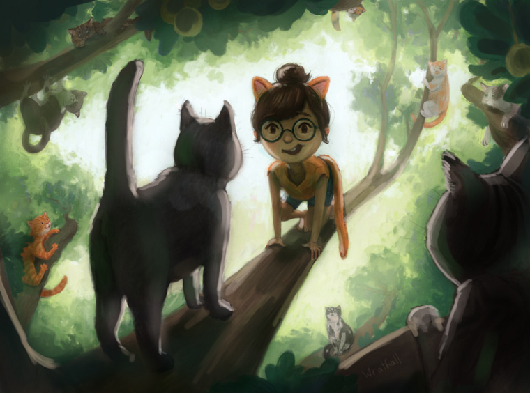
            I painted a bit over to show shading, lighting and reflected light! The objects closer to the light is brighter and less saturated and the things closer are more darker and more saturated, making a bit more depth. I made the shading pretty green because I believe light reflects off the leaves and therefore makes everything green haha!

            and another thing you can do with lighting-
            0_1498820168954_cat cat2.jpg
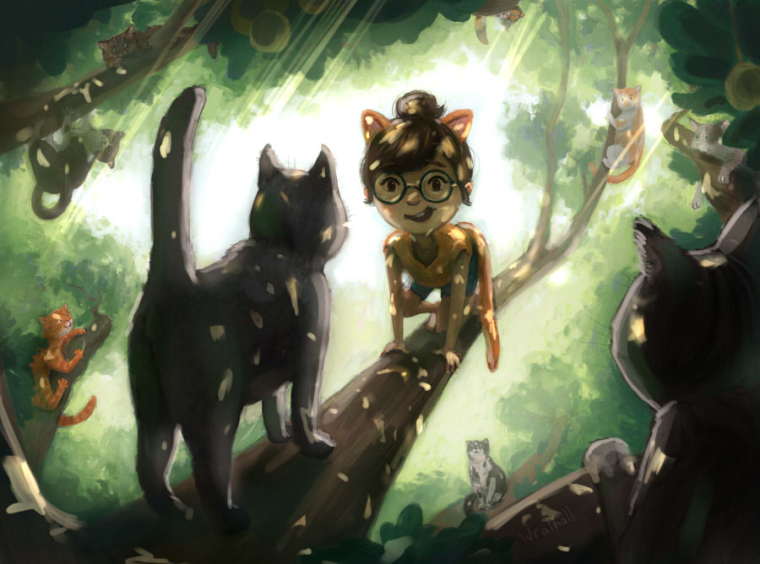
            If its bright outside and the foliage isn't as dense- light rays can pierce through and show themselves! Here's another thing you can do with lighting in a tree.

            The same things can apply with your other drawing! I think you're doing great, just keep drawing!

            And with style? Don't worry about that, style will come on its own naturally. In my opinion you already have a style!

            1 Reply Last reply Reply Quote 2
            • WithLinesOfInk
              WithLinesOfInk @NoWayMe last edited by

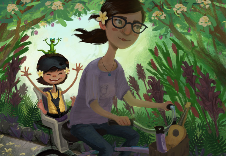
              @nowayme @TessW Having a centered composition is a constant habit of mine, too, to the extent that I have "DYNAMIC COMPOSITION" on a sticky note above my monitor. 😣

              http://Www.lauraslaterillustrations.com
              https://www.instagram.com/withlinesofink/
              http://lauraslatersketches.tumblr.com/

              1 Reply Last reply Reply Quote 1
              • WithLinesOfInk
                WithLinesOfInk last edited by

                Tess, I love how consistent your style is! I think people have given some great advice here, and really it is all just a few minor tweaks and things to consider moving forward. Have you done a Dream Portfolio, by any chance? It's something @Lee-White had me do several times, and which I now do yearly, to figure out what exactly I wanted and needed in my portfolio, and it's been super helpful. If you want to message me, I can explain more in depth!

                http://Www.lauraslaterillustrations.com
                https://www.instagram.com/withlinesofink/
                http://lauraslatersketches.tumblr.com/

                1 Reply Last reply Reply Quote 1
                • TessaW
                  TessaW last edited by

                  @myss Thanks! Yup, I struggle a bit with values. I've been told I have the tendency to go too dark and contrasted, so I actually lightened this painting at the end. Maybe I shouldn't have? I was also considering doing dappled light but was concerned it would be too busy. But it does look quite magical the way you've done it! Thanks for your thoughtful paint-overs.

                  @WithLinesOfInk No I haven't done a Dream Portfolio! Sounds intriguing. I will definitely message you.

                  Website: www.tessawrathall.com

                  Instagram: www.instagram.com/tessawrathall_art/

                  1 Reply Last reply Reply Quote 0
                  • TessaW
                    TessaW last edited by

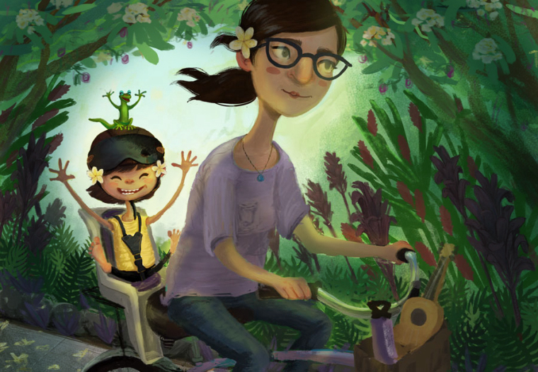
                    Working on updating this piece. I kind of wanted to see if I could throw a bunch of busy foliage in the background with warm colors and still keep my focal points.

                    0_1498941109318_GECKO-BIKE-RIDE-JUNE-2017-copy.jpg

                    Website: www.tessawrathall.com

                    Instagram: www.instagram.com/tessawrathall_art/

                    WithLinesOfInk Jose Ramos 2 Replies Last reply Reply Quote 2
                    • WithLinesOfInk
                      WithLinesOfInk @TessaW last edited by

                      @tessw So cute! I think you could brighten the mom and kid a bit, or push back the background even further. But the values among the background elements are very cohesive and non-invasive!

                      http://Www.lauraslaterillustrations.com
                      https://www.instagram.com/withlinesofink/
                      http://lauraslatersketches.tumblr.com/

                      1 Reply Last reply Reply Quote 1
                      • WithLinesOfInk
                        WithLinesOfInk last edited by

                        0_1498947203846_Values.jpg

                        http://Www.lauraslaterillustrations.com
                        https://www.instagram.com/withlinesofink/
                        http://lauraslatersketches.tumblr.com/

                        1 Reply Last reply Reply Quote 1
                        • WithLinesOfInk
                          WithLinesOfInk last edited by

                          Here, this is kind of what I was thinking. I can send you the photoshop file with layers if you want to see kind of where I slopped everything in. 0_1498947395224_Sloppy_edits.jpg

                          http://Www.lauraslaterillustrations.com
                          https://www.instagram.com/withlinesofink/
                          http://lauraslatersketches.tumblr.com/

                          1 Reply Last reply Reply Quote 3
                          • Jose Ramos
                            Jose Ramos @TessaW last edited by

                            @tessw said in Building my portfolio:

                            o see if I could throw a bunch of b

                            Great work Tess...I love it!

                            1 Reply Last reply Reply Quote 1
                            • TessaW
                              TessaW last edited by

                              @Jose-Ramos Thank you!

                              Website: www.tessawrathall.com

                              Instagram: www.instagram.com/tessawrathall_art/

                              1 Reply Last reply Reply Quote 0
                              • Tyson Ranes
                                Tyson Ranes @TessaW last edited by

                                @tessw Your stuff is awesome, has a great quality/feel to it.

                                TessaW 1 Reply Last reply Reply Quote 0
                                • TessaW
                                  TessaW last edited by TessaW

                                  @withlinesofink said in Building my portfolio:

                                  @tessw So cute! I think you could brighten the mom and kid a bit, or push back the background even further. But the values among the background elements are very cohesive and non-invasive!

                                  Thanks for your feedback! Sorry, should have replied to you sooner, but I was thinking about how to incorporate your advice.

                                  I'm getting closer and closer (at least, to the best of my ability), which seems like it's harder and harder to make progress on this. Still have a bit to do. I don't want to emphasize the mom as much, which is why I have chosen to keep her pretty dark and less contrasted. Do you think that's ok for the image as a whole? Or are you finding that you want the mom to be as much of a focal point as the girl and the gecko?

                                  0_1499150778288_GECKO-BIKE-RIDE-JULY-2017-back-up-copy.jpg

                                  Website: www.tessawrathall.com

                                  Instagram: www.instagram.com/tessawrathall_art/

                                  WithLinesOfInk S 2 Replies Last reply Reply Quote 0
                                  • TessaW
                                    TessaW @Tyson Ranes last edited by

                                    @tyson-ranes Thank you very much!

                                    Website: www.tessawrathall.com

                                    Instagram: www.instagram.com/tessawrathall_art/

                                    1 Reply Last reply Reply Quote 1
                                    • WithLinesOfInk
                                      WithLinesOfInk @TessaW last edited by

                                      @tessw This works perfectly for that intention! I like it!

                                      http://Www.lauraslaterillustrations.com
                                      https://www.instagram.com/withlinesofink/
                                      http://lauraslatersketches.tumblr.com/

                                      1 Reply Last reply Reply Quote 1
                                      • S
                                        smithdraws @TessaW last edited by

                                        @tessw This has a lot of things working for it and the way you've staged it with the lighting reads as being from the child's point of view which I think is what you were going for. Only one thing sticks out to me as needing addressed. The child's legs seem too short relative to her arms and torso; some foreshortening is appropriate but as is the legs seem too short.

                                        https://www.instagram.com/joshuasmithdraws/?hl=en

                                        Twitter handle: @smittyjosh

                                        TessaW 1 Reply Last reply Reply Quote 1
                                        • TessaW
                                          TessaW @smithdraws last edited by

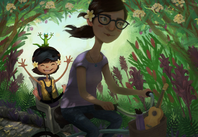
                                          @smithdraws Thanks! Made them longer. . . hopefully long enough. Put the correction back in the first post.

                                          Website: www.tessawrathall.com

                                          Instagram: www.instagram.com/tessawrathall_art/

                                          1 Reply Last reply Reply Quote 1
                                          • First post
                                            Last post