First Post....3rd Thursday September Piece
-
Hey everyone! I'm new to SVS and to the forums. I joined about a month ago, and just finished up the Creative Composition class. I wanted to take a stab at some of the things I've learned by trying this month's 3rd Thursday challenge. I took a few creative liberties with the prompt, I hope that is ok.
I envisioned Charly as a cute little bat. This piece was done in graphite, colored pencil and Gamsol. I tried to do a little adjusting in PS. My goal is to re-color the entire thing in PS with my wacom before the crits, but in the event I can't finish, I want to submit this piece. There are some things about it that I really love, and some things I'm not so crazy about, so I'd love to get some thoughts and feedback from the group here.
Composition: Do you see anything I can improve as far as overall composition or placement?
Tonal Range: This is hard for me, especially in traditional media and using color. How can I improve my areas of dark/light and contrast? How can I improve color overall? (other than taking the color class, believe me I'm planning to!).
Anything else you all can think of. Thanks so much! Looking forward to learning right along with you all.

z.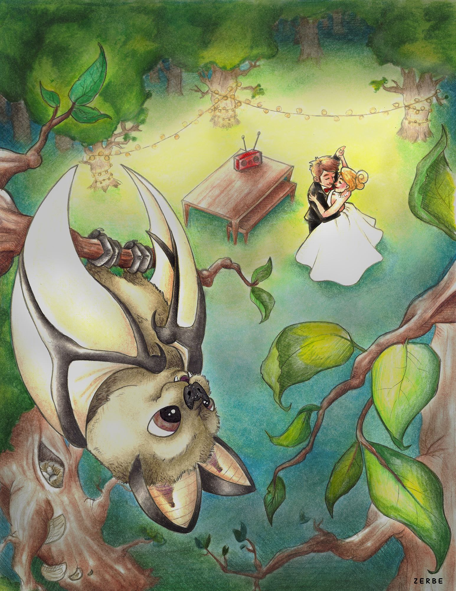
-
I really like this, a very fresh take on the theme.
")
-
Hi Kim, Love the composition and use of colors. Used colored pencils? Beautiful!
-
This looks good. My first though is that the red radio is competing with the couple. My second is that when I squint my eyes there isn't a strong focal point (first read, second and so forth). If you put it in Photoshop and turn it to gray scale it's really easy to see where you need more or less contrast. It's also a good way to do some quick value comps. I did that to a couple of my pieces right after I took the Creative Comp class and realized I needed to work on my focal points and contrast. Anyway, hope that helps and welcome to the SVS forum.
-
i would agree regarding the radio, I would suggest putting wine glasses and a bottle of wine on the table, with some nibbles. Great start, welcome aboard, keep up the good work.
-
Thanks so much for the feedback! I debated on the red radio, I was hoping a pop of color against all that blue green would be a nice touch. I'll try a few color variations on that and see which works the best. I love the idea of adding some other things to the table! I've give that a shot.
I'm really at a loss for how to do the contrast. In black and white I can do it, but how to implement those changes in the color version really escapes me. That is definitely something I will work on. I almost NEVER draw backgrounds, so this was a huge step for me!
I'll work on some of this feedback, and post variations. Thanks again, really excited to continue illustrating and learning here with this awesome group of people!