Society of Visual Storytelling

    SVSLearn Forums

    • Register
    • Login
    • Search
    • Recent
    • Tags
    • Popular
    • Users
    • Groups
    • Search

    Greatest fear - WIP

    General Discussion
    19
    34
    5955
    Loading More Posts
    • Oldest to Newest
    • Newest to Oldest
    • Most Votes
    Reply
    • Reply as topic
    Log in to reply
    This topic has been deleted. Only users with topic management privileges can see it.
    • DOTTYP
      DOTTYP last edited by

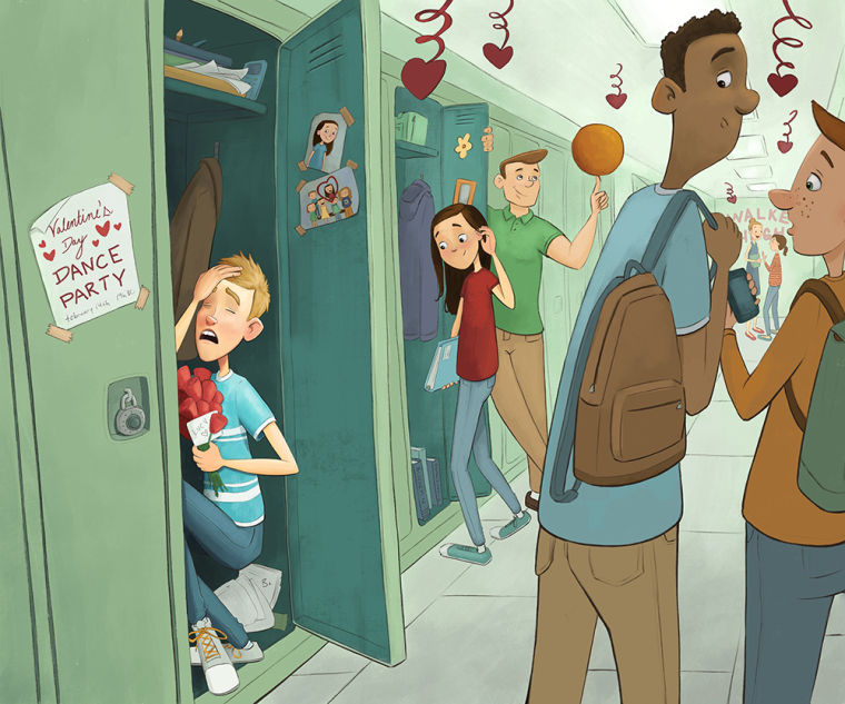
      Second one much better,I thought the first boy was being bullied (which would be a good fear) Great idea you have come up with.

      scribbles.artstation.com
      www.instagram.com/dottypaints

      1 Reply Last reply Reply Quote 1
      • tombarrettillo
        tombarrettillo last edited by

        looking good. I would open the locker boy's eyes, looking toward the girl (even though he can't see her because of the door; makes the connection better). Also, I would turn both boys' heads in the foreground to the left. I assume the one on the left is looking at the boy in the locker, but his head turned right seems unnatural.

        https://www.youtube.com/@tombarrettart

        1 Reply Last reply Reply Quote 1
        • DanetteDraws
          DanetteDraws @NoWayMe last edited by

          @nowayme I love this! The concept is great, and the drawing itself is well done. My only criticism is of the guy spinning the ball on his fingertip. To me he looks like an adult rather than a teenager.
          There were so many shy guys in my highschool. In my graduating year, three different guys signed my yearbook confessing they always had a crush on me but were too afraid to say anything. I was like 'awww - I wish you'd said something sooner!' And I was super shy myself, but still I was the one to ask guys to dance with me at school dances. haha The struggle is real. 😉
          Anyway - I can't wait to see it finished!

          https://danettebyatt.com
          Twitter @DanetteDraws
          Instagram @DanetteDraws

          1 Reply Last reply Reply Quote 2
          • NoWayMe
            NoWayMe last edited by NoWayMe

            This is what I have so far! Critiques are more then welcome 🙂

            0_1503886537416_Worst_fear_10.jpg

            noemiegionetlandry.squarespace.com
            noemie_illustration on Instagram

            Tyson Ranes Eric Castleman 2 Replies Last reply Reply Quote 7
            • tombarrettillo
              tombarrettillo last edited by

              Looking good so far! As a graphic design, the small flyer stands out to me. Might make it larger to fill the width of the door, and taller to look more like a poster.

              https://www.youtube.com/@tombarrettart

              1 Reply Last reply Reply Quote 1
              • Tyson Ranes
                Tyson Ranes @NoWayMe last edited by

                @nowayme Excellent work! You hit the criteria bullseye.

                Tyson Ranes 1 Reply Last reply Reply Quote 1
                • Tyson Ranes
                  Tyson Ranes @Tyson Ranes last edited by

                  @tyson-ranes just noticed>>> basketball looks overly plain, if you could put some spinny line work or something that works with your overall style to show motion I think it would add an extra punch.

                  NoWayMe 1 Reply Last reply Reply Quote 2
                  • Eric Castleman
                    Eric Castleman @NoWayMe last edited by Eric Castleman

                    @nowayme this is so good! I love how you took the prompt and really played with the idea in a very different way.

                    EricCastleman.com

                    SCBWI profile
                    https://www.scbwi.org/members-public/eric-castleman

                    1 Reply Last reply Reply Quote 1
                    • NoWayMe
                      NoWayMe @Tyson Ranes last edited by

                      @tyson-ranes Yes! I was planning to do that 🙂

                      noemiegionetlandry.squarespace.com
                      noemie_illustration on Instagram

                      1 Reply Last reply Reply Quote 1
                      • evilrobot
                        evilrobot SVS OG last edited by

                        Great image. Very impressed that you have so many characters and are still able to have such clear story telling. Love it.

                        http://www.palacioillustration.com/

                        https://www.scbwi.org/illustrator-gallery/illustrator-detail/?illustrator_id=84142

                        https://www.pinterest.com/evilrobot2/pins/

                        https://twitter.com/MyEvilRobot

                        1 Reply Last reply Reply Quote 1
                        • NoWayMe
                          NoWayMe last edited by

                          Thanks everyone!! 🙂

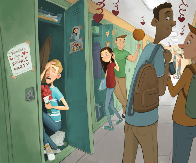
                          It's almost there! (Still have to do the basketball and few touchups) I changed the background colors quite a bit, everything felt a little too green. Also, I played with some adjustment layers in photoshop to try to make my focal point clearer. Hope it's working better 🙂

                          0_1503971260769_Worst_fear_12.jpg

                          noemiegionetlandry.squarespace.com
                          noemie_illustration on Instagram

                          Gary Wilkinson 1 Reply Last reply Reply Quote 4
                          • Gary Wilkinson
                            Gary Wilkinson @NoWayMe last edited by Gary Wilkinson

                            @nowayme

                            Awesome work. There isnt much that I can add, but a few things that come to mind is that the 2 girls in the background are lit up and framed by the 2 guys in the foreground which makes me wonder if its a part of the story (if you cropped just that side of the image it could almost be a painting in itself). Perhaps if you darkened that area slightly and put some kids walking to their next class instead then it would put more impact on the left part of the story.

                            Also I feel like there should be more cast shadows. The lights are fluorescent so it would be very faint, but it might help ground the girl a little more

                            www.garywilkinsonart.com
                            www.instagram.com/gwillustration/
                            www.twitter.com/GWillustration

                            1 Reply Last reply Reply Quote 1
                            • jasonandroosmith
                              jasonandroosmith last edited by

                              This looks so good! I think you were the one that suggested svs to me! My memory is terrible, it was either on a Livestream or Instagram......anyway, thanks!

                              NoWayMe 1 Reply Last reply Reply Quote 1
                              • NoWayMe
                                NoWayMe @jasonandroosmith last edited by

                                @jasonandroosmith Instagram! 🙂

                                noemiegionetlandry.squarespace.com
                                noemie_illustration on Instagram

                                jasonandroosmith 1 Reply Last reply Reply Quote 0
                                • lmrush
                                  lmrush Pro SVS OG last edited by

                                  this is so great, great job on the perspective and the color choices!

                                  Lisa Rush
                                  www.lisarushgallery.com
                                  www.facebook.com/ArtbyLisaRush/
                                  www.instagram.com/lisarush11/

                                  1 Reply Last reply Reply Quote 1
                                  • jasonandroosmith
                                    jasonandroosmith @NoWayMe last edited by

                                    @nowayme awesome! well thanks again for suggesting it!

                                    1 Reply Last reply Reply Quote 0
                                    • julian beresford
                                      julian beresford SVS OG last edited by

                                      @NoWayMe Your illustration style is really cool, I like the way you render and use colour too.

                                      Julian Beresford - Freelance Illustrator
                                      www. jgberesford.com
                                      https://www.instagram.com/jbfantasticalemporium/

                                      1 Reply Last reply Reply Quote 0
                                      • First post
                                        Last post