WIP Worst Fear Composition
-
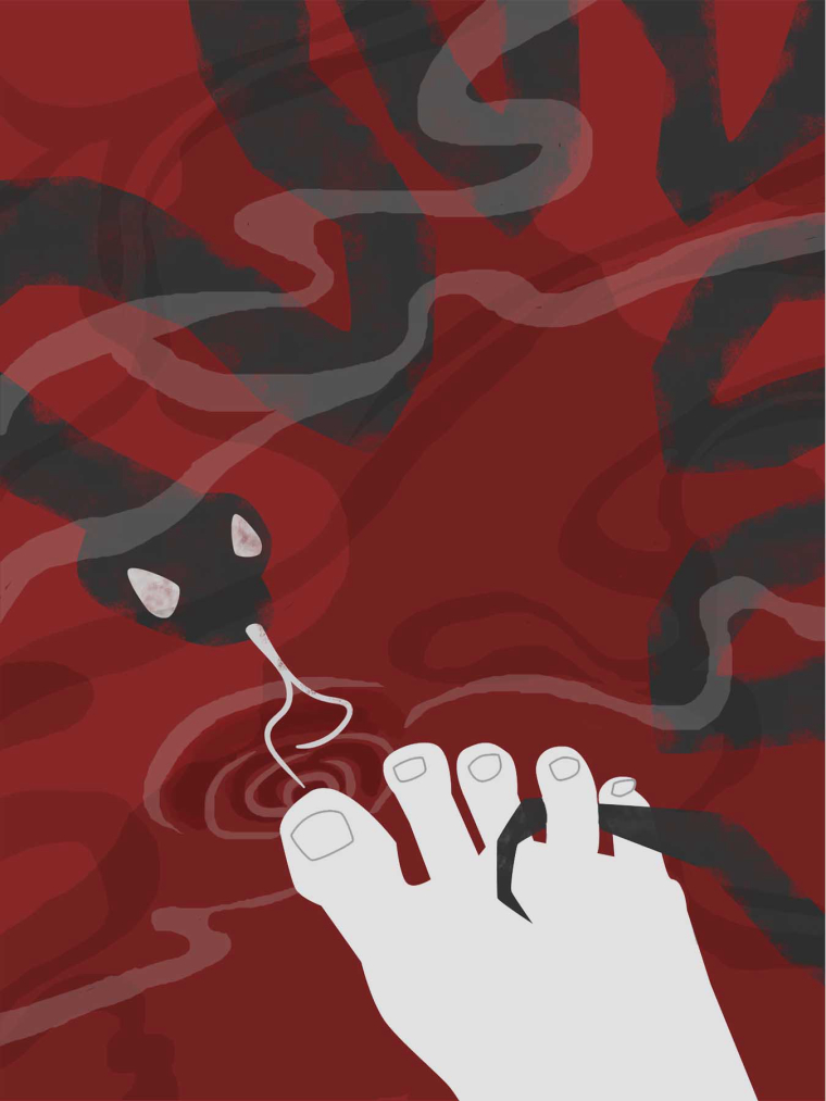
Hey all, I'd love any input on my Worst Fear WIP.
-
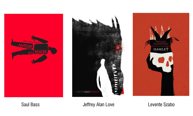
I'm going for a flat style, similar to these.
-
I would make more straight lines with the foot. Like instead of a round heel have it come to a point since the snakes are very linear.
-
I think it looks great! I think the more rounded foot is a nice contrast to the sharp angular snakes. looks more vulnerable. My mom would die if she saw that! She is terrified of snakes
")
-
I like the simplistic style, but i'm wondering if it might look better if you have the snakes more in perspective. The water seems to recede but the snakes in the background don't.
-
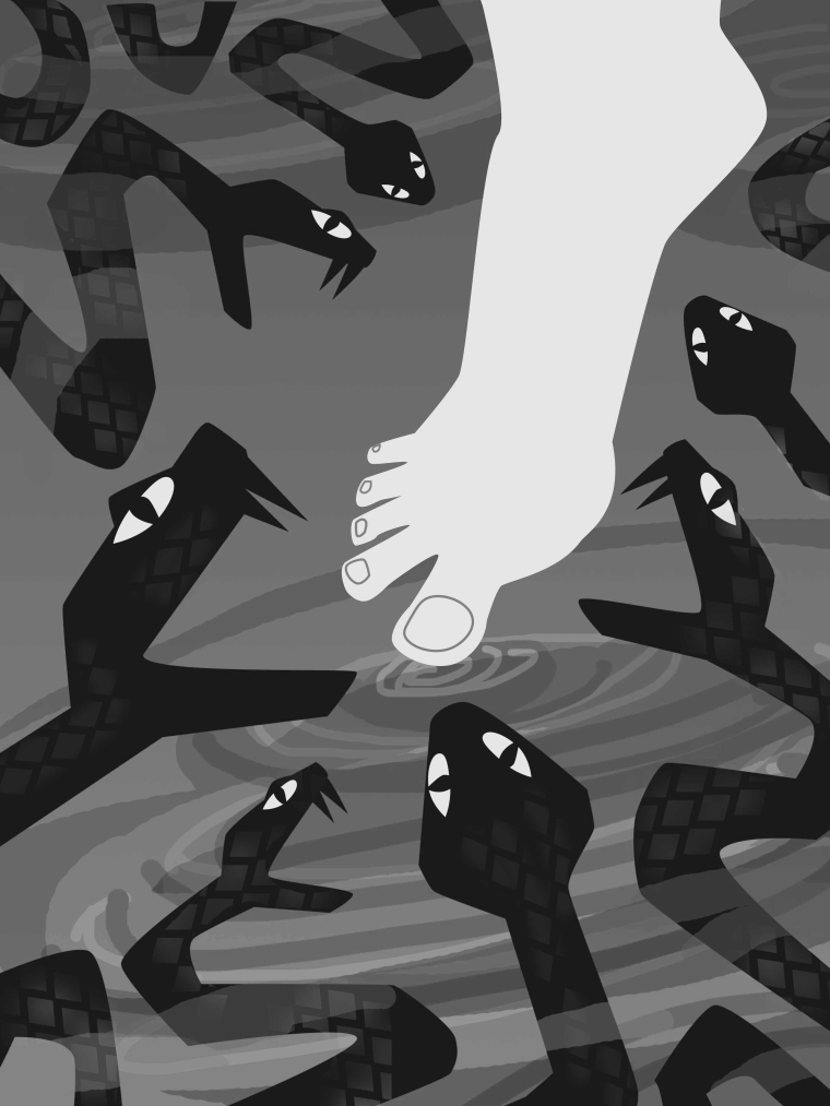
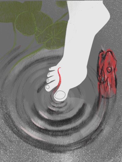
@lynda_percival This is looking nice - i really like the idea and the style - for critique i would say that for me there may be too many snakes - there might be more tension if there were fewer or only one snake. Possibly having the mouth not quite so far open too - i had an idea while looking at this that there could be something clever about the relationship between the ripples and the snakes - i took a quick try at it and did not succeed as you can see but it does get an idea across that can be improved upon - i think if some of the shapes were more ragged ( maybe almost like carefully torn paper) and had areas of inconsistent coverage like on the crown and the wolf head it might be closer to the style you are going for - i like the crisp outline of the foot though so i'm really not sure - anyways - feel free to ignore - i look forward to seeing where you go with this
-
@Chip-Valecek Thanks! I'll see what the foot looks like with straighter lines.
@Gary-Wilkinson Ah! Thanks. Flat doesn't have to equal flatten out the perspective. I knew you guys would help me figure it out.
@Kevin-Longueil Thanks for taking the time to do a draw over! You know, I initially had only 3 snakes. Ten versions later, I don't even remember why I added more, but only one really might be the best solution. As far as the ragged edges, I am planning to play around with that a bit, but I also like the clean lines. So, I'm not sure... Thanks for your help.
@Marsha-Kay-Ottum-Owen Thanks! I'm glad the foot looks vulnerable because that's what I'm going for and I've drawn and redrawn it 100 times. It's hard to make a foot silhouette look "unsuspecting" but "not too relaxed." -
I'd love suggestions for how to make this better. Less is more, I think, so I have only one snake as @Kevin-Longueil suggested and added some ragged edges. I changed the position of the foot back to an earlier version "to put the viewer in the situation," as suggested by an instructor. The sharp pointy lines of the snake are intentional, as I'm trying to convey threat. But, they might be too straight? I've also intentionally cropped the image like this to create the feeling of "how big IS this snake?" Too many shapes of reflection on the water? I don't know. I can't tell if I'm moving closer or further away.