September Illustration Contest: Transportation
-
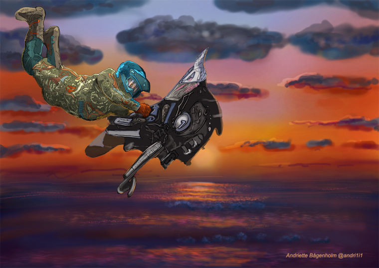
Transportation to heaven, Andriette Bågenholm painted on iPadPro with Appl Pen,in Procreate
-
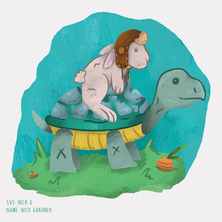 Here goes nothing! (First time submitting a project!)
 -
Here's my Entry for this Month's Prompt. I call it Mermaid Cruise.
I am very into mermaids this month (Wrong month actually. I should have been into it last MerMay instead :3). So when the prompt called for"Transportation", I thought, why not make something like a mermaid-run travel company. So This is the illustration I came up with.
I picture those animal passengers are off to some tropical island for vacation.
This illustration was done first by sketching on a piece of paper by hand and then coloring it in Photoshop.
If you're interested in viewing my previous works, here's a link to my portfolio
Nyrryl Cadiz - PORTFOLIO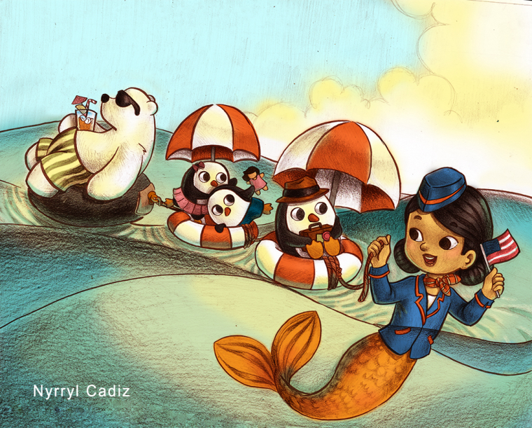
-
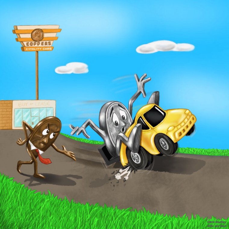
"Test-Drive Gone Wrong"
Mr. Nick soon realized he was at the wrong dealership! Mr. Copper was not pleased.Did a lil "twist" on the transportation prompt.
Anybody remember when these were popular?

www.chrisdudleyart.com
@art_dud -
@nick-g I have the same idea I am working on but the opposite, turtle on rabbit LOL
-
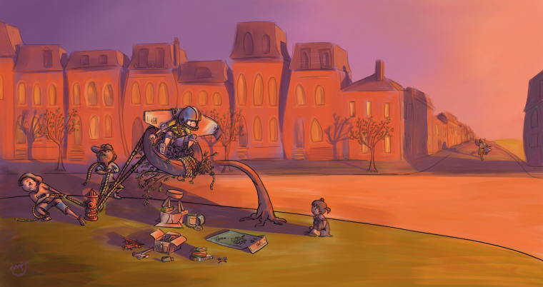
"Test Pilot"
It's early in the morning, the engineers and the pilot are ready for their first flight test. What could possibly go wrong?
@mfjamesillustrations
wakeupmonster.co.uk -
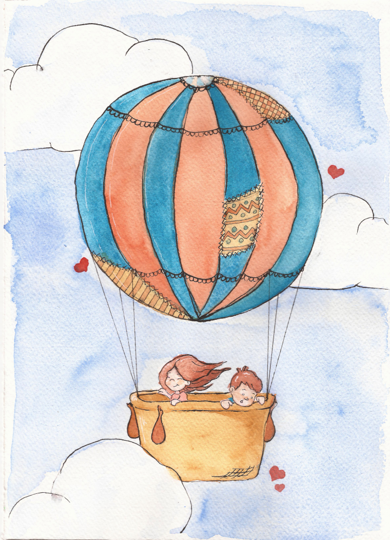
I have been experimenting with watercolors lately. I hope you enjoy.
@mlfforte
-
@mandy-forte This is very cute! I like it.
-
@mf-jamesI like your concept!
-
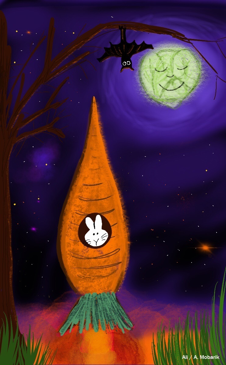
'Rocket Rabbit'
First time doing this. So much fun Lots of talented illustrators here!
 -
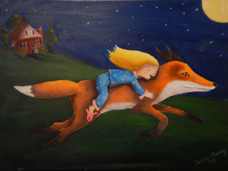
"Transportation"
By Cassie Chancy -
This post is deleted! -
Wow Lisa, great job!
-
@lmrush I like your illustration so much. it's very cute.
-
@lydia-m Your concept is very cute and heart-warming. I like it. Your textures too! Did you paint it in Photoshop? What type of brush did you use?
-
@tessw Thank you Tess, still not completely happy with it but happy to be creating and progressing

-
@nyrryl-cadiz thank you

-
Lisa, this is a charming illustration.
It's a tricky one with value control though. Are these light shapes on a light background or darker shapes on a light background? Make your decision there a little more definite. I would tend to darken around the edge of your characters and boat. Darken your overall local colors in there and possibly use lighting to make the values read better. Look at some of Will's work. He is a master at controlling this kind of stuff.
Nice stuff to everyone so far! keep em' coming!
-
@lee-white Thank you, I will study Will's work. You guys make it look so easy, it is really hard-thanks for your time

-
This post is deleted!