When are an illustration's "problems" worth fixing?
-
Below is what I submitted to last months competition, and at the time, I considered it finished, or at least ready for coloring ( ran out of time). But now that I have looked at it more, I see some issues that could be fixed, but could possibly be let go.
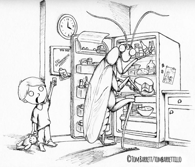
The biggest fix I see is the fridge door—the perspective is off, and its size does match the opening. Is this something that needs to be fixed before I color it? I guess because it bothers me enough to ask for opinions, the answer is already "yes", but would like to get other's opinions and thoughts on what they let go, and what they fix.
-
From what I see it's just the top edge of the door. Didn't pick up on it until I read the rest of your post though. If I see it, I go back into it. Might as well. What else am I doing? That said, I won't nit-pick my stuff, because as with most of the people here I'm sure I am my own worst critic........I feel like my response was not helpful hahaha just went in a bit of a circle here.
-
Any illustration I do could go through endless rounds of "fixing" things. I will see "mistakes" in my illustration every time I look at them. When I do not bear accepting the mistakes anymore, I take them out of my portfolio
") To be honest, I see mistakes in published illustrations too ....so when are illlustrations problems worth fixing? I think if the first thing you see is the mistakes, then they should be fixed. The perception changes over time and distance, so I will always let an illustration "rest" for a few days or even a week (if there is time, of course) before looking at it again and calling it finished (or not). Also, illustrations that looked "perfect" a while ago, may seem full of mistakes when I look at them a year later.
To be honest, I see mistakes in published illustrations too ....so when are illlustrations problems worth fixing? I think if the first thing you see is the mistakes, then they should be fixed. The perception changes over time and distance, so I will always let an illustration "rest" for a few days or even a week (if there is time, of course) before looking at it again and calling it finished (or not). Also, illustrations that looked "perfect" a while ago, may seem full of mistakes when I look at them a year later.
In this one, I would personally fix the perspective of the fridge door and also that of the cake. I would move the clock higher so it is not a near-tangent with the door, change the curve of the boy´s T-shirt bottom edge and also the folds (they look a bit random). I would also recheck the insect´s body - the top edge of the "wings" does not look correct. I would also make some variations on the boy´s face - at the moment he does not look scared, he looks "spaced out", and the position of the features is off (they do not match the angle of the head). I am looking at it as if it was mine - thus the unbuffered critique...It remains a very nice drawing and a great idea! -
Thanks @jasonandroosmith. Your response was helpful. : )
-
@smceccarelli Thanks for the honest critique. You mentioned some things I would have not noticed. Would appreciate clarification on how you would change the boy's face to be scared rather than spaced-out. I was trying to go for a "scared stiff" look, thus the small irises, but maybe that could be done better. And on the cake, it is supposed to look tilted as the roach is taking it out, but, again, perhaps there is a better perspective. Thanks!
-
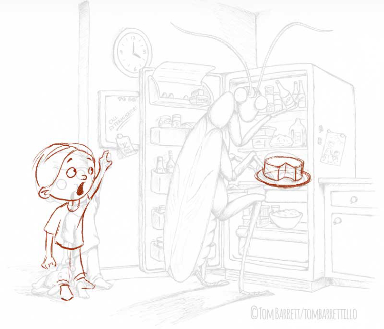
@tombarrettillo Here is a super quick sketch to show what I mean. I think the problem is mainly with the gaze direction and the position of the mouth. Also, while drawing over it, I noticed the boy is not balanced - he looks like he is falling backwards. For the cake, the main problem is that the ellipses of the plate and the two ellipses of the cake (top and bottom) do not match each other. You can tilt it as much as needed, but the three ellipses have to match.
I hope this helps - of course each artist has their own style, so feel free to ignore!
-
@smceccarelli Thanks for the draw-over. Helps a lot. His bad balance was my poor attempt to have him stretching for the light switch. : )
-
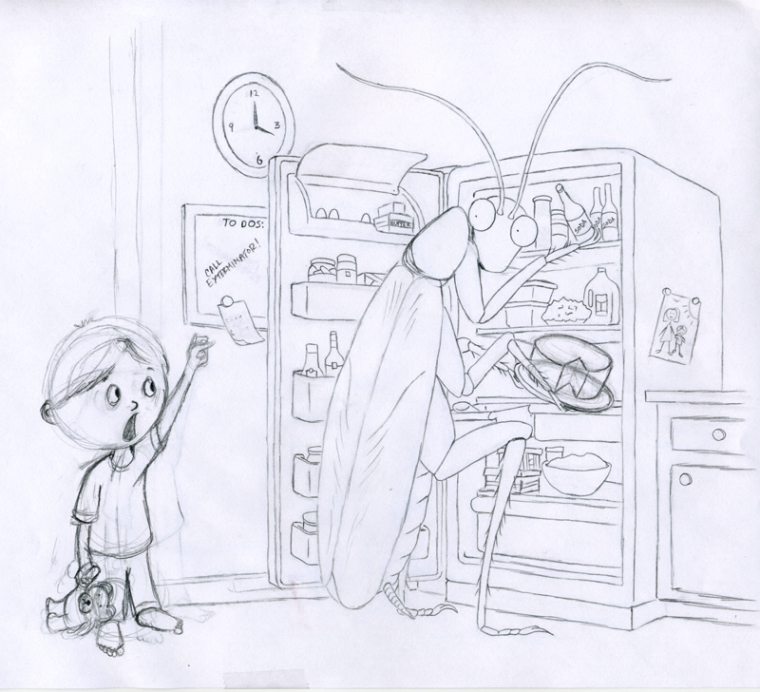
@smceccarelli here is a quick revision of the boy and cake. Better?
-
There's some good points made but be careful not to lose your style. The boy looks like he's been draw by another artist. The mouth position is better but make the eyes big like they were on the first drawing. I think the eyebrows not showing on the first image made him spaced out. Keep the eyebrows and he looks scared. Also watch out for the proportions as the boy's body looks a little long. Raise the base of the shirt and increase the length of the legs. This is just an opinion. Others are available! I'm really liking it so far. Nice idea and fun characters!
-
@ians Thanks!