Art for fantasy childrens novel
-
Ooook whew here I go ....
")
Some time ago I decided to make an illustrated version of a kids novel from my childhood, for my PF. This was supposed to be easy and fun. But just because it is one of my favourite novels, I went from being super excited to being frustrated and getting stuck I should have expected this. I would love some thoughts on where this is going :))
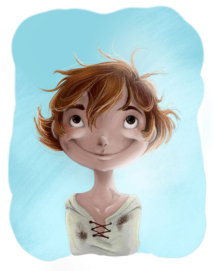
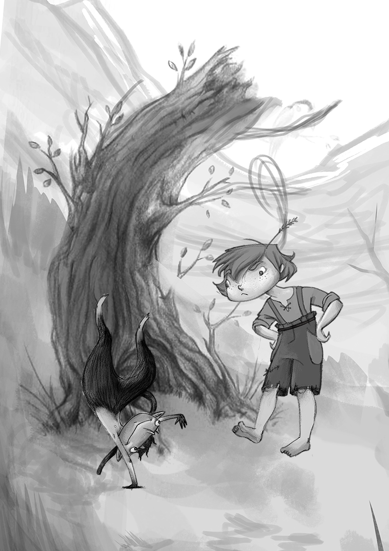
1930s. Main character is a boy, described with long messy hair, strong and always with wripped clothes and dirty. He was banished from home because he only does bad things. I have been told in my design he looks like a girl. What do you think? Any ideas on how to make boys look more boyish, but not manly?
The other character is a devilish creature, that his father banished from home because he can not do bad. They become friends. The creature is athletic and always hopping around. I used this to show that they are basically opposites. This here is the scene where they meet.
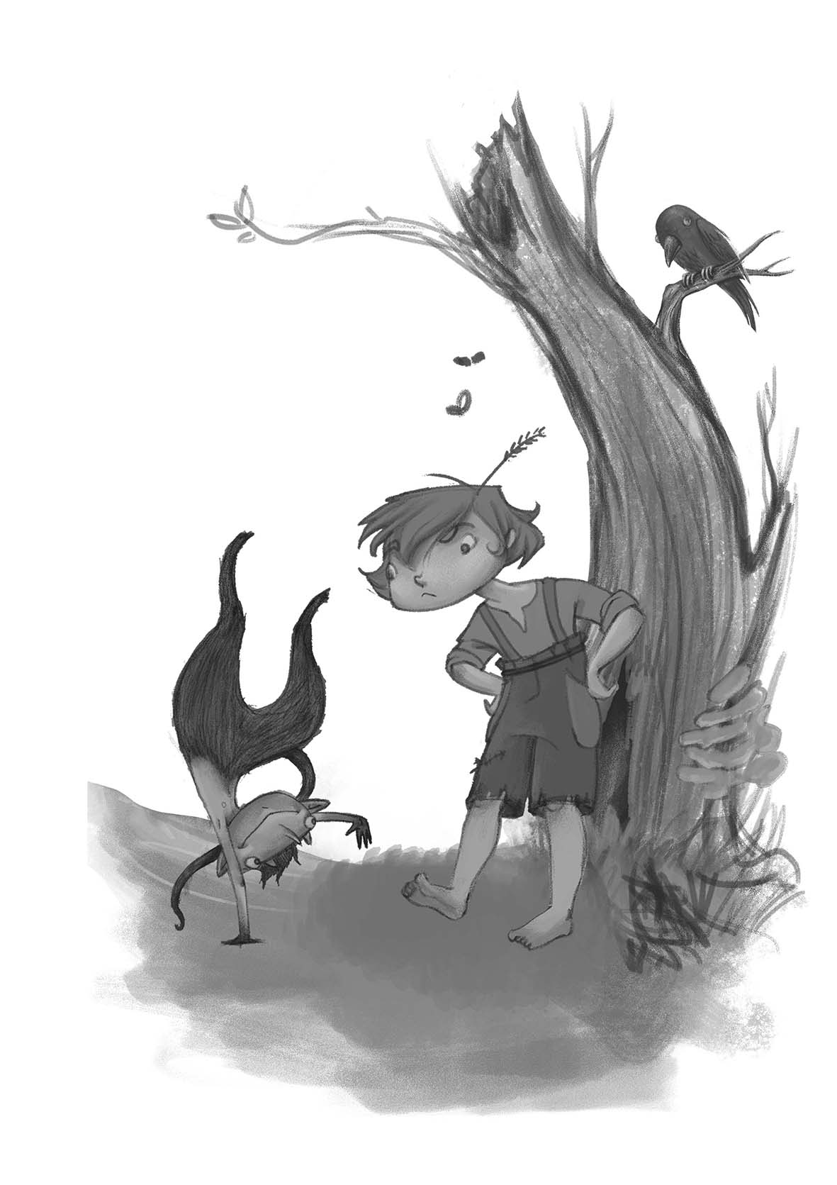
The raven is also a character.
Any feedback and suggestions are very welcome and appreciated.
-
This is so appealing! I love the gouache/almost chalk feel of the coloured image!
Lovely work
Ace -
@Ace-Connell Thanks Ace
-
@Madlenn lovely illustrations! I do quite like the messy brush strokes of the 2nd one in particular. The devil and raven characters are very cute!
I would say that the two illustrations have quite the same feel to them - they almost look like different styles. Maybe it's because I don't see the connection between the boy - they look like different characters rather than the same. They have a different face shape for one - the 2nd one doesn't have the pointy chin like the first. I like how he looks in the 2nd illustration best (no pointy chin) but that's very subjective.
In either illustration I don't see him as being girly at all - I got right away in both that he's a little boy. Unless he's comparable to Arya Stark or something, in which case that's fine cause her character pretty much looks like a boy! haha (GoT reference, just in case I lost you!)
Oh - also there's no laces on his shirt in the 2nd illustration, also not connecting with the first. Small details like that should be kept consistent.
-
Great work, love your style. I think the problem is his hair. I would suggest exaggerating his neck, shoulders and arms. Make them a little thicker so its more obvious that he is male.
-
I like your style
-
Great characters!! I agree with Steve, widening the shoulders should give him a more masculine look. The hair is awesome, the expression is wonderful, and your devilish creature is so fun! Keep up the good work!
-
This is really great work, I love your style too! I am curious about the novel what is the name of it? I can't wait to see more of this please keep sharing!
-
I like your style and your characters. Really expressive.
-
O wow thanks everyone!
I will use your suggestions and post the corrections soon. I also have a villain wizard coming along, so, more to come@thrace7724 The novel is Yan Bibiyan (name of the main character). It's from a bulgarian author, so I don't believe its been translated, at least I couldn't find anything on the internet. It's sort of got a similar feel to Coraline, Wizard of oz thing, but with a boy. I just love that kind of stuff :))))
-
I always have trouble making my little kids look less like 17 year olds, so I can relate to your frustration with drawing little boys. But personally he looks like a 10-12 year boy to me.
-
I think that for me they are perfect...i like the androgyny of the boy character...any child can identify with him... very charming characters...love the puckish looking creature also
-
Lovely! Your style is beautiful!
For the boy, I'd give freckles, and yes trim the hair a bit. the curl on the left side is making him (while adorable) look a little more girl-ish.
Keep making these wonderful works! I'm a fan!
-
@mbore710 That's good to hear
Also I think we are usually more comfortable drawing our own gender first, and I'm still coming out of that.
@Kevin-Longueil Thank you, Kevin
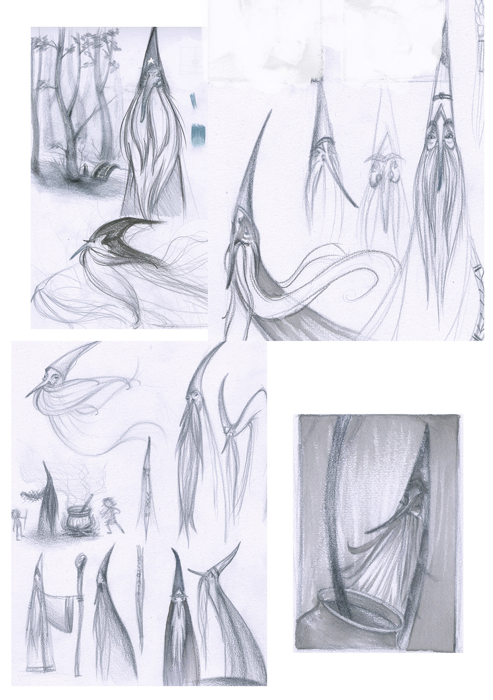
@Christina-Taylor-Brown Thank you, Cristina. I think you are so very right about the curl, but I am still hoping to find a way to keep the hair and get the boy look. Everything is still pretty much in the concept stage so I hope it will evolve in a better way.Here's a little update with some sketches. These are of the bad guy wizard character. In the story he lies a lot, can grow very big or become very small.
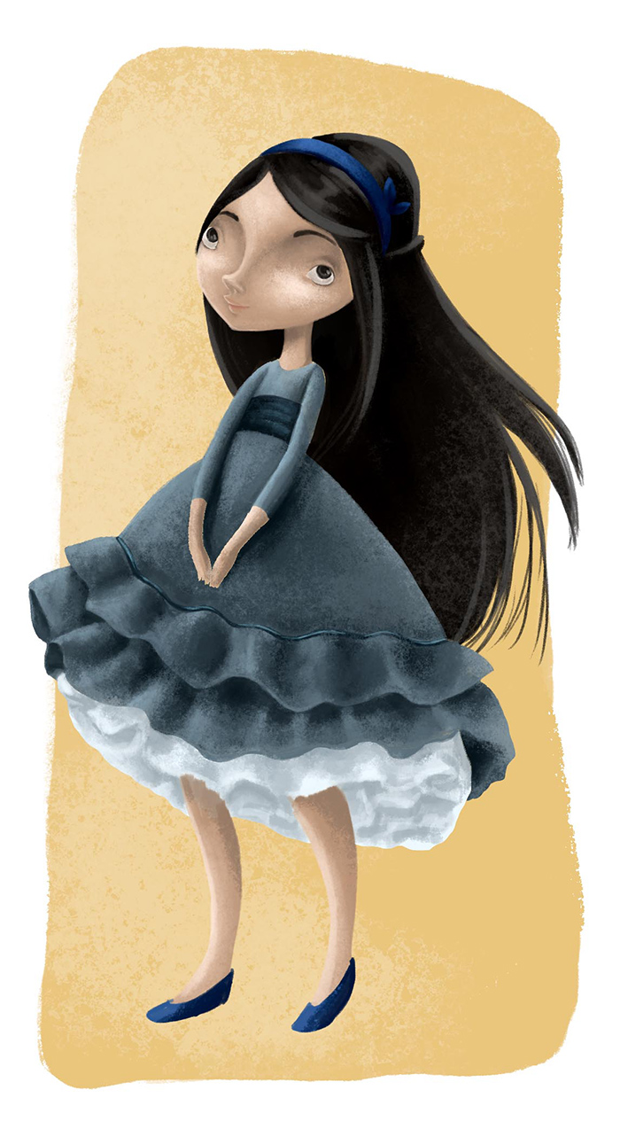
This is a concept drawing I did for the girl character. She has been turned into a raven by the wizard. It's still not what I had in my head, but thought to show it anyway
I also did a tweak in the first drawing. Redid the tree and played around with placement. Any thought on wheter this is better or worse would be very appreciated
-
Oh my gosh! I love the wizard so much! You have such a way with making those shapes work and come alive! Wonderful!
-
@Christina-Taylor-Brown Thanks, Cristina! Thats actually a result from the Drawing Villains and Monsters class. It explains a lot :)))
-
@Madlenn
I think switching the tree to the other side really improved the harmony of your image (which is gorgeous by the way). You just have to be carefull that the little creature really pops infront of the tree. With his dark legs it should work. For the case that this will be colored at the end, the popping might be even supported by color.
Nice Project! It is fun to follow it.
Actually it inspires me a lot also to go back to what I loved to read as a kid and think about some character design. Thanks! -
I agree I think swapping over the tree does improve the composition considerably.